Textbox
- Demonstration: Textbox
- Java API: org.zkoss.zul.Textbox
- JavaScript API: zul.inp.Textbox
Employment/Purpose
A textbox is used to let users input textual data.
You could assign value, type, constraint, rows, cols to a textbox
using the corresponding properties. When you assign the property type
to a string value “password” when multiline is false then any character in this component will replace by ‘*’.
You could also assign a constraint value with a regular expression string or a default constraint expression (available value is “no empty”). When user change the value of textbox, it will cause a validating process to validate the value. If the validation fails, then a notification will pop up.
Common Use Cases
- Single-line text input — collect short free-form text such as names, search terms, or identifiers by using the default single-row textbox.
- Multi-line text area — collect longer content such as comments or descriptions by setting
rowsto a value greater than1(which also enablesmultilineautomatically). - Password fields — hide sensitive input by setting
type="password". - Validated input — enforce patterns like email addresses or non-empty fields with the
constraintattribute (see InputElement). - Tab-formatted content — allow users to insert tab characters for code or tabular text by enabling
tabbable="true". - Submit on Enter — fire the
onOKevent immediately when the user presses Enter in a single-line field by enablingsubmitByEnter="true".
Example

<textbox value="text..." />
<textbox value="secret" type="password" />
<textbox constraint="/.+@.+\.[a-z]+/: Please enter an e-mail address" />
<textbox rows="5" cols="40">
    <attribute name="value">
text line1...
text line2...
    </attribute>
</textbox>
To specify multilines value, you can use the attribute element or

 as shown below
<textbox rows="5" cols="40">
<attribute name="value">
text line1...
text line2...
</attribute>
</textbox>
<textbox value="Line 1
Line 2" rows="3"/>
Properties
Value
Default Value: ""
Sets the text content of the textbox. Passing null is treated as an empty string. The value is subject to any active constraint; a WrongValueException is thrown when validation fails.
<textbox value="Hello, World!"/>
Multiline
If true, zk renders a multiline textbox. The multiline will also be true if you set rows larger than 1.
Rows
Default Value: 1
Sets the number of visible text lines. The value must be greater than 0; passing 0 or a negative number throws a WrongValueException. Setting rows to a value greater than 1 automatically enables multiline. Note that rows cannot be used together with vflex or height — an UiException is thrown if you attempt to combine them.
<textbox rows="5" cols="40" placeholder="Enter your message…"/>
Tabbable
By specifying a true, the tabbox can insert a long space or format the content inside textbox conveniently. For example,
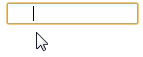
<textbox tabbable="true"/>
SubmitByEnter
since 8.5.2
When you specify true, pressing Enter will fire onOK event rather then move to next line, if you want to move to next line, you should press Shift + Enter.
When submitByEnter=”false”, press Enter will move to next line.
The default is false.
<textbox submitByEnter="true" onOK=""/>
Type
The type attribute determines the component-rendered HTML element <input type="?">.
By setting the type as password, the text that is entered into the box cannot be viewed and is replaced by *.
Username: <textbox/>
Password: <textbox type="password"/>
since 6.5.0
The type attribute support HTML 5 defined types tel, email and url.
Phone: <textbox type="tel"/>
Email: <textbox type="email"/>
WebSite: <textbox type="url"/>
Supported Events
- Inherited Supported Events: InputElement
Supported Molds
Available molds of a component are defined in lang.xml embedded in zul.jar.
| Name | Snapshot |
|—|—|
| default | |
| rounded | 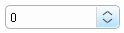 since 5.0.0
|
since 5.0.0
|
Supported Children
*NONE
Inherited Functions
Please refer to InputElement for inherited functions, such as in-place edition.