Cropper
- Java API: org.zkoss.zkmax.zul.Cropper
- JavaScript API: zkmax.cropper.Cropper
since 8.6.0
Employment/Purpose
This component allows users to crop a selected range of image.
Common Use Cases
- Avatar / profile photo upload — embed a
<cropper>in an upload dialog so users can select and crop a square region before saving the image to the server. - Fixed-ratio image editing — set
aspectRatioto enforce a specific width-to-height ratio (e.g.16/9for banners) so the crop selection is always proportional. - Custom toolbar — set
toolbarVisible="false"and invokecrop()/cancel()programmatically from your own buttons or keyboard shortcuts. - Real-time preview — combine
instant="true"with an<image>component updated in theonChangehandler to show a live thumbnail of the cropped area as the user drags.
Example
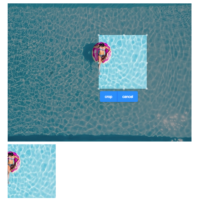
<cropper x="50" y="100" w="100" h="100" onCrop="img.setContent(event.getMedia())" width="800px"
 toolbarVisible="true"  src="swimming-pool.jpg"/>
    <image id="img"/>
Properties
AspectRatio
The width and height of the selected range will be fixed to the specified ratio.
Content
Type: Image
The content image.
<cropper content="${imgContent}"/>
CroppedFormat
Image formats like image/jpeg or image/png is allowed, Default is
set to image/png
CrossOrigin
Default Value: null
Sets the crossorigin attribute on the underlying <img> element, controlling how the browser handles cross-origin requests for the image. This maps directly to the HTML5 crossorigin attribute and is rendered to the client even if the browser does not support it.
| Value | Meaning |
|---|---|
null (default) |
No crossorigin attribute is sent; cross-origin cookies and credentials are not included. |
"anonymous" |
CORS request is sent without credentials. An invalid string or empty string is also treated as "anonymous". |
"use-credentials" |
CORS request is sent with credentials (cookies, certificates, HTTP authentication). |
<cropper src="/path/to/image.jpg" crossOrigin="anonymous"/>
H
The height of the selected range.
Instant
Default Value: false
When set to true, the onChange event is fired immediately and continuously as the user drags to resize the crop selection area. When false (the default), onChange fires only after the user finishes resizing.
For live previews or real-time feedback, set instant="true". For performance-sensitive scenarios where you only need the final crop coordinates, leave this at the default false and use onChanging to track intermediate states.
<cropper src="/path/to/image.jpg" instant="true" onChange="updatePreview(event)"/>
MaxHeight
The maximum height of the selected crop area.
MaxWidth
The maximum width of the selected crop area.
MinHeight
The minimum height of the selected crop area.
MinWidth
The minimum width of the selected crop area.
Src
The src of the image.
ToolbarVisible
This component provides a built-in toolbar with Crop and Cancel
buttons. You can make it invisible and create your UI control. Then call
crop() and cancel() on your own.
W
The width of the selected range.
X
The left offset of the selected range.
Y
The top offset of the selected range.
Supported Events
| Name | Event Type | Description |
|---|---|---|
onCancel |
Event | Denotes the user has clicked the built-in Cancel button to dismiss the crop operation. |
onChange |
Event | Denotes user has resized the selected range. |
onChanging |
Event | Denotes user is resizing the selected range. |
onCrop |
UploadEvent | Denotes user has cropped the image. |
- Inherited Supported Events: HtmlBasedComponent
Supported Children
None — <cropper> does not accept child components.