Listbox
- Demonstration: Listbox
- Java API: org.zkoss.zul.Listbox
- JavaScript API: zul.sel.Listbox
Employment/Purpose
Components: listbox, listitem, listcell, listhead and listheader.
A list box is used to display a number of items in a list. The user may
select an item from the list. Although listhead is optional, if it
exists, notice that the number of listheader should equal the number
of listcell, so that listbox can display its content correctly. If
listhead contains no listheader, the listbox will display nothing
in its content.
Common Use Cases
- Selectable lists: Display a collection of items where the user must pick one (single selection) or several (multiple selection with
multiple="true"orcheckmark="true"). - Tabular data with row selection: Show multi-column rows where clicking an entire row selects it — prefer Listbox over Grid when selection is the primary interaction.
- Large datasets with lazy loading: Bind a
ListModeland enable ROD (org.zkoss.zul.listbox.rod) so only the visible rows are rendered, keeping memory use low. - Paged navigation: Switch to
mold="paging"to split thousands of records across pages, optionally usingautopagingto compute page size from available height automatically. - Drop-down selector: Use
mold="select" rows="1"as a lightweight HTML<select>replacement when a full dropdown (selectbox,combobox) is not required.
Example
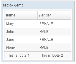
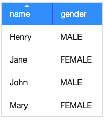
 <window title="listbox demo" border="normal" width="250px">
    <listbox id="box">
        <listhead sizable="true">
            <listheader label="name" sort="auto" />
            <listheader label="gender" sort="auto" />
        </listhead>
        <listitem>
            <listcell label="Mary" />
            <listcell label="FEMALE" />
        </listitem>
        <listitem>
            <listcell label="John" />
            <listcell label="MALE" />
        </listitem>
        <listitem>
            <listcell label="Jane" />
            <listcell label="FEMALE" />
        </listitem>
        <listitem>
            <listcell label="Henry" />
            <listcell label="MALE" />
        </listitem>
        <listfoot>
            <listfooter>
                <label value="This is footer1" />
            </listfooter>
            <listfooter>
                <label value="This is footer2" />
            </listfooter>
        </listfoot>
    </listbox>
</window>
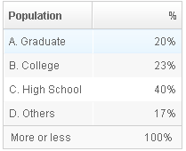
Listboxes Contain Buttons
In theory, a list cell can contain any other components, as demonstrated below.

<zk>
    <listbox width="250px">
        <listhead>
            <listheader label="Population"/>
            <listheader label="Percentage"/>
        </listhead>
        <listitem value="A">
            <listcell><textbox width="90%" value="A. Graduate"/></listcell>
            <listcell label="20%"/>
        </listitem>
        <listitem value="B">
            <listcell><checkbox label="B. College"/></listcell>
            <listcell><button label="23%"/></listcell>
        </listitem>
        <listitem value="C">
            <listcell label="C. High School"/>
            <listcell><textbox cols="8" value="40%"/></listcell>
        </listitem>
    </listbox>
</zk>
Notes:
- Don’t use a list box, when a grid is a better choice. The appearances of list boxes and grids are similar, but the listbox should only be used to represent a list of selectable items.
- Users are usually confused if a listbox contains editable components
such as a
textboxor acheckbox. - Due to the limitation of the browsers, users cannot select a range of characters from text boxes.
Mold
The Listbox has three molds: default, select, and paging.
Select Mold
Suggest using Selectbox.
If the select mold is used, Listbox renders an HTML <select> tag
instead.
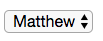
    <listbox mold="select">
        <listitem label="Matthew"/>
        <listitem label="Macus"/>
        <listitem label="Lucas"/>
        <listitem label="John"/>
    </listbox>
Note: if the mold is “select”, rows is “1”, and none of the items
are marked as selected, the browser will display the listbox as if the
first item is selected. Worst of all, if the user selects the first item
in this case, no onSelect event is sent. To avoid this confusion,
developers should select at least one item when using mold="select"
and rows="1".
In addition to each item’s label, you can assign an application-specific
value to each item using the setValue method.
<listhead> is not supported in this mold.
Listgroup Supported
since 8.6.0
This mold supports having Listgroups and renders them as HTML <optgroup>.
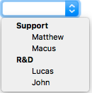
<listbox mold="select">
<listgroup label="Support"/>
<listitem label="Matthew"/>
<listitem label="Macus"/>
<listgroup label="R&D"/>
<listitem label="Lucas"/>
<listitem label="John"/>
</listbox>
Keyboard Navigation Listbox
- Press
UPandDOWNto move the selection up and down by one list item. - Press
PgUpandPgDnto move the selection up and down by one page. - Press
HOMEto move the selection to the first item, andENDto move to the last item. - Press
Ctrl+UPandCtrl+DOWNto move the focus up and down by one list item without changing the selection. - Press
SPACEto select the item in focus.
Paging
Like grids, you can use multiple pages to represent large content by
setting the mold to paging. Similarly, you can control how many items
each page displays, whether to use an external paging component and
whether to customize the behavior when a page is selected.
The listbox and grid components support the paging intrinsically, so
you don’t need to specify a paging component explicitly as above unless
you want to have different visual layout or to control multiple
listbox and gridcontrols with one paging component.
Please refer to the Grid for more details.
Autopaging
When using the paging mold and vflex, you can also turn on autopaging (org.zkoss.zul.Listbox#setAutopaging(boolean)) such that Listbox will determine the page size automatically based on the available height.
since 5.0.2
Note: If the autopaging is enabled, the height of each row will be applied the following CSS by default. If you want to change the height, please overwrite the CSS rule as your preference.
.z-listbox-autopaging .z-listcell-cnt {
    height: 30px;
    overflow: hidden;
}
since 5.0.8
Note: In ZK 7, we change the naming .z-listcell-cnt to .z-listcell-content. since 7.0.3
.z-listbox-autopaging .z-listitem {
    height: 80px; /* set custom height */
}
.z-listbox-autopaging .z-listcell-content {
    height: auto;     /* remove the default height */
    max-height: 58px; /* limit the height to avoid long text increasing the height */
}
PagingDisabled
since 8.0.3
Once the pagingDisabled is set to true, users will be blocked from
navigating through the pagination.
Selection
Nonselectable Tags
since 5.0.5
By default, when a user clicks on an HTML <button>, <input>, <textarea>
or <a> tag, it doesn’t change the selection. For example, when a
user clicks the textbox in the following example, the selection state of
the item won’t be changed (only the textbox gains the focus).
<listitem>
    <listcell>
        <textbox/>
    </listcell>
</listitem>
Click to Select Anyway
Sometimes it is not intuitive, such as using with inplace editing (org.zkoss.zul.impl.InputElement#isInplace()). If you want to have more control of whether to select an item, you could specify a list of tags in the nonselectableTags property (org.zkoss.zul.Listbox#setNonselectableTags(java.lang.String)). For example, if you want to select the item, no matter what tag the user clicks, you could specify an empty string as follows.
<listbox nonselectableTags="">
    <listitem><listcell><textbox/></listcell></listitem>
    <listitem><listcell><button label="button"/></listcell></listitem>
    <listitem><listcell><h:input xmlns:h="native"/></listcell></listitem>
    <listitem><listcell><datebox/></listcell></listitem>
</listbox>
If you only want to ignore BUTTON and INPUT only, you could specify:
<!-- The tag here means HTML tag, not ZUL tag -->
<listbox nonselectableTags="button, input"/>
Click Checkmark to Select Only
since 5.0.6
If you want to toggle the selection only when the user clicks on the
checkmark, you could specify *. Notice that you have to specify
checkmark="true" as well (otherwise, no item is selectable).
This setting also allows to select and copy a text in a listcell with ctrl+c.
    <listbox checkmark="true" nonselectableTags="*">
        <listitem>
            <listcell>
                you can copy the text with ctrl+c
            </listcell>
        </listitem>
    </listbox>
Multiple Selection
since 6.0.0
When a user clicks on a list item, the whole row is selected and the
onSelect event is sent back to the server to notify the application.
You are able to enable multiple selections by setting the multiple
attribute to true. The default value is false.
If there is no checkmark (by default checkmark="false"), then click
to select one item will deselect others, just like you select a file
in a file browser in a OS.
To select multiple items, you can:
- press
Ctrlto select separate items:

- press
Shiftto select consecutive items:

Enable with a ListModel
If you assign a ListModel to a Listbox, then you should enable the multiple selection with the ListModel
. Please do not set multiple on listbox directly, and set multiple on the model instead.
...
List Items = new ArrayList();
for (int i = 0; i < 1000; i++) {
    Items.add("data "+i);
}
ListModelList model = new ListModelList(Items);
model.setMultiple(true);
...

<listbox model="${model}" ... />
The Checkmark Property
The checkmark attribute controls whether to display a checkbox or a
radio button in front of each list item.
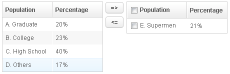
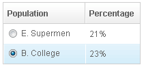
In the following example, you will notice how a checkbox is added automatically when you move a list item from the left listbox to the right one. The checkbox is then removed when you move a list item from the right listbox to the left listbox.
<zk>
<hbox>
<listbox id="src" rows="0" multiple="true" width="200px">
<listhead>
<listheader label="Population"/>
<listheader label="Percentage"/>
</listhead>
<listitem id="a" value="A">
<listcell label="A. Graduate"/>
<listcell label="20%"/>
</listitem>
<listitem id="b" value="B">
<listcell label="B. College"/>
<listcell label="23%"/>
</listitem>
<listitem id="c" value="C">
<listcell label="C. High School"/>
<listcell label="40%"/>
</listitem>
<listitem id="d" value="D">
<listcell label="D. Others"/>
<listcell label="17%"/>
</listitem>
</listbox>
<vbox>
<button label="=>" onClick="move(src, dst)"/>
<button label="<=" onClick="move(dst, src)"/>
</vbox>
<listbox id="dst" checkmark="true" rows="0" multiple="true" width="200px">
<listhead>
<listheader label="Population" width="120px"/>
<listheader label="Percentage"/>
</listhead>
<listitem id="e" value="E">
<listcell label="E. Supermen"/>
<listcell label="21%"/>
</listitem>
</listbox>
<zscript>
void move(Listbox src, Listbox dst) {
Listitem s = src.getSelectedItem();
if (s == null)
Messagebox.show("Select an item first");
else
s.setParent(dst);
}
</zscript>
</hbox>
</zk>
Note: If the multiple attribute is false, radio buttons are displayed
instead, as demonstrated by the right hand listbox.
To enable Select all feature, there are some constraints as below: since 5.0.11
Select all checkbox in listheader is only available if ROD is false.
since 8.0.0
If paging mold is enabled, the Select all checkbox in listheader is only available when using a ListModel implementation as model. (e.g. ListModelList)
since 6.5.5
The Select all checkbox on listheader now support onCheckSelectAll event that can determine whether it is checked or not.
<listbox checkmark="true" multiple="true" width="350px">
    <custom-attributes org.zkoss.zul.listbox.rod="false"/>
    <attribute name="onCheckSelectAll"><![CDATA[
        if (event.isChecked()) {
            System.out.println("Select All Checked");
        } else {
            System.out.println("Select All Un-Checked");
        }
    ]]></attribute>
    <listhead>
        <listheader label="col 1" />
        <listheader label="col 2" />
    </listhead>
    <listitem id="a" value="A">
        <listcell label="A. Graduate"/>
        <listcell label="20%"/>
    </listitem>
    <listitem id="b" value="B">
        <listcell label="B. College"/>
        <listcell label="23%"/>
    </listitem>
</listbox>
Deselect Others when Clicking an Item with Checkmark
since 5.0.5
If a listbox’s checkmark (org.zkoss.zul.Listbox#isCheckmark()) is set to true, the selection will be toggled when an user clicks an item. In other words, all other items will remain their selection state.
If you prefer to deselect all other items and select the item being
clicked (which the behavior of ZK 5.0.4 and earlier), you could specify
true to this library property called org.zkoss.zul.listbox.checkmarkDeselectOthers
in WEB-INF/zk.xml:
<library-property>
    <name>org.zkoss.zul.listbox.checkmarkDeselectOthers</name>
    <value>true</value>
</library-property>
Toggle Selection when Right Clicking an Item with Checkmark
since 5.0.5 If a listbox’s checkmark (org.zkoss.zul.Listbox#isCheckmark()) is enabled, the selection will be toggled when user right click on item.
If you prefer not to select/deselect item on right click, you could
specify false to this library property called
org.zkoss.zul.listbox.rightSelect in WEB-INF/zk.xml:
<library-property>
    <name>org.zkoss.zul.listbox.rightSelect</name>
    <value>false</value>
</library-property>
Sorting
Listboxes support the sorting of list items directly. When you enable sorting, a user can click a Listheader to switch the sorting order between ascending and descending. There are a few ways to enable the sorting of a particular column.
Sort
The simplest way is sort="auto". Then, when a user clicks a
listheader, listbox sorts the column based on the ‘label of each
listcell in a case-insensitive way.
<zk>
    <listbox width="200px">
        <listhead>
            <listheader label="name" sort="auto"/>
            <listheader label="gender" sort="auto"/>
        </listhead>
...
    </listbox>
</zk>
Auto-sorting on Fields
If ListModel contains non-String object, you need to specify its
property to sort. By default, it sorts in a case-sensitive way with
FieldComparator.
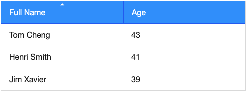
In the following example, we demonstrate how to sort a person object based on its First Name, Last Name, or Age.
    <zscript>
        <![CDATA[

class Person {
      private String firstName;
      private String lastName;
      private int age;

      public Person(String f, String l, int a) {
          firstName = f;
          lastName = l;
          age = a;
      }

      public String getFirstName() {
          return firstName;
      }
      public String getLastName() {
          return lastName;
      }
      public String getFullName() {
          return firstName + " " + lastName;
      }
      public int getAge() {
          return age;
      }
  }

  ListModelList persons = new ListModelList();
  persons.add(new Person("Tom", "Cheng", 43));
  persons.add(new Person("Henri", "Smith", 41));
  persons.add(new Person("Jim", "Xavier", 39));
]]>
    </zscript>
    <listbox model="${persons}">
        <listhead>
            <listheader label="Full Name" sort="auto(lastName, firstName)" />
            <listheader label="Age" sort="auto(age)" />
        </listhead>
        <template name="model">
            <listitem>
                <listcell label="${each.fullName}" />
                <listcell label="${each.age}" />
            </listitem>
        </template>
    </listbox>
Case-insensitive
To sort in case-insensitive, you can apply one of the functions below:
- UPPER()
- LOWER()
<listheader label="First Name" sort="auto(UPPER(firstName))" />
The SortAscending and SortDescending Properties
If you prefer to sort list items in different ways, you can assign a
java.util.Comparator instance to the sortAscending and/or
sortDescending attributes. Once assigned, the list items can be sorted
in the ascending and/or descending order with the specified comparator.
The invocation of the sort attribute with auto automatically assigns
two comparators to the sortAscending and sortDescending attributes.
You can override any of them by assigning another comparator.
For example, assume you want to sort based on the value of list items,
rather than list cell’s label, then you assign an instance of
ListitemComparator to these attributes as follows.
    <zscript>
        import org.zkoss.zul.*;
        Comparator asc = new ListitemComparator(-1, true, true);
        Comparator dsc = new ListitemComparator(-1, false, true);
    </zscript>
    <listbox width="200px" model="${model}">
        <listhead>
            <listheader label="ID" sortAscending="${asc}" sortDescending="${dsc}"/>
        </listhead>
    </listbox>
The SortDirection Property
The sortDirection attribute determines the display of the sorting
direction icon to indicate “ascending” or “descending”. It doesn’t
sort the data. If list items are sorted before adding to the listbox,
you should set this attribute explicitly.
<listheader sortDirection="ascending"/>
Sorting is maintained automatically by the listboxes as long as you assign the comparator to the corresponding list header.
The onSort Event
When you assign at least one comparator to a Listheader, an
onSort
event is sent to the server if users clicks on it. The Listheader
implements a listener to sort.
If you prefer to handle sorting manually, you can add your own listener
to a Listheader for the onSort event. To prevent the default
listener invoking the sort method, you have to call the
stopPropagation method. Alternatively, you can override the sort
method, please see below.
The Sort Method
The sort method is the underlying implementation of the default
onSort event listener. It is also useful if you want to sort the list
items using Java code. For example, you may have to call this method
after adding items (assuming that they are not added in the proper
order).
new Listem("New Stuff").setParent(listbox);
if (!"natural".header.getSortDirection())
    header.sort("ascending".equals(header.getSortDirection()));
The default sorting algorithm is quick-sort (by use of the sort method
from the org.zkoss.zk.ui.Components class). You can override it with
your own implementation or listen to the onSort event as described in
the previous section.
Tip: Sorting a large amount of live data could degrade the performance significantly. It is better to intercept the onSort event or the sort method to handle it effectively. Please refer to the Sort Live Data section further down.
Live Data
Like grid1, listbox supports live data. With live data, developers can separate data from the view. In other words, developers need only to provide the data by implementing the org.zkoss.zul.ListModel interface, rather than manipulating the list box directly.
The benefits are twofold:
- It is easier to use different views to display the same set of data.
- The list box sends the data to the client only if it is visible. This saves a lot of network traffic if there is a large amount of data.
There are three steps to make use of live data.
1 Prepare the data in the form of a org.zkoss.zul.ListModel. ZK has a concrete implementation called org.zkoss.zul.SimpleListModel for representing an array of objects.
2 Implement the org.zkoss.zul.ListitemRenderer interface for rendering a item of data into the listbox.
-
- This is optional. If it is not specified the default renderer is used to render the data into the first column.
- You can implement different renderers for representing the same data in different views.
3 Set the data in the model attribute and, optionally, the renderer in
the itemRenderer attribute.
In the following example, we prepared a list model called strset,
assigned it to a list box through the model attribute. Then, the
listbox will do the rest.
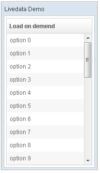
<window title="Livedata Demo" border="normal" width="200px">
    <zscript><![CDATA[
        String[] data = new String[30];
        for(int j=0; j < data.length; ++j) {
            data[j] = "option "+j;
        }
        ListModel strset = new SimpleListModel(data);
    ]]></zscript>
    <listbox rows="10" model="${strset}">
        <listhead>
            <listheader label="Load on demend"/>
        </listhead>
    </listbox>
</window>
Rendering All Items at Once
Sometimes an application needs a listbox with a model to render all rows
on the initial loading and after every model change. A typical case is
when your code must traverse or manipulate listitem children
programmatically — for example, swapping or reordering the child cells
of each row — which only works if every Listitem is fully rendered.
However, when a listbox uses a model together with a constrained height
(e.g. vflex or a fixed height), there are two independent
mechanisms that each limit how many rows get rendered, and you must
handle both:
- ROD (render-on-demand), a ZK EE feature, renders listitems on
demand. Disable it with the custom attribute
org.zkoss.zul.listbox.rod="false". - Live data, available in all editions, only creates items at the client as the user scrolls. Bypass it by calling org.zkoss.zul.Listbox#renderAll() on the server.
Applying only one of the two is a common pitfall — some rows will still be missing until you apply both together.
Disable ROD with the custom attribute:
<listbox id="taskList" vflex="true" model="@load(vm.tasks)">
    <custom-attributes org.zkoss.zul.listbox.rod="false"/>
    <!-- listhead, templates... -->
</listbox>
Then call renderAll() from any server-side code with access to the
component, e.g. in a composer or after updating the model:
Listbox listbox = (Listbox) Selectors.iterable(view, "#taskList").iterator().next();
listbox.renderAll();
Note: you have to call renderAll() again whenever the model
changes, because newly added items are rendered on demand again.
Caution: rendering everything at once sacrifices the performance benefits of ROD and live data, so reserve this approach for cases that truly require a fully-built DOM and complete Listitems. For the performance-oriented default behavior, see Turn on Render on Demand.
Sorting with Live Data
If you allow users to sort a listbox with live data, you have to implement the interface, org.zkoss.zul.ext.Sortable, in addition to the org.zkoss.zul.ListModel.
class MyListModel implements ListModel, Sortable {
    public void sort(Comparator cmpr, boolean ascending) {
        //do the real sorting
        //notify the listbox (or grid) that data is changed by use of ListDataEvent
    }
    ...
}
When a user wants to sort the listbox, the listbox will invoke org.zkoss.zul.ext.Sortable#sort(java.util.Comparator,boolean) to sort the data. In other words, the sorting is done by the list model, rather than the listbox.
After sorting, the list model will notify the listbox by invoking the org.zkoss.zul.event.ListDataListener#onChange(org.zkoss.zul.event.ListDataEvent) method of the listbox’ registered org.zkoss.zul.event.ListDataListener instances. These are registered by org.zkoss.zul.ListModel#addListDataListener(org.zkoss.zul.event.ListDataListener). In most cases, all the data is changed, so the list model usually sends the following event:
new ListDataEvent(this, ListDataEvent.CONTENTS_CHANGED, -1, -1)
Note: the implementation of the org.zkoss.zul.ListModel and org.zkoss.zul.ext.Sortable is independent of the visual presentation. In other words, they can be used with grids, listboxes and any other components supporting org.zkoss.zul.ListModel.
If you require maximum flexibility, you should not depend on the actual component used, and instead use org.zkoss.zul.event.ListDataEvent to communicate model changes.
Scroll a Listitem into Current View
When a Listbox is scrollable, if you want to scroll a Listitem out of the visible area into the current view (visible area), you can call scrollToIndex().
Columns Menu
For example, since 6.5.0
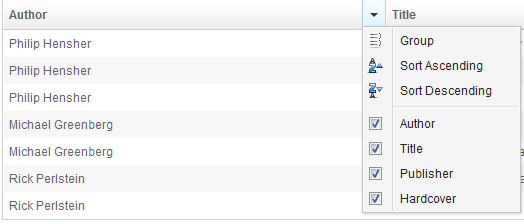
<zk>
    <listbox>
        <listhead menupopup="auto">
            <listheader label="Author" sort="auto"/>
            <listheader label="Title" sort="auto"/>
            <listheader label="Publisher" sort="auto"/>
            <listheader label="Hardcover" sort="auto"/>
        </listhead>
        // omitted...
    </listbox>
</zk>
- For further details, please refer to Listhead component directly.
Ungroup Column Menu
When the user groups the content of the listbox, the column’s menu will show an ungroup icon for user to reset the group.
since 6.5.0
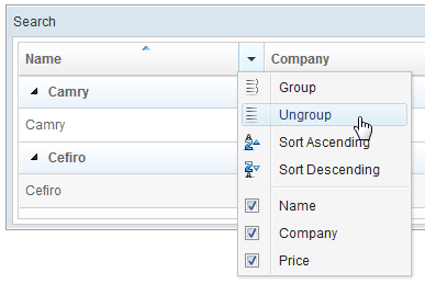
Note: If the Listbox contains with Model, GroupsModel, you have to register an onUngroup event for listheader to show an ungroup icon and then replace the current model with a ListModel to reset the group.
For example,
<zk>
    <zscript><![CDATA[
  int cnt = 0;
Object[][] foods = new Object[][] {
    new Object[] { "Vegetables", "Asparagus", "Vitamin K", 115, 43},
    new Object[] { "Vegetables", "Beets", "Folate", 33, 74},
    new Object[] { "Vegetables", "Tomatoes", "Vitamin C", 57, 37},
    new Object[] { "Seafood", "Salmon", "Tryptophan", 103, 261},
    new Object[] { "Seafood", "Cod", "Tryptophan", 90, 119}
};
public class FoodGroupRenderer implements ListitemRenderer {
    public void render(Listitem row, Object obj, int index) {
        if (row instanceof Listgroup) {
            row.setLabel(obj.toString());
        } else {
            Object[] data = (Object[]) obj;
            row.appendChild(new Listcell(data[0].toString()));
            row.appendChild(new Listcell(data[1].toString()));
            row.appendChild(new Listcell(data[2].toString()));
            row.appendChild(new Listcell(data[3].toString()));
            row.appendChild(new Listcell(data[4].toString()));
        }
    }
}
ListModelList listmodel = new ListModelList();
for (int i = 0; i < foods.length; i++)
    listmodel.add(foods[i]);
ListitemRenderer renderer = new FoodGroupRenderer();
GroupsModel model = new GroupsModelArray(foods, new ArrayComparator(0, true));
    ]]></zscript>
    <listbox id="listbox" model="${model}" itemRenderer="${renderer}">
        <listhead menupopup="auto">
            <listheader label="Category" sort="auto(0)" onGroup='listbox.setModel(model)'
                onUngroup='listbox.setModel(listmodel);' />
            <listheader label="Name" sort="auto(1)" />
            <listheader label="Top Nutrients" sort="auto(2)" />
            <listheader label="% of Daily" sort="auto(3)" />
            <listheader label="Calories" sort="auto(4)" />
        </listhead>
    </listbox>
</zk>
Listgroup Component
Both Grid, and Listbox support Grouping concept, it enables developers to display data in an advanced way. Moreover, live data are also supported in Grouping Grid, and Listbox with the org.zkoss.zul.GroupsModel interface..
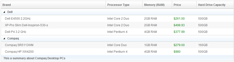
<zk>
    <listbox>
        <listhead sizable="true">
            <listheader label="Brand"/>
            <listheader label="Processor Type" width="150px"/>
            <listheader label="Memory (RAM)" width="120px"/>
            <listheader label="Price"  width="100px"/>
            <listheader label="Hard Drive Capacity" width="150px"/>
        </listhead>
        <listgroup label="Dell"/>
        <listitem>
            <listcell style="padding-left:15px" label="Dell E4500 2.2GHz"/>
            <listcell label="Intel Core 2 Duo"/>
            <listcell label="2GB RAM"/>
            <listcell label="$261.00" style="color:green"/>
            <listcell label="500GB"/>
        </listitem>
        <listitem>
            <listcell style="padding-left:15px" label="XP-Pro Slim Dell-Inspiron-530-s"/>
            <listcell label="Intel Core 2 Duo"/>
            <listcell label="2GB RAM"/>
            <listcell label="$498.93" style="color:green"/>
            <listcell label="500GB"/>
        </listitem>
        <listitem>
            <listcell style="padding-left:15px" label="Dell P4 3.2 GHz"/>
            <listcell label="Intel Pentium 4"/>
            <listcell label="4GB RAM"/>
            <listcell label="$377.99" style="color:green"/>
            <listcell label="500GB"/>
        </listitem>
        <listgroup label="Compaq"/>
        <listitem>
            <listcell style="padding-left:15px" label="Compaq SR5113WM"/>
            <listcell label="Intel Core Duo"/>
            <listcell label="1GB RAM"/>
            <listcell label="$279.00" style="color:green"/>
            <listcell label="160GB"/>
        </listitem>
        <listitem>
            <listcell style="padding-left:15px" label="Compaq HP XW4200"/>
            <listcell label="Intel Pentium 4"/>
            <listcell label="4GB RAM"/>
            <listcell label="$980" style="color:green"/>
            <listcell label="500GB"/>
        </listitem>
        <listgroupfoot>
            <listcell span="5" label="This a summary about Compaq Desktop PCs"/>
        </listgroupfoot>
    </listbox>
</zk>
*Available in ZK PE and EE only
For more information, please take a look at these smalltalks,
- Learn About Grouping with Listbox and Grid
- About How Grouping Works with Live Data
- Add Summary Field For Grouping.
Or refer to Listgroup component directly.
Frozen Component
In ZK 5 you are now able to freeze columns within a Grid and Listbox. This mirrors functionality seen within Excel and makes data in these components easier to read, interpret and handle.
The following code demonstrates how to freeze a column within a Grid:
    <listbox>
        <listhead>
            <listheader label="header 1"/>
            <listheader label="header 2"/>
            <listheader label="header 3"/>
            <listheader label="header 4"/>
        </listhead>
        <frozen columns="2"/>
        <listitem>
            <listcell label="cell 1"/>
            <listcell label="cell 2"/>
            <listcell label="cell 3"/>
            <listcell label="cell 4"/>
        </listitem>
    </listbox>
since 5.0.0
- For further details, please refer to Frozen component directly.
Properties
Single-Column Listboxes
The simplest format is as follows. It is a single-column and single-selection list box.
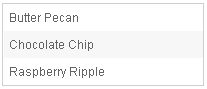
<zk>
    <listbox width="200px">
        <listitem label="Butter Pecan"/>
        <listitem label="Chocolate Chip"/>
        <listitem label="Raspberry Ripple"/>
    </listbox>
</zk>
Multi-Column Listboxes
The list box also supports multiple columns. When a user selects an item, the entire row is selected.
To define a multi-column list, the number of listcells must match the number of columns with a row. For example if there are 4 columns then each row must contain 4 listcells.
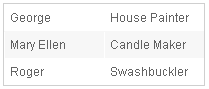
<zk>
    <listbox width="200px">
        <listitem>
            <listcell label="George"/>
            <listcell label="House Painter"/>
        </listitem>
        <listitem>
            <listcell label="Mary Ellen"/>
            <listcell label="Candle Maker"/>
        </listitem>
        <listitem>
            <listcell label="Roger"/>
            <listcell label="Swashbuckler"/>
        </listitem>
    </listbox>
</zk>
Column Headers
You can specify column headers by using listhead and listheader,
please see the code below2. In addition to a label, you can specify
an image as the header by image attribute.
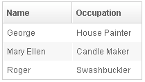
    <listbox width="200px">
        <listhead>
            <listheader label="Name"/>
            <listheader label="Occupation"/>
        </listhead>
        ...
    </listbox>
Column Footers
You could specify the column footers by using listfoot and
listfooter. Please note, each time a listhead instance is added to a
list box, it must be the first child, and a listfoot instance the last
child.
<zk>
    <listbox width="200px">
        <listhead>
            <listheader label="Population"/>
            <listheader align="right" label="%"/>
        </listhead>
        <listitem id="a" value="A">
            <listcell label="A. Graduate"/>
            <listcell label="20%"/>
        </listitem>
        <listitem id="b" value="B">
            <listcell label="B. College"/>
            <listcell label="23%"/>
        </listitem>
        <listitem id="c" value="C">
            <listcell label="C. High School"/>
            <listcell label="40%"/>
        </listitem>
        <listitem id="d" value="D">
            <listcell label="D. Others"/>
            <listcell label="17%"/>
        </listitem>
        <listfoot>
            <listfooter label="More or less"/>
            <listfooter label="100%"/>
        </listfoot>
    </listbox>
</zk>
Auxiliary Headers
Like grids, you can specify auxiliary headers with the auxhead and
auxheader components.
Please refer to the Grid for more details.
Drop-Down List
You can create a drop-down list by setting the listbox’s mold to select and making the box a single row. Notice you cannot use multi-column for the drop-down list.

<zk>
    <listbox mold="select" rows="1">
        <listitem label="Car"/>
        <listitem label="Taxi"/>
        <listitem label="Bus" selected="true"/>
        <listitem label="Train"/>
    </listbox>
</zk>
Scrollable Listboxes
A list box will be scrollable if it has a defined or automatically
calculated height (e.g. by specifying the rows, height or vflex
attribute) and there is not enough space to display all the list items.
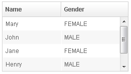
<zk>
    <listbox width="250px" rows="4">
        <listhead>
            <listheader label="Name" sort="auto"/>
            <listheader label="Gender" sort="auto"/>
        </listhead>
        <listitem>
            <listcell label="Mary"/>
            <listcell label="FEMALE"/>
        </listitem>
        <listitem>
            <listcell label="John"/>
            <listcell label="MALE"/>
        </listitem>
        <listitem>
            <listcell label="Jane"/>
            <listcell label="FEMALE"/>
        </listitem>
        <listitem>
            <listcell label="Henry"/>
            <listcell label="MALE"/>
        </listitem>
        <listitem>
            <listcell label="Michelle"/>
            <listcell label="FEMALE"/>
        </listitem>
    </listbox>
</zk>
since 7.0.0
The browser’s default scrollbar is replaced by floating scrollbar and it is not visible unless user mouse over on the content. To turn off the floating scrollbar and use original scrollbar, please add the following configuration in zk.xml.
<library-property>
    <name>org.zkoss.zul.nativebar</name>
    <value>true</value>
</library-property>
Note: the value of org.zkoss.zul.nativebar is true by default ( since 7.0.2 )
SizedByContent
By default, the widths of listheaders have to be specified explicitly,
or the width of the entire listbox will be evenly distributed among all
the listheaders regardless of what content they might have. If you want
to have a minimal width (that fits the content), you can specify
hflex="min" on a listheader (not the listbox).
However, a listbox provides an attribute called sizedByContent. By
specifying it as true, the column width will be adjusted automatically.
However, it is controlled by the browser, so you will have no 100%
control of it. For example, if a user resized a column, the final width
might not be exactly the same as what he resized.
In general, we suggest to specify hflex in listheaders, rather than
specifying sizedByContent at a listbox for a much more predictable
result.
Span
since 5.0.6 By default, when sizedByContent is true, the listheaders only take the required space.
If you want to span the width of the listheaders to occupy the whole listbox, you can specify true to this attribute
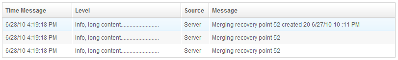
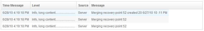
<listbox sizedByContent="true" span="true" width="800px">
    <listhead>
        <listheader label="Time Message" />
        <listheader label="Level" />
        <listheader label="Source" />
        <listheader label="Message" />
    </listhead>
    <listitem>
        <listcell label="6/28/10 4:19:18 PM" />
        <listcell label="Info, long content.........................." />
        <listcell label="Server" />
        <listcell label="Merging recovery point 52 created 20 6/27/10 10 :11 PM" />
    </listitem>
</listbox>
Example Usages
See
listbox-sizedByContent.zul

Rows
The rows attribute is used to control how many rows are visible. By
setting it to zero, the list box will resize itself to hold as many as
items if possible.
Vflex
The vflex property controls whether the listbox will grow or shrink
vertically to fit the given space. It is named vertical flexibility. For
example, if the list is too big to fit in the browser window, its height
will decrease to make the whole list control visible in the browser
window.
This property is ignored if the rows attribute is specified.
Show messages when empty
The emptyMessage attribute is used to show a message when we have no
items.
since 5.0.7
        <listbox id="test1" emptyMessage="No items match your search">

            <listhead sizable="true">
                <listheader label="Type" width="520px" />
                <listheader label="Content" hflex="min" />
                <listheader label="Content" hflex="1" />
            </listhead>
        </listbox>
Maxlength
The maxlength property defines the maximum number of characters
visible at the browser. By setting this attribute, you are able to
create a narrower list box.
Sizable
Like columns, you can set the sizable attribute of the listhead to
true to allow users to resize the width of list headers. The
onColSize event is also sent when a user resizes listbox.
Auto Fitting Columns
When you want to resize a column of a Grid or Listbox, all you now need to do is double click the column when the mouse is over where the columns meet and the column will automatically resize to fit its contents. To enable this functionality Listbox’s Listhead need the attribute sizable=”true”. In other words, all sizable column provides the auto-fitting functionality. since 5.0.0
The onAfterRender Event

<zk>
    <zscript><![CDATA[
        ListModelList lm = new ListModelList(Arrays.asList(new String[] { "David",
                "Thomas", "Steven" }));
    ]]></zscript>

    <listbox width="300px" model="${lm}" onAfterRender="self.setSelectedIndex(2)"/>
</zk>
Sticky Header
since 9.6.0
After adding a sclass “z-sticky-header”, when we scroll down a page and make a Listbox’s header out of visible range in a viewport, the Listbox’s header becomes floating and sticky on the top of the page.
  <listbox sclass="z-sticky-header">
    <!-- listhead, listitem... -->
  </listbox>
InnerWidth
Default Value: "100%"
since 3.0.0
Sets the width of the inner table that holds the list items. Accepts any valid CSS width value (e.g. "200px", "50%"). Passing null resets it to the default "100%". Useful when you want the inner content to be wider than the listbox container so that horizontal scrolling is enabled.
<listbox innerWidth="300px" width="200px">
    <listhead>
        <listheader label="Name"/>
        <listheader label="Description"/>
    </listhead>
</listbox>
Name
Sets the name attribute of the underlying HTML element. This is intended only for integration with legacy web applications that submit forms via the browser’s native HTTP POST. If your application is built on ZK’s event-driven model you should not use this attribute.
<listbox name="colorPicker">
    <listitem label="Red"/>
    <listitem label="Green"/>
    <listitem label="Blue"/>
</listbox>
OddRowSclass
Default Value: "<zclass>-odd" (e.g. "z-listbox-odd")
since 3.5.0
Sets the CSS class applied to every odd-numbered row, producing the striped-row effect. If you pass an empty string or a class name that does not exist in your stylesheet the striping effect disappears. Provide your own class to apply a custom background or text style to alternate rows.
<style>
  .my-alt-row { background: #f0f8ff; }
</style>
<listbox oddRowSclass="my-alt-row">
    <listitem label="Even row"/>
    <listitem label="Odd row — custom background"/>
    <listitem label="Even row"/>
</listbox>
Paginal
Specifies an external paging controller (a component that implements org.zkoss.zul.Paginal, typically a <paging> element) to use instead of the listbox’s built-in paging bar. This is effective only when mold="paging" is set. If null is passed while the paging mold is active, the listbox creates an internal paging child automatically. Use an external paging component when you want to share one paging bar across multiple listboxes or grids, or when you need a custom layout for the page navigator.
<paging id="pg" totalSize="100" pageSize="10"/>
<listbox mold="paging" paginal="${pg}">
    <listhead>
        <listheader label="Name"/>
    </listhead>
</listbox>
SelectedIndex
Default Value: -1 (nothing selected)
Returns or sets the zero-based index of the selected item. Setting -1 clears the current selection. If the index is out of range an UiException is thrown. When a ListModel is used in paging mold the listbox may need to load the target page before the item becomes accessible.
<listbox selectedIndex="1">
    <listitem label="Alpha"/>
    <listitem label="Beta"/>
    <listitem label="Gamma"/>
</listbox>
SelectedItem
Deselects all currently selected items and selects the given Listitem. Equivalent to calling selectItem(item). Returns null when no item is selected. When ROD (render-on-demand) is enabled the returned item might not yet be loaded; call renderItem first if you need to access its children.
<zk>
  <listbox id="lb">
    <listitem id="i1" label="Option A"/>
    <listitem id="i2" label="Option B"/>
  </listbox>
  <button label="Select B" onClick="lb.setSelectedItem(i2)"/>
</zk>
SelectedItems
since 3.6.0
Adds every Listitem in the supplied Set to the current selection. Requires multiple="true"; throws WrongValueException if the listbox is in single-selection mode. Returns a read-only set of all currently selected listitems.
<listbox id="lb" multiple="true">
<listitem id="a" label="Alpha"/>
<listitem id="b" label="Beta"/>
<listitem id="c" label="Gamma"/>
</listbox>
<button label="Select A & C" onClick="lb.setSelectedItems(new java.util.HashSet(java.util.Arrays.asList(a, c)))"/>
Seltype
Default Value: "single"
Sets the selection type. Accepted values:
| Value | Meaning |
|---|---|
single |
Only one item may be selected at a time (default). |
multiple |
More than one item may be selected simultaneously. |
Setting seltype="multiple" is equivalent to setting multiple="true". A WrongValueException is thrown for any other value.
<listbox seltype="multiple">
    <listitem label="Apple"/>
    <listitem label="Banana"/>
    <listitem label="Cherry"/>
</listbox>
Custom Attributes
org.zkoss.zul.listbox.rightSelect
[default: true]
[inherit: true]
It specifies that the selection will be toggled when user right clicks on an item, if the checkmark is enabled (org.zkoss.zul.Listbox#isCheckmark()). If it is turned off, right clicking on an item won’t change its selection state.
org.zkoss.zul.listbox.groupSelect
[default: false]
[inherit: true]
since 5.0.7
It specifies whether Listgroups are selectable under this Listbox. (Similar to above, it can also be specified as a library property, which will be in effect for the whole application.)
org.zkoss.zul.listbox.autoSort
[default: false]
[inherit: true]
since 5.0.7
Specifies whether to sort the model when the following cases:
- org.zkoss.zul.Listbox#setModel(ListModel) is called and org.zkoss.zul.Listheader#setSortDirection(String) is set.
- org.zkoss.zul.Listheader#setSortDirection(String) is called.
- Model receives org.zkoss.zul.event.ListDataEventand org.zkoss.zul.Listheader#setSortDirection(String) is set.
If you want to ignore sort when receiving org.zkoss.zul.event.ListDataEvent, you can specifies the value as ignore.change.
org.zkoss.zul.listbox.rod
[default: false]
[inherit: true]
It specifies whether to enable ROD (render-on-demand). For more information, please refer to ZK Developer’s Reference: Performance Tips.
org.zkoss.zul.listbox.preloadSize
[default: 50]
[inherit: true]
since 6.0.1
It specifies the number of items to preload when receiving the rendering request from the client. It is used only if live data (org.zkoss.zul.Listbox#setModel(ListModel)) and not paging (org.zkoss.zul.Listbox#getPagingChild()).
org.zkoss.zul.listbox.initRodSize
[default: 50]
[inherit: true]
since 6.0.1
Specifies the number of items rendered when the Listbox first render. It is used only if live data (org.zkoss.zul.Listbox#setModel(ListModel)) and not paging (org.zkoss.zul.Listbox#getPagingChild()).
org.zkoss.zul.listbox.autohidePaging
[default: true]
[inherit: true]
since 7.0.1
It specifies whether to enable autohide property for internal paging component.
Supported Events
| Name | Event Type | Description |
|---|---|---|
onSelect |
org.zkoss.zk.ui.event.SelectEvent | Notifies one that the user has selected or deselected an item in the listbox. |
onFocus |
org.zkoss.zk.ui.event.Event | Denotes when a component gets the focus. Remember event listeners execute at the server, so the focus at the client might be changed when the event listener for onFocus got executed. |
onBlur |
org.zkoss.zk.ui.event.Event | Denotes when a component loses the focus. Remember event listeners execute at the server, so the focus at the client might be changed when the event listener for onBlur got executed. |
onPageSize |
org.zkoss.zul.event.PageSizeEvent | Notifies the paging size has been changed when the autopaging (org.zkoss.zul.Listbox#setAutopaging(boolean)) is enabled and user changed the size of the content. |
onCheckSelectAll |
org.zkoss.zk.ui.event.CheckEvent | (Since 6.5.6) Notifies the checkbox on a listheader is checked to select all checkable items. |
onRender |
org.zkoss.zk.ui.event.Event | An AU request sent by the client to ask the server to render list items that are currently in the visible viewport (used internally for ROD; no associated event data). |
onInnerWidth |
org.zkoss.zk.ui.event.Event | Fired when the user resizes the inner width of the listbox (e.g. by dragging a column border). Used internally to keep server and client state in sync. |
onScrollPos |
org.zkoss.zk.ui.event.Event | Fired when the listbox scroll position changes. Used internally to synchronize the scroll position between client and server; duplicate events are suppressed. |
onTopPad |
org.zkoss.zk.ui.event.Event | Fired when the top padding of the listbox changes during ROD (render-on-demand) scrolling. Used internally to maintain the virtual-scroll illusion for large datasets. |
onDataLoading |
org.zkoss.zk.ui.event.Event | Fired when the listbox is about to load data from the ListModel (e.g. during ROD lazy-load or paging). You can listen to this event to show a loading indicator. |
onAcrossPage |
org.zkoss.zk.ui.event.Event | Fired when a selection crosses a page boundary in paging mold (e.g. shift-selecting across pages). Used internally to synchronize multi-page selections. |
onAnchorPos |
org.zkoss.zk.ui.event.Event | Fired when the anchor position of the listbox is updated on the client, used internally to keep the server-side scroll anchor in sync during ROD. |
- Inherited Supported Events: XulElement
Supported Molds
Available molds of a component are defined in lang.xml embedded in zul.jar.
| Name | Snapshot |
|---|---|
| default |  |
| select |  |
| paging |  |