Span
- Demonstration: N/A
- Java API: org.zkoss.zul.Span
- JavaScript API: zul.wgt.Span
Employment/Purpose
The Span component in ZK is a lightweight container used for grouping child components. It is typically utilized for purposes such as assigning CSS styles or creating more complex layouts within ZK applications. Conceptually, the Span component functions similarly to HTML’s SPAN tag. Notably, content placed within a Span is displayed inline with other sibling elements, without introducing line breaks between them.
Common Use Cases
-
Inline styling of a group of components — Wrap related components in a
<span>and set astyleorsclassattribute to apply visual formatting (e.g. color, font weight) to the entire group without introducing a block-level line break.<span style="color:red; font-weight:bold;"> <label value="Error:" /> <label value="Invalid input" /> </span> -
Inline label-plus-input pairing — Place a descriptive label and its associated input field inside a
<span>so they flow side-by-side within a form row without extra<div>or<hbox>overhead.<span> Name: <textbox /> </span> -
Conditional visibility toggling — Apply
visible="false"to a<span>to hide or show a group of inline components together in response to user actions or ViewModel state.<span visible="${vm.showDetails}"> <label value="${vm.detail}" /> <button label="Edit" onClick="@command('edit')" /> </span>
Example
The example illustrates the usage of the Span component in a ZK application. Within the Span container, a label “Name:” is followed by a textbox input field.
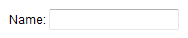
<span>
    Name: <textbox />
</span>
Try it
Supported Children
*ALL: The Span component is a container component that can hold various kinds of components. It allows you to add any kind of component as its child.