Combobutton
- Demonstration:
- Java API: org.zkoss.zul.Combobutton
- JavaScript API: zul.wgt.Combobutton
Employment/Purpose
A Combobutton is a special Button that embeds a popup or menupopup child.
You could assign a label and an image to a Combobutton by the
label and image properties. If both are specified, the dir
property control which is displayed up front, and the orient property
controls whether the layout is horizontal or vertical, the autodrop
property control whether the child popup/menupopup open while mouseover
and close while mouseout the right side drop down icon of Combobutton
automatically.
When the user clicks the drop down icon of Combobutton, the child popup/menupopup of the Combobutton will be displayed.
Common Use Cases
- Toolbar action menu — place a
<combobutton>withmold="toolbar"inside a<toolbar>to give a toolbar button a drop-down menu of related actions without taking extra horizontal space. - Split button pattern — use the left-click area for the primary action (via
onClick) and the drop-down arrow to expose secondary actions in a<menupopup>, so the most common operation is always one click away. - Contextual popup — embed a
<popup>child containing arbitrary content (search boxes, list boxes, color pickers) to create a rich in-place panel triggered from a single button.
Example
- Combobutton with Popup
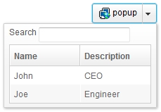
    <combobutton label="popup" image="/img/network.gif">
        <popup>
            <vbox>
                <hbox>
                    Search
                    <textbox />
                </hbox>
                <listbox width="200px">
                    <listhead>
                        <listheader label="Name" />
                        <listheader label="Description" />
                    </listhead>
                    <listitem>
                        <listcell label="John" />
                        <listcell label="CEO" />
                    </listitem>
                    <listitem>
                        <listcell label="Joe" />
                        <listcell label="Engineer" />
                    </listitem>
                </listbox>
            </vbox>
        </popup>
    </combobutton>
- Combobutton with Menupopup
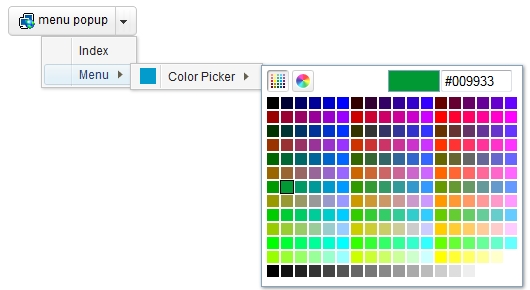
    <combobutton label="menu popup" image="/img/network.gif">
        <menupopup>
            <menuitem label="Index"/>
            <menu label="Menu">
                <menupopup>
                    <menu label="Color Picker" content="#color=#029BCB" />
                </menupopup>
            </menu>
        </menupopup>
    </combobutton>
- Combobutton as Toolbarbutton
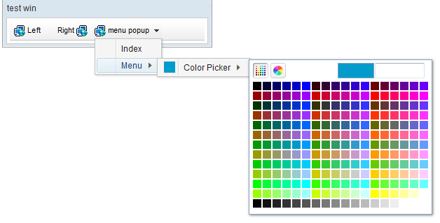
<zk>
    <window border="normal" title="test win"
        width="300px">
        <toolbar>
            <toolbarbutton label="Left" image="/img/network.gif" />
            <space />
            <toolbarbutton label="Right" image="/img/network.gif"
                dir="reverse" />
            <combobutton label="menu popup" image="/img/network.gif"
                mold="tbbtn">
                <menupopup>
                    <menuitem label="Index"/>
                    <menu label="Menu">
                        <menupopup>
                            <menu label="Color Picker" content="#color=#029BCB" />
                        </menupopup>
                    </menu>
                </menupopup>
            </combobutton>
        </toolbar>
    </window>
</zk>
Properties
Autodrop
Default Value: false
org.zkoss.zul.Combobutton#setAutodrop(boolean) is used to set whether the child popup should drop down automatically while mouseover the right drop down icon of Combobutton.
<combobutton label="popup" autodrop="true" />
Open
Default Value: false
since 6.0.0
Sets whether the child popup or menupopup is dropped down (true) or closed (false). The change only takes effect while the Combobutton is visible; calling open="true" on a hidden button has no effect.
<combobutton label="Actions" open="true">
    <popup>
        <menuitem label="Edit" />
        <menuitem label="Delete" />
    </popup>
</combobutton>
Moreover, it support other properties inherited from Button in stead of upload.
Supported Events
| Name | Event Type | Description |
|---|---|---|
onClick |
org.zkoss.zk.ui.event.MouseEvent | Denotes when left button of Combobutton is clicked. |
onOpen |
org.zkoss.zk.ui.event.OpenEvent | Denotes when the child popup is opened or closed. |
- Inherited Supported Events: Button
Supported Molds
default
The default appearance for a standalone combobutton.
toolbar
since 6.5.0
The toolbar mold renders the combobutton for use within a toolbar context. (The tbbtn mold name was renamed to toolbar in ZK 6.5.0.)