Listgroup
- Java API: org.zkoss.zul.Listgroup
- JavaScript API: zkex.sel.Listgroup
Employment/Purpose
Adds the ability for single level grouping to the Listbox.
Common Use Cases
- Categorised data lists — group related rows (e.g. contacts by department, products by category) inside a
<listbox>so users can collapse sections they are not currently interested in. - Load-on-demand grouping — listen to the
onOpenevent and create child<listitem>elements only when the group is first expanded, reducing initial page load time for large datasets. - Pre-collapsed summary view — set
open="false"on several groups at page load to present a compact summary; users drill into the groups they care about.
Example
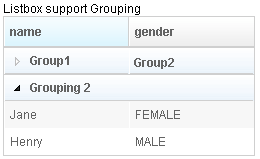
 <?xml version="1.0" encoding="UTF-8"?>
 <zk>
     Listbox support Grouping
     <listbox id="listbox" width="250px">
         <listhead sizable="true" id="h">
             <listheader id="h1" label="name" sort="auto" />
             <listheader id="h2" label="gender" sort="auto" />
         </listhead>
         <listgroup id="gp1" open="false">
             <listcell label="Group1"/>
             <listcell label="Group2"/>
         </listgroup>
         <listitem>
             <listcell label="a Mary" />
             <listcell label="a FEMALE" />
         </listitem>
         <listitem>
             <listcell label="b Mary" />
             <listcell label="b FEMALE" />
         </listitem>
         <listitem id="li1">
             <listcell label="c Mary1" />
             <listcell label="c FEMALE1" />
         </listitem>
         <listitem>
             <listcell label="d Mary" />
             <listcell label="d FEMALE" />
         </listitem>
         <listitem>
             <listcell label="e John" />
             <listcell label="e MALE" />
         </listitem>
         <listgroup id="g2" label="Grouping 2" />
         <listitem>
             <listcell label="Jane" />
             <listcell label="FEMALE" />
         </listitem>
         <listitem>
             <listcell label="Henry" />
             <listcell label="MALE" />
         </listitem>

     </listbox>
 </zk>
Properties
Open
Default Value: true
Controls whether the group is expanded (true) or collapsed (false). When set to false, all <listitem> children of this group are hidden. Users can toggle the group by clicking the group row; this property lets you set the initial or programmatic state.
<listbox>
    <listgroup label="Group 1" open="false">
        <!-- listitems are collapsed by default -->
    </listgroup>
    <listitem>
        <listcell label="Item A" />
    </listitem>
</listbox>
Supported Events
| Name | Event Type | Description |
|---|---|---|
onOpen |
org.zkoss.zk.ui.event.OpenEvent | Denotes user has opened or closed a component. Note: unlike onClose, this event is only a notification. The client sends this event after opening or closing the component. It is useful to implement load-on-demand by listening to the onOpen event, and creating components when the first time the component is opened. |
- Inherited Supported Events: Listitem
Supported Molds
default
The standard group header row with an open/close toggle arrow. Items beneath the group are indented and shown or hidden based on the open state.
select
Rendered as part of a <listbox mold="select"> (a native HTML <select>-style listbox). In this mold the group header acts as an <optgroup> label, visually separating the options that follow it. The open/close toggle is not available in this mold.
Supported Children
* Listcell