Menupopup
- Demonstration: Menu
- Java API: org.zkoss.zul.Menupopup
- JavaScript API: zul.menu.Menupopup
Employment/Purpose
A container is used to display menus. It should be placed inside a Menu.
Note: to have better performance, onOpen is sent only if non-deferrable event listener is registered (see Deferrable).
To load the content dynamically, you can listen to the onOpen event, and then create menuitem when OpenEvent.isOpen() is true.
Default HtmlBasedComponent.getSclass(): menupopup.
Common Use Cases
Context Menu
Attach a menupopup as a right-click context menu to any component using its context attribute.
<listbox context="ctxMenu">
    <listitem label="Row 1"/>
    <listitem label="Row 2"/>
</listbox>
<menupopup id="ctxMenu">
    <menuitem label="Edit"/>
    <menuitem label="Delete"/>
</menupopup>
Standalone Popup Menu
Open a menupopup programmatically from a button using the popup attribute or by calling open() in an event handler.
<button label="Options" popup="optMenu, position=after_start"/>
<menupopup id="optMenu">
    <menuitem label="Settings"/>
    <menuitem label="Help"/>
</menupopup>
Toggle Visibility
Use type=toggle in the popup attribute so that clicking the target component alternately shows and hides the menupopup.
since 7.0.1
<button label="Toggle Menu" popup="toggleMenu, type=toggle"/>
<menupopup id="toggleMenu">
    <menuitem label="Option A"/>
    <menuitem label="Option B"/>
</menupopup>
Lazy-Loading Menu Items
Listen to the inherited onOpen event (from Popup) to create menu items on demand, improving performance for large or dynamic menus. Use OpenEvent.isOpen() to act only when the popup is opening.
<menu label="Dynamic">
    <menupopup onOpen="if (event.open) loadItems(self)"/>
</menu>
Example
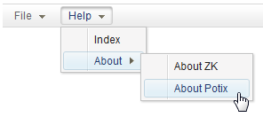
<menubar id="menubar">
    <menu label="File">
        <menupopup onOpen="alert(self.id)">
            <menuitem label="New" onClick="alert(self.label)" />
            <menuitem label="Open" onClick="alert(self.label)" />
            <menuitem label="Save" onClick="alert(self.label)" />
            <menuseparator />
            <menuitem label="Exit" onClick="alert(self.label)" />
        </menupopup>
    </menu>
    <menu label="Help">
        <menupopup>
            <menuitem label="Index" onClick="alert(self.label)" />
            <menu label="About">
                <menupopup>
                    <menuitem label="About ZK" onClick="alert(self.label)" />
                    <menuitem label="About Potix" onClick="alert(self.label)" />
                </menupopup>
            </menu>
        </menupopup>
    </menu>
</menubar>
Toggle Menupopup
since 7.0.1
If you assign a menupopup to a target component and add type=toggle to
its popup or context attribute, it will toggle the visibility of
menupopup by click. That means if you click the target component, it
will cause the menupopup to show up, click on the target component again
will hide the menupopup.
<button label="left click" popup="mp, type=toggle"/>
<menupopup id="mp">
    <menuitem label="menupopup"/>
</menupopup>
Highlight Position
since 8.6.0
We can highlight position in a menupopup by using setActive(int)
method. Notice that we can only highlight menuitem or menu that is
neither disabled nor invisible.
The setActive will not cause a menupopup to be opened. An explicit
open is needed if the menupopup is not showed.
<button label="Highlight Index" onClick="mnuHelp.open(); mnuHelp.getMenupopup().setActive(0);" />
<menubar>
    <menu label="Help" id="mnuHelp">
        <menupopup>
            <menuitem label="Index" onClick="alert(self.label)" />
            <menu label="About">
                <menupopup>
                    <menuitem label="About ZK" onClick="alert(self.label)" />
                    <menuitem label="About Potix" onClick="alert(self.label)" />
                </menupopup>
            </menu>
        </menupopup>
    </menu>
</menubar>
Supported Events
| Name | Event Type | Description |
|---|---|---|
| Inherited Supported Events | - | See Popup |
Supported Children
* Menu , Menuitem , Menuseparator