Stepbar
- Demonstration: Stepbar
- Java API: org.zkoss.zkmax.zul.Stepbar
- JavaScript API: zkmax.wgt.Stepbar
since 9.0.0
Employment/Purpose
Stepbar is a navigation component suitable for displaying the progress of a multi-step task.
Common Use Cases
Wizard / multi-step form — place a <stepbar> above a sequence of panels and bind activeIndex to the current step so the progress indicator stays in sync with the visible panel:
<zk>
    <stepbar id="bar" activeIndex="0" width="700px">
        <step title="Personal Info" />
        <step title="Account Setup" />
        <step title="Confirmation" />
    </stepbar>
    <button label="Next" onClick="bar.activeIndex = bar.activeIndex + 1" />
</zk>
Vertical checkout flow — use orient="vertical" when horizontal space is limited:
<stepbar orient="vertical" activeIndex="1" width="200px">
    <step title="Cart" />
    <step title="Shipping" />
    <step title="Payment" />
    <step title="Review" />
</stepbar>
Model-driven steps — populate steps from a StepModel when the step list is dynamic:
<zscript>
    import org.zkoss.zkmax.zul.DefaultStepModel;
    import org.zkoss.zul.ListModelList;
    ListModelList items = new ListModelList(java.util.Arrays.asList("Order", "Ship", "Deliver"));
    DefaultStepModel model = new DefaultStepModel(items);
</zscript>
<stepbar model="${model}" width="600px" />
Example

<zk>
    <stepbar activeIndex="1" width="600px">
        <step title="First Step" />
        <step title="Second Step" />
        <step title="Third Step"/>
    </stepbar>
</zk>
Supported Browsers
It is compatible with browsers that fully support CSS flexbox, like IE 11, Edge, Firefox, Opera, Chrome, and Safari.
IE10 is not supported as it only partially supports flexbox. Check flexbox browser support.
Accessibility
since 9.5.0
Keyboard Support
(Only available if linear is false)
| Key | Description |
|---|---|
| ArrowLeft / ArrowUp | Focus on the previous step. |
| ArrowRight/ ArrowDown | Focus on the next step. |
| Enter / Spacebar | Select the step. |
Labeling with ARIA
To name a component with ARIA attribute by adding the aria-label
client attribute to the component, please refer to
ZK Developer’s Reference/Accessibility#Specify_ARIA_Attributes
Properties
ActiveIndex
The index of the active step. (Default: 0)
ActiveStep
The active step object. (Default: first step)
Linear
Set whether the steps in this stepbar are displayed in order.
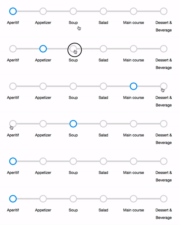
Non-linear means users can toggle the active steps easily by clicking on any step even if the step is not the next one in the sequence. In linear mode, they can only activate in order.
Orient
Default Value: horizontal
Sets the orientation of the stepbar. Accepted values:
| Value | Meaning |
|---|---|
horizontal |
Steps flow left-to-right (default) |
vertical |
Steps stack top-to-bottom |
since 10.2.0
<stepbar orient="vertical" width="200px">
    <step title="First Step" />
    <step title="Second Step" />
    <step title="Third Step" />
</stepbar>
Model
The step model associated with this stepbar. (Learn Model-Driven Rendering)
You can use org.zkoss.zkmax.zul.DefaultStepModel, wrap an existing org.zkoss.zul.ListModelList by DefaultStepModel’s constructor, or implement StepModel.
StepRenderer
The renderer used to render each step.(Learn Model-Driven Rendering)
You can specify your own org.zkoss.zkmax.zul.StepRenderer at this attribute to renders a Step object with your data.
WrappedLabels
Set whether the labels in children steps are wrapped. (Default: false)
true: 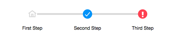
false: 
Supported Events
| Name | Event Type | Description |
|---|---|---|
onChange |
org.zkoss.zk.ui.event.Event | Represents an event caused by a user’s selection changed at the client. |
- Inherited Supported Events: XulElement
Supported Children
*Step