Rangeslider
- Demonstration: Rangeslider
- Java API: org.zkoss.zkex.zul.Rangeslider
- JavaScript API: zkex.slider.Rangeslider
since 9.0.0
Employment/Purpose
A rangeslider component represents a slider with a start and an end value. A rangeslider accepts a range of value starting from 0 to a certain maximum value. The default maximum value of rangeslider is 100. You can change the maximum allowed value by setting the max property. Notice that the value of max property is always larger than the value of min property.
Common Use Cases
Price or Date Range Filter
Use a rangeslider when users need to set both a lower and upper bound simultaneously — for example, filtering a product listing by price band or narrowing search results to a date range. The component’s dual-thumb design makes the intent clear without requiring two separate inputs.
<rangeslider min="0" max="500" startValue="50" endValue="300"
             onRangeValueChange="updateFilter(event.startValue, event.endValue)"/>
Configuring a Numeric Window or Tolerance
When the domain requires a symmetric or asymmetric tolerance window (e.g. audio equaliser bands, temperature thresholds, data-quality score ranges), a rangeslider lets the user drag both ends of the window in one control.
<rangeslider min="-20" max="20" startValue="-5" endValue="5" step="1"
             markScale="5" tooltipVisible="true"/>
Vertical Layout for Timelines or Axes
Set orient="vertical" to embed the rangeslider alongside a chart axis or timeline, letting users zoom in to a sub-range while the axis orientation stays consistent with the chart.
<rangeslider orient="vertical" min="0" max="24" startValue="8" endValue="18"
             markScale="4"/>
Example
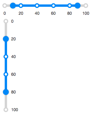
  <rangeslider startValue="10" endValue="90"/>

  <rangeslider orient="vertical" startValue="20" endValue="80" markScale="20" />
Accessibility
since 9.5.0
Keyboard Support
| Key | Description |
|---|---|
| ArrowUp / ArrowDown | Move the slider button. |
| ArrowLeft / ArrowRight | Move the slider button. |
| Home / End | Move the slider button to the minimum/maximum. |
| PageUp / PageDown | Move the slider button in the large step. |
ARIA Attributes
| Attributes | Description |
|---|---|
| data-ariaStartLabel | Describe the the slider button (start). |
| data-ariaEndLabel | Describe the the slider button (end). |
| data-largeStep-multiplier (optional) | Describe the moving step of pressing PageUp/PageDown. |
ARIA Example
<zk xmlns:ca="client/attribute">
  <rangeslider ca:aria-label="range value" ca:data-ariaStartLabel="minimal range value"
      ca:data-ariaEndLabel="maximal range value"/>
</zk>
Labeling with ARIA
To name a component with ARIA attribute by adding the aria-label
client attribute to the component, please refer to
ZK Developer’s Reference/Accessibility#Specify_ARIA_Attributes
Properties
Orient
Default: horizontal
Sets it either “horizontal” or “vertical” to display rangslider.
Marks
Default: null
Sets the marks information map for displaying value marks. In this map, the key represents the number value of slider, and the value represents the displayed scale text.
The attribute accepts only a Map<Integer, String>, so assign it with an
EL expression or data binding. A literal string such as
marks="10:10%, 20:20%" is not converted and causes a
ClassCastException.
<rangeslider marks="@init(vm.marks)" startValue="20" endValue="80"/>
// in the ViewModel
public Map<Integer, String> getMarks() {
    Map<Integer, String> marks = new LinkedHashMap<>();
    marks.put(10, "10%");
    marks.put(50, "50%");
    marks.put(90, "90%");
    return marks;
}
marks and a positive markScale cannot be used at the same time.
MarkScale
Default: 20
Sets the marks information for displaying value marks.
By default, the value marks will be displayed every 20 starting from the minimum value. (if min is 0, then it displays “0 20 40 …”)
Setting markScale="0" does not hide the marks: a value of 0 is not sent
to the browser, so the marks are still displayed every 20.
<rangeslider markScale="25"/> <!-- displays 0 25 50 75 100 -->
Max
Default: 100
Rangeslider supports maximal position, which can be changed by the max property.
Min
Default: 0
Rangeslider supports minimal position, which can be changed by the min property.
StartValue
Default Value: 0
Represents the starting value of the rangeslider range.
<rangeslider startValue="10" endValue="90"/>
EndValue
Default Value: 0
Represents the ending value of the rangeslider range.
<rangeslider startValue="10" endValue="90"/>
Step
Default: 1
By default, the rangeslider will scroll to the position continuously when a user drags it. If you prefer to scroll a discrete fixed amount at each step, you can set the amount of value using the step property.
TooltipVisible
Default: false
The tooltip displays the value of a slider button in the rangeslider. If the tooltipvisible is true, the tooltips of the slider buttons will always be visible.
Supported Events
| Name | Event Type | Description |
|---|---|---|
| onRangeValueChange | RangeValueChangeEvent | Denotes the range value of a component has been changed by the user. |
- Inherited Supported Events: XulElement
Supported Children
*None