Bandbox
- Demonstration: Bandbox
- Java API: org.zkoss.zul.Bandbox
- JavaScript API: zul.inp.Bandbox
Employment/Purpose
A bandbox is a special text box that embeds a customizable popup window (aka., a dropdown window). Like comboboxes, a bandbox consists of an input box and a popup window. The popup window is opened automatically, when a user presses Alt+DOWN or clicks the magnifier button.
Unlike comboboxes, the popup window of a bandbox could be anything. It is designed to give developers the maximal flexibility. A typical use is to represent the popup window as a search dialog.
Common Use Cases
- Search dialog — embed a
<listbox>or<grid>inside<bandpopup>so users can search and pick a value without navigating away from the form. - Date/time range picker — place two
<datebox>components in the popup to let users choose a start and end date; copy the selected range back to the bandbox value on confirm. - Cascading selection — combine multiple
<combobox>or<listbox>elements in the popup to guide users through a multi-step selection (e.g. country → region → city). - Lazy-loaded lookup — use the
onOpenevent withfulfillto defer rendering the popup content until the user first opens it, keeping initial page load fast.
Example
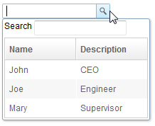
    <bandbox>
        <bandpopup>
            <listbox style="max-width:300px"
                     onSelect="bd.value=self.selectedItem.label;bd.close();">
                <listhead>
                    <listheader label="Name"/>
                    <listheader label="Description"/>
                </listhead>
                <listitem>
                    <listcell label="John"/>
                    <listcell label="CEO"/>
                </listitem>
                <listitem>
                    <listcell label="Joe"/>
                    <listcell label="Engineer"/>
                </listitem>
                <listitem>
                    <listcell label="Mary"/>
                    <listcell label="Supervisor"/>
                </listitem>
            </listbox>
        </bandpopup>
    </bandbox>
Accessibility
since 9.5.0
Keyboard Support
| Key | Description |
|---|---|
| Alt + ArrowDown | Open the popup. |
| Alt + ArrowUp / Escape | Close the popup. |
| Tab | If the input is focused and the popup is opened, move focus to the popup. |
Labeling with ARIA
To name a component with ARIA attribute by adding the aria-label
client attribute to the component, please refer to
ZK Developer’s Reference/Accessibility#Specify_ARIA_Attributes
Properties
The Close Method
A popup window could contain any components, so it is the developer’s job to close the popup and copy any needed value from it.
<listbox width="200px"
   onSelect="bd.value=self.selectedItem.label; bd.close();">
In the above example, we copy the selected item’s label to the bandbox, and then close the popup.
Autodrop

By default, the popup window won’t be opened until user clicks the
button, or presses Alt+DOWN on the keyboard. However, you can set the
autodrop property to true and as soon as the user types a character
the popup will be opened. This is helpful for novice users, but it might
be annoying for experienced users.
<zk>
    <bandbox id="bd" autodrop="true">
        <bandpopup>
            ...
        </bandpopup>
    </bandbox>
</zk>
ButtonVisible
Default Value: true
Controls whether the magnifier button on the right side of the input box is visible. Set to false to hide the button and rely solely on autodrop or programmatic open/close.
<bandbox buttonVisible="false">
    <bandpopup>
        ...
    </bandpopup>
</bandbox>
The onOpen Event
If the user opens the popup window the onOpen event is sent to the
application. By using the fulfill attribute with the onOpen value as
shown below, you can defer the creation of the popup window.
<bandbox id="test">
    <bandpopup fulfill="test.onOpen">
     ...
    </bandpopup>
</bandbox>
Alternatively, you can prepare the popup window in Java by listening to
the onOpen event, as depicted below.
<zk>
    <bandbox id="band" onOpen="prepare()"/>

    <zscript>
         void prepare()
         {
             if (band.getPopup() == null) {
                 //create child elements
             }
         }
    </zscript>
</zk>
The onChanging Event
Since a bandbox is also a text box, you are also able to listen to an
onChanging event. By listening to this event, you can manipulate the
popup window in any fashion. The code below illustrates capturing the
user key and displaying information accordingly.
<zk>
    <bandbox id="band" autodrop="true" onChanging="suggest()"/>
    <zscript>
         void suggest()
         {
             if (event.value.startsWith("A")) {
                 //do something
             } else if (event.value.startsWith("B")) {
                 //do another
             }
         }
    </zscript>
</zk>
Notice that, when the onChanging event is received, the content of the
bandbox has not changed. Therefore, you cannot get the value property
of the bandbox. Instead, you should call
org.zkoss.zk.ui.event.InputEvent.getValue().
Constraint
You could specify what value to accept for input controls by the use of
the constraintproperty. It could be a combination of no empty,
and/or a regular expression.
To specify two or more constraints, use comma to separate them as follows.
<bandbox constraint="no empty,/^A/"/>
To specify a regular expression, you may have to use the character /
to enclose the regular expression as follows.
<bandbox constraint="/^A/"/>
Notes:
- The above statement is XML, so do not use
\\to specify a backslash. However typing\\is necessary, if writing in Java.
new Bandbox().setConstraint("/.+@.+\\.[a-z]+/");
- You are allowed to mix regular expressions with other constraints by separating them with a comma.
If you prefer to display different message to the default one, you can append the error message to the constraint with a colon.
<bandbox constraint="/^A/: only allowed the item start with A"/>
Notes:
- The error message, if specified, must be the last element and start with colon.
- To support multiple languages, you could use the 「l」 function as depicted in the Internationalization chapter.
<bandbox constraint="/^A/: ${c:l(‘err.startwith.required’)}"/>
IconSclass
since 8.6.2 Specify the sclass name of the Bandbox button icon. For built-in icon, please see LabeliImageElement.
Open
Default Value: false
since 6.0.0
Sets or returns whether the bandpopup is currently shown. Setting open="true" in ZUL will display the popup as soon as the component renders (only takes effect when the component is visible). Use the open() and close() Java methods for imperative control from a composer or event handler.
<bandbox open="true">
    <bandpopup>
        ...
    </bandpopup>
</bandbox>
PopupWidth
since 8.0.3
Sets the width of the bandpopup dropdown. Accepts any valid CSS length value (e.g. "300px") or a percentage (e.g. "130%"). When a percentage is given, the popup width is calculated relative to the width of the bandbox itself — for example, "130%" on a 300px-wide bandbox produces a 390px popup.
<bandbox popupWidth="300px">
    <bandpopup>
        ...
    </bandpopup>
</bandbox>
Supported Events
| Name | Event Type | Description |
|---|---|---|
onOpen |
org.zkoss.zk.ui.event.OpenEvent | Denotes user has opened or closed a component. Note: unlike onClose, this event is only a notification. The client sends this event after opening or closing the component. |
- Inherited Supported Events: Textbox
Supported Molds
Available molds of a component are defined in lang.xml embedded in zul.jar.
| Name | Snapshot |
|—|—|
| default |  |
| rounded |
|
| rounded |  since 5.0.0
|
since 5.0.0
|
Supported Children
Inherited Functions
Please refer to Textbox for inherited functions.