Radiogroup
- Demonstration: Radiogroup
- Java API: org.zkoss.zul.Radiogroup
- JavaScript API: zul.wgt.Radiogroup
Employment/Purpose
Used to group multiple radio buttons. In one radiogroup, only one radio button may be selected at a time.
Common Use Cases
- Mutually exclusive options in a form — use
radiogroupwhenever the user must pick exactly one value from a fixed set (e.g., gender, priority, shipping method). - Vertical survey questions — set
orient="vertical"for a top-to-bottom list of choices that is easier to scan than a horizontal row. - Data-driven options — bind a
ListModelvia themodelattribute to render radio buttons dynamically from a backend list without hardcoding<radio>elements. - Cross-grid radio groups — when radio buttons must live inside different grid rows or other containers, link them to a shared
<radiogroup>using theradiogroupattribute on each<radio>(requires ZK 5.0.4+). - Custom radio rendering — implement
RadioRendererand assign it viaradioRendererto control label text, icons, or additional markup rendered for each model item.
Example
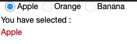
<window title="Radiobox & Radio Demo" width="200px" border="normal">
<vbox>
<radiogroup onCheck="fruit.value = self.selectedItem.label">
<radio label="Apple" />
<radio label="Orange" />
<radio label="Banana" />
</radiogroup>
You have selected :
<label id="fruit" style="color:red" />
</vbox>
</window>
Note: To support the versatile layout, a radio group accepts any kind of children , including Radio. On the other hand, the parent of a radio, if any, must be a radio group.
Radiogroup as an Ancestor of Radio
When used without a model, the radiogroup can contain arbitrary components in addition to Radio.
ZK groups radio components into the same radio group if they share the same ancestor, not just direct parent. It allows a more sophisticated layout. For example,
<radiogroup>
  <vlayout>
    <hlayout>
      <radio label="radio 1"/>
      <radio label="radio 2"/>
      <radio label="radio 3"/>
    </hlayout>
    <hlayout>
      <radio label="radio 4"/>
      <radio label="radio 5"/>
      <radio label="radio 6"/>
    </hlayout>
  </vlayout>
</radiogroup>
A Row of a Grid as a Radio Group
since 5.0.4
Sometimes it is not possible to make the radiogroup component as an ancestor of all radio components. For example, each row of a grid might be an independent group. To solve this, you have to assign the radiogroup component to the radio component explicitly by the use of org.zkoss.zul.Radio#setRadiogroup(java.lang.String) or org.zkoss.zul.Radio#setRadiogroup(org.zkoss.zul.Radiogroup).

<zk>
  <radiogroup id="popular"/>
  <radiogroup id="fun"/>
  <grid>
    <columns>
      <column label="Question"/>
      <column label="Option 1"/>
      <column label="Option 2"/>
      <column label="Option 3"/>
      <column label="Comment"/>
    </columns>
    <rows>
      <row>
        Most popular
        <radio label="Java" radiogroup="popular"/>
        <radio label="Groovy" radiogroup="popular"/>
        <radio label="C#" radiogroup="popular"/>
        <textbox/>
      </row>
      <row>
        Most fun
        <radio label="Open Source" radiogroup="fun"/>
        <radio label="Social Networking" radiogroup="fun"/>
        <radio label="Searching" radiogroup="fun"/>
        <textbox/>
      </row>
    </rows>
  </grid>
</zk>
Live Data
since 6.0.0
Like a listbox, radiogroup supports ListModel, so that developers are able to separate the data from the view. In other words, developers only need to provide the data by implementing the org.zkoss.zul.ListModel interface, rather than manipulating the radiogroup directly. The benefits are twofold.
- It is easier to show the same set of data in different views.
- The grid sends the data to the client only if it is visible. It saves a lot of network traffic if the amount of data is large.
There are three steps to make use of live data.
1. Store your data object in a org.zkoss.zul.ListModel
ZK provides several implementation implementations of ListModel, just
choose one upon your needs.
2. Set the ListModel at the model attribute.
3. (Optional) Implement the
org.zkoss.zul.RadioRenderer
interface to render each radio and specify it in the radioRenderer
attribute
* This is optional. If it is not specified, ZK will render it with the default renderer.
* You can implement different renderers for representing the same data in different views.
In the following example, we prepared a ListModel called strset,
assign it to a radigroup using the model attribute. Then, the
radigroup will do the rest.

    <zscript><![CDATA[
        String[] data = new String[5];
        for(int j=0; j < data.length; ++j) {
            data[j] = "option "+j;
        }
        ListModel strset = new SimpleListModel(data);
        ]]></zscript>
  <radiogroup  model="${strset}" />
Properties
Name
Default Value: automatically generated unique name
Sets the shared HTML name attribute for all radio buttons in this group. All child <radio> components inherit this name. ZK generates a unique name automatically, so you typically do not need to set this manually unless your application relies on form submission via HTTP (outside ZK’s event model).
<radiogroup name="favoriteFruit">
    <radio label="Apple" />
    <radio label="Orange" />
    <radio label="Banana" />
</radiogroup>
Orient
Default Value: horizontal
Controls the layout direction of the radio buttons in this group. Accepted values:
| Value | Meaning |
|---|---|
horizontal |
Radio buttons are arranged in a row (default) |
vertical |
Radio buttons are stacked in a column |
<radiogroup orient="vertical">
    <radio label="Apple" />
    <radio label="Orange" />
    <radio label="Banana" />
</radiogroup>
SelectedIndex
Default Value: -1 (no selection)
Returns or sets the zero-based index of the currently selected radio button. Setting this to -1 clears the selection. Note that external radio buttons (those linked via radiogroup attribute rather than being descendants) are counted after descendant radio buttons.
<radiogroup selectedIndex="1">
    <radio label="Apple" />
    <radio label="Orange" />
    <radio label="Banana" />
</radiogroup>
SelectedItem
Default Value: null (no selection)
Returns or sets the currently selected Radio component. Setting it to null clears the selection. The provided radio must already belong to this radiogroup; otherwise an exception is thrown. This property is typically set programmatically from a composer or ViewModel rather than as a ZUL attribute.
In static ZUL, pre-select declaratively with selected="true" on the desired <radio>:
<radiogroup>
    <radio label="Apple" selected="true" />
    <radio label="Orange" />
    <radio label="Banana" />
</radiogroup>
Model
since 6.0.0
Associates a ListModel with this radiogroup to enable data-driven rendering. When a model is set, the radiogroup renders one Radio child per model item automatically. The model must also implement Selectable. This is an object-typed property — construct the model in <zscript>, a composer, or a ViewModel and reference it via EL.
<zscript><![CDATA[
    String[] data = new String[] { "Apple", "Orange", "Banana" };
    ListModel strset = new org.zkoss.zul.SimpleListModel(data);
]]></zscript>
<radiogroup model="${strset}" />
RadioRenderer
since 6.0.0
Sets a custom RadioRenderer that controls how each Radio is rendered when a model is assigned. If not specified, the default renderer converts each model item to a string label. Changing the renderer after the model has been rendered does not automatically re-render; reassign the model to trigger a refresh. This is an object-typed property — supply an instance via <zscript>, a composer, or a ViewModel and reference it via EL.
<zscript><![CDATA[
    import org.zkoss.zul.RadioRenderer;
    import org.zkoss.zul.Radio;
    RadioRenderer myRenderer = new RadioRenderer() {
        public void render(Radio item, Object data, int index) {
            item.setLabel("Option: " + data.toString().toUpperCase());
        }
    };
    String[] data = new String[] { "apple", "orange", "banana" };
    ListModel strset = new org.zkoss.zul.SimpleListModel(data);
]]></zscript>
<radiogroup model="${strset}" radioRenderer="${myRenderer}" />
Supported Events
| Name | Event Type | Description |
|---|---|---|
onCheck |
org.zkoss.zk.ui.event.CheckEvent | Denotes when a radio under the radiogroup is checked. |
- Inherited Supported Events: XulElement
Supported Children
*ALL