Toolbar
- Demonstration: Toolbar
- Java API: org.zkoss.zul.Toolbar
- JavaScript API: zul.wgt.Toolbar
Employment/Purpose
A toolbar organizes a series of command buttons or controls in a compact, space-efficient layout. Common uses include file operations (Save, Open, Export), text formatting (Bold, Italic, Underline), or application controls. Toolbars can be oriented horizontally (default) or vertically, and adapt to narrow spaces using the overflow popup feature.
See also: Button, Toolbarbutton
Common Use Cases
Horizontal toolbar with centered buttons
Use align="center" to center all toolbar children within the available width:
<toolbar align="center" width="400px">
    <toolbarbutton label="New" iconSclass="z-icon-file"/>
    <toolbarbutton label="Open" iconSclass="z-icon-folder-open"/>
    <toolbarbutton label="Save" iconSclass="z-icon-save"/>
</toolbar>
Vertical toolbar (side panel)
Use orient="vertical" to stack buttons top-to-bottom, suitable for side-panel toolbars:
<toolbar orient="vertical">
    <toolbarbutton label="Cut" iconSclass="z-icon-cut"/>
    <toolbarbutton label="Copy" iconSclass="z-icon-copy"/>
    <toolbarbutton label="Paste" iconSclass="z-icon-paste"/>
</toolbar>
Overflow popup for narrow containers
When a toolbar is placed in a constrained width, enable overflowPopup so items that do not fit collapse into a popup menu:
<toolbar overflowPopup="true" width="250px">
    <toolbarbutton label="Bold" iconSclass="z-icon-bold"/>
    <toolbarbutton label="Italic" iconSclass="z-icon-italic"/>
    <toolbarbutton label="Underline" iconSclass="z-icon-underline"/>
    <toolbarbutton label="Strike" iconSclass="z-icon-strikethrough"/>
    <toolbarbutton label="Link" iconSclass="z-icon-link"/>
</toolbar>
Example
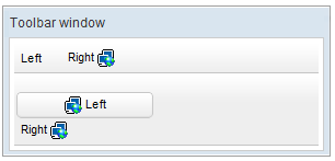
<window title="Toolbar window" border="normal" width="300px">
    <toolbar>
        <toolbarbutton label="Left" />
        <space />
        <toolbarbutton label="Right" image="/img/network.gif"
            dir="reverse" />
    </toolbar>
    <toolbar orient="vertical">
        <button label="Left" image="/img/network.gif" width="125px" />
        <toolbarbutton label="Right" image="/img/network.gif"
            dir="reverse" />
    </toolbar>
</window>
Properties
align
Default Value: start
Sets the alignment of children inside the toolbar. Accepted values:
| Value | Meaning |
|---|---|
start |
Children are aligned to the leading edge (left in LTR layouts) — default |
center |
Children are centered |
end |
Children are aligned to the trailing edge (right in LTR layouts) |
since 3.5.0
<toolbar align="center">
    <toolbarbutton label="Save" />
    <toolbarbutton label="Cancel" />
</toolbar>
orient
Default Value: horizontal
Sets the orientation of the toolbar, controlling whether buttons are laid out in a row or a column. Accepted values:
| Value | Meaning |
|---|---|
horizontal |
Buttons are placed left-to-right — default |
vertical |
Buttons are stacked top-to-bottom |
<toolbar orient="vertical">
    <toolbarbutton label="Cut" />
    <toolbarbutton label="Copy" />
    <toolbarbutton label="Paste" />
</toolbar>
overflowPopup
Default Value: false
since 8.6.0
When overflowPopup="true", a toolbar will have a ... symbol that shows a popup that contains those buttons not fitting in the toolbar.
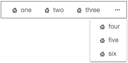
<toolbar overflowPopup="true" width="350px" style="border: 1px black solid;">
    <toolbarbutton label="one" iconSclass="z-icon-home"/>
    <toolbarbutton label="two" iconSclass="z-icon-home"/>
    <toolbarbutton label="three" iconSclass="z-icon-home"/>
    <toolbarbutton label="four" iconSclass="z-icon-home"/>
    <toolbarbutton label="five" iconSclass="z-icon-home"/>
    <toolbarbutton label="six" iconSclass="z-icon-home"/>
</toolbar>
overflowPopupIconSclass
Default Value: z-icon-ellipsis-h
since 9.6.0
When overflowPopup="true", you can customize the overflow popup trigger icon by specifying overflowPopupIconSclass. For a complete list of icons, please refer to FontAwesome Cheatsheet.
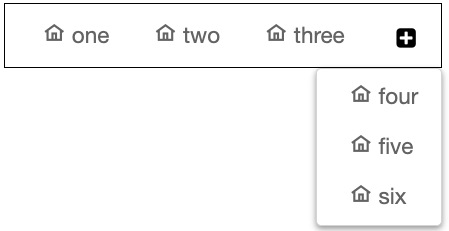
<toolbar overflowPopup="true" overflowPopupIconSclass="z-icon-plus-square" width="350px" style="border: 1px black solid;">
    <toolbarbutton label="one" iconSclass="z-icon-home"/>
    <toolbarbutton label="two" iconSclass="z-icon-home"/>
    <toolbarbutton label="three" iconSclass="z-icon-home"/>
    <toolbarbutton label="four" iconSclass="z-icon-home"/>
    <toolbarbutton label="five" iconSclass="z-icon-home"/>
    <toolbarbutton label="six" iconSclass="z-icon-home"/>
</toolbar>
Supported Events
- Inherited Supported Events: XulElement
Supported Molds
Available molds of a component are defined in lang.xml embedded in zul.jar. It is suggested to set mold to panel while toolbar is in the footer of a panel.
| Name | Snapshot |
|---|---|
| default |  |
| panel |  |
Supported Children
*ALL