GoldenLayout
- Java API: org.zkoss.zkmax.zul.GoldenLayout
- JavaScript API: zkmax.goldenlayout.GoldenLayout
since 8.6.0
Employment/Purpose
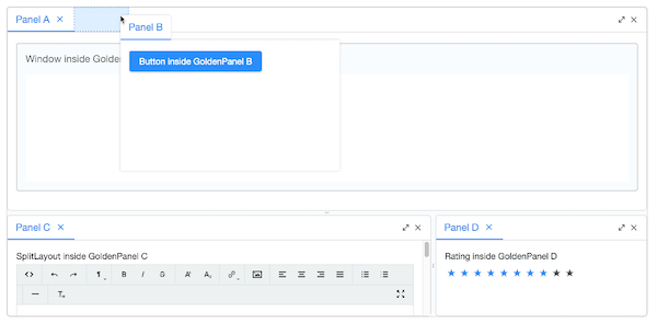
GoldenLayout is a layout container which layouts panels as docker type and is used to represent GoldenLayout. GoldenLayout is the parent component, and its children component can only be GoldenPanel.
A GoldenLayout could be nested to another GoldenLayout (actually, almost all kinds of components) to form a complicated layout.
Example
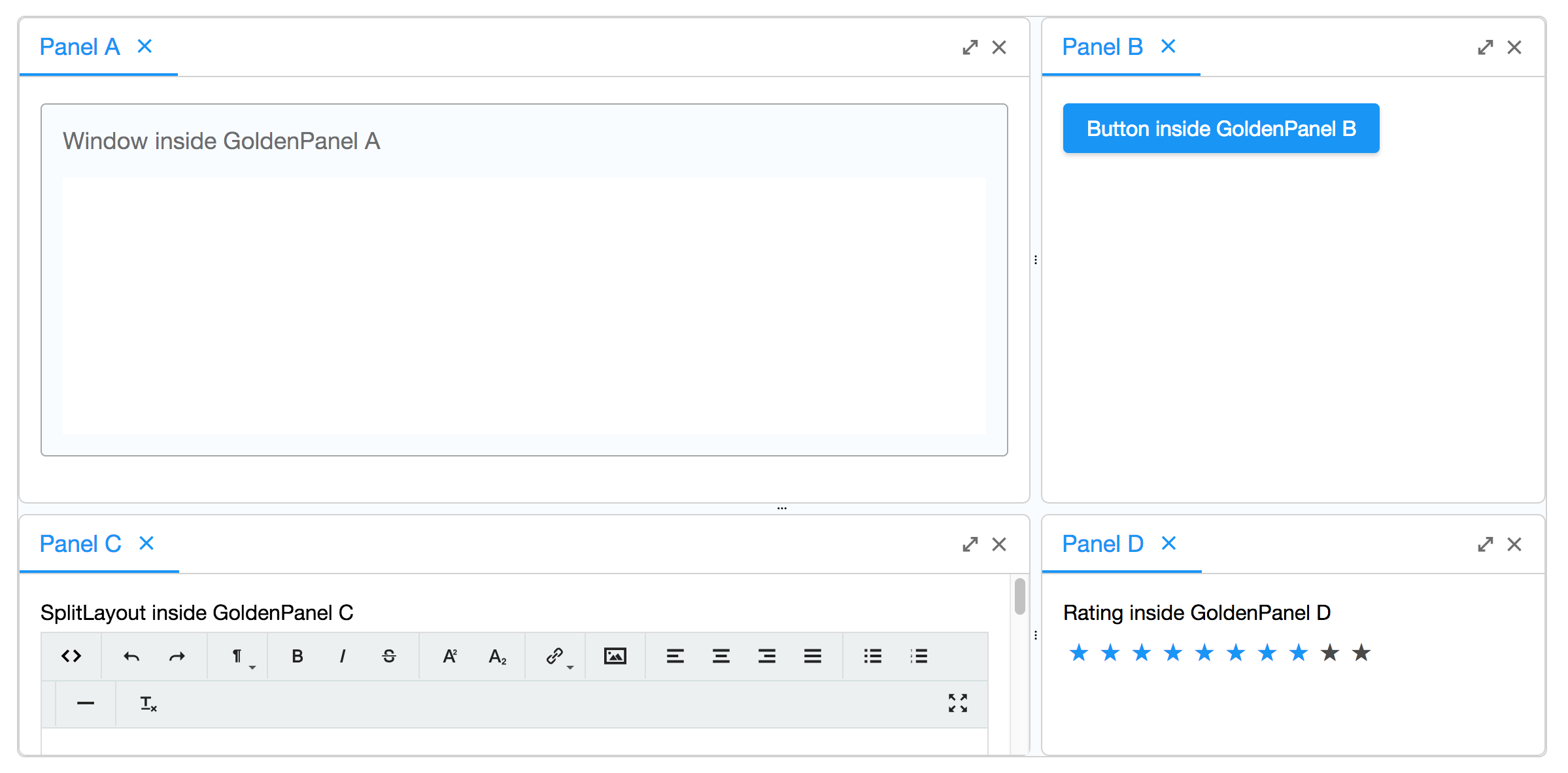
    <goldenlayout vflex="1" hflex="1">
        <attribute name="areas">
            A A B
            A A B
            C C D
        </attribute>
        <goldenpanel area="A" title="Panel A">
            <window vflex="1" title="Window inside GoldenPanel A" border="normal"/>
        </goldenpanel>
        <goldenpanel area="B" title="Panel B">
            <button label="Button inside GoldenPanel B"/>
        </goldenpanel>
        <goldenpanel area="C" title="Panel C">
            <vlayout>
                SplitLayout inside GoldenPanel C
                <splitlayout hflex="1" height="500px">
                    <tbeditor vflex="1"/>
                    <window border="normal" title="Window" vflex="1"/>
                </splitlayout>
            </vlayout>
        </goldenpanel>
        <goldenpanel area="D" title="Panel D">
            <vlayout>
                Rating inside GoldenPanel D
                <rating max="10" rating="8"/>
            </vlayout>
        </goldenpanel>
    </goldenlayout>
Properties
The goldenLayout is layouted as docker type, and is usually construct
with a tree structure, which is hard to layout in zul. ZK change the
structure for initial rendering to a one layer design. All the
GoldenPanels are in one layer inside GoldenLayout, and the panels layout
pattern will be specified by the areas attribute of GoldenLayout and
area attribute of GoldenPanel. The order added to the GoldenLayout
only represents the stacking order if they are stacked together in the
same area.
Common Use Cases
Define an initial layout with areas
Use the areas attribute to declare a grid-like template on initial render. Each area name maps to one or more goldenpanel children via their area attribute. Merged cells automatically size the panels proportionally.
<goldenlayout vflex="1" hflex="1">
    <attribute name="areas">
        nav  nav  nav
        side main main
        side foot foot
    </attribute>
    <goldenpanel area="nav"  title="Navigation"/>
    <goldenpanel area="side" title="Sidebar"/>
    <goldenpanel area="main" title="Main Content"/>
    <goldenpanel area="foot" title="Footer"/>
</goldenlayout>
Switch orientation for column-first layouts
Set orient="horizontal" when you want panels to flow left-to-right as the primary axis instead of top-to-bottom.
<goldenlayout vflex="1" hflex="1" orient="horizontal">
    <attribute name="areas">
        A B C
    </attribute>
    <goldenpanel area="A" title="Left"/>
    <goldenpanel area="B" title="Center"/>
    <goldenpanel area="C" title="Right"/>
</goldenlayout>
React to user drag-and-drop with onMatrixUpdate
Listen to onMatrixUpdate to persist or react to layout changes made by the user at runtime.
<goldenlayout vflex="1" hflex="1" onMatrixUpdate="handleUpdate(event)">
    <attribute name="areas">
        A B
    </attribute>
    <goldenpanel area="A" title="Panel A"/>
    <goldenpanel area="B" title="Panel B"/>
</goldenlayout>
Areas
Default Value: null
Sets a matrix-like areas template that defines how child goldenpanel components are arranged on initial rendering. Each row of the template is written on a separate line; tokens on a row are separated by whitespace. Each token is an area name that must match the area attribute of a goldenpanel child. Repeating the same token across adjacent cells causes those cells to merge, and the proportional span determines the auto-calculated hflex/vflex of the corresponding panels (overridable per-panel).
Note: the reserved name $root cannot be used as an area name. Setting areas after the component has already rendered raises an error — this attribute is effective for initial rendering only.
<goldenlayout vflex="1" hflex="1">
    <attribute name="areas">
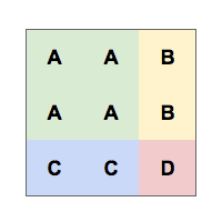
        A A B
        A A B
        C C D
    </attribute>
    <goldenpanel area="A" title="Panel A"/>
    <goldenpanel area="B" title="Panel B"/>
    <goldenpanel area="C" title="Panel C"/>
    <goldenpanel area="D" title="Panel D"/>
</goldenlayout>
Orient
Default Value: ”vertical”
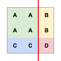
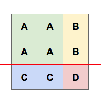
Sets the initial dividing orientation used when the areas template is parsed. ”vertical” divides the layout into rows first (panels stack top-to-bottom); ”horizontal” divides into columns first (panels flow left-to-right).
| Value | Meaning |
|---|---|
vertical (default) |
Rows are created first; panels are laid out top-to-bottom |
horizontal |
Columns are created first; panels are laid out left-to-right |
<goldenlayout vflex=”1” hflex=”1” orient=”horizontal”>
    <attribute name=”areas”>
        A B C
    </attribute>
    <goldenpanel area=”A” title=”Panel A”/>
    <goldenpanel area=”B” title=”Panel B”/>
    <goldenpanel area=”C” title=”Panel C”/>
</goldenlayout>
From the example above, it’s possible to divide in two ways.
| areas | vertical | horizontal |
|---|---|---|
 |
 |
 |
Adding GoldenPanels
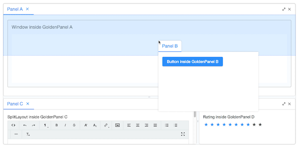
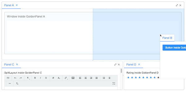
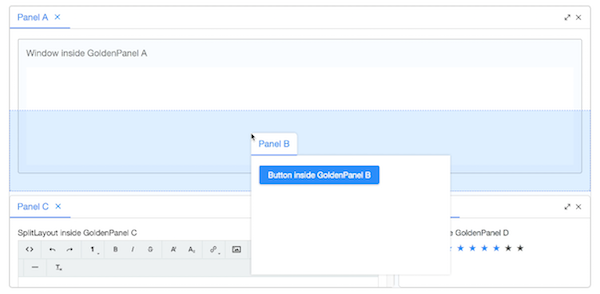
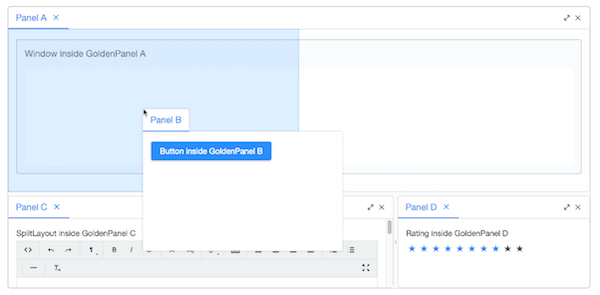
By user’s drag drop, the GoldenPanels are usually dropped to a region
like north, east, south, west and stack of a GoldenPanel. So
we provide some GoldenPanel adding APIs to simulate these actions.
Please refer to the addPanel APIs like
org.zkoss.zkmax.zul.GoldenLayout#addPanel(GoldenPanel, GoldenPanel, String)
in org.zkoss.zkmax.zul.GoldenLayout.
north
east
south
west
stack
Supported Events
| Name | Event Type | Description |
|---|---|---|
onMatrixUpdate |
Event | Fired when the areas matrix is updated — for example, after a user drags and drops a goldenpanel to a new region. The event data contains the updated matrix, the removed area name (if any), the added area name (if any), and the current orient value. |
- Inherited Supported Events: XulElement