Datebox
- Demonstration: Date and Time
- Java API: org.zkoss.zul.Datebox
- JavaScript API: zul.db.Datebox
Employment/Purpose
An edit box for holding a date. After click on the calender, a
calender will pop-up for inputting date.
Common Use Cases
- Date-only input with calendar popup — Use
<datebox/>whenever a form needs a single date value; the built-in popup calendar eliminates manual text parsing errors. - Date-and-time input — Combine a date-format pattern with a time part (e.g.
format="yyyy-MM-dd HH:mm") to let users pick both date and time in one widget. - Constrained date ranges — Apply the
constraintattribute (e.g.constraint="no past"orconstraint="between 20240101 and 20241231") to restrict the range of acceptable dates without custom validation code. - Locale-aware formatting — Bind
localeandformattogether (e.g.format="long") to render dates in the user’s natural locale format while still storing ajava.util.Dateon the server. - Time-zone selection — Set
displayedTimeZonesto a comma-separated list of zone IDs andtimeZonesReadonly="false"to let the user switch time zones directly in the calendar popup.
Example
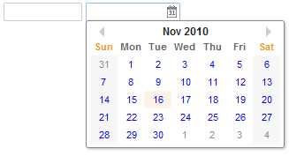
 <datebox lenient="true" buttonVisible="false" />
 <datebox lenient="false" buttonVisible="true" />
Integrate Moment.js
since 8.5.1 The JavaScript widgets including org.zkoss.zul.Datebox,org.zkoss.zul.Timebox,org.zkoss.zkmax.zul.Timepicker rely on moment.js and moment-timezone.js to handle time zone information more accurately.
To check the included moment.js version, enter zk.mm.version in the
browser developer console tab.
Customization
since 5.0.3 You can customize the rendering of the calendar at the client by JavaScript code that overrides zul.db.Renderer.
Accessibility
since 9.5.0
Keyboard Support
| Key | Description |
|---|---|
| Alt + ArrowUp / Alt + ArrowDown | Open the date picker popup. |
| ArrowUp / ArrowDown / ArrowLeft / ArrowRight | (In popup) Navigate the date. |
| Enter / Spacebar | (In popup) Select the date. |
| Escape | (In popup) Close the popup. |
Labeling with ARIA
To name a component with ARIA attribute by adding the aria-label
client attribute to the component, please refer to
ZK Developer’s Reference/Accessibility#Specify_ARIA_Attributes
Properties
ButtonVisible
Default Value: true
Controls whether the calendar-icon button on the right side of the text field is visible. When set to false, users can still type a date directly but cannot open the popup calendar via the button.
since 2.4.1
<datebox buttonVisible="false"/>
DefaultDateTime
Default Value: null (current date/time is used)
Sets the java.time.LocalDateTime that the calendar popup highlights when the datebox value is empty. When null, the popup opens at today’s date and the current time. This property is useful when you want the popup to open at a specific date rather than today.
Because the value is a LocalDateTime object (not a string), construct it — for example in a <zscript> block (or supply it from a composer or ViewModel) — and reference it with an EL expression.
since 9.0.0
<zscript>
    import java.time.LocalDateTime;
    LocalDateTime startOfYear = LocalDateTime.of(2024, 1, 1, 0, 0);
</zscript>
<datebox defaultDateTime="${startOfYear}"/>
Lenient
Default Value: true
Controls whether the date/time parser is lenient. When true, the parser uses heuristics to interpret inputs that do not precisely match the format (for example, "Feb 30" is silently adjusted to the nearest valid date). When false, inputs must match the format exactly or a validation error is shown. For stricter calendar-date checking, also see StrictDate.
<datebox lenient="false"/>
StrictDate
Default Value: false
When true, any calendar-invalid input such as "Jan 0" or "Nov 31" is rejected outright rather than being silently adjusted by the lenient parser. When false, such inputs are left for the lenient/strict parsing logic controlled by Lenient.
since 8.6.0
<datebox strictDate="true"/>
TimeZone
Default Value: null (uses the server default from TimeZones.getCurrent())
Sets the java.util.TimeZone that the datebox uses for display and parsing. Pass null to revert to the system default. When displayedTimeZones is also set, the assigned time zone must be one of those in the list; otherwise the first time zone in the list is selected automatically.
<datebox displayedTimeZones="GMT+12,GMT+8" timeZone="GMT+8"/>
TimeZonesReadonly
Default Value: true
When true, the time-zone drop-down shown in the calendar popup is read-only and the user cannot change the active time zone. Set to false to allow the user to select a different time zone from the list provided by displayedTimeZones.
since 3.6.3
<datebox displayedTimeZones="GMT+12,GMT+8" timeZone="GMT+8" timeZonesReadonly="false"/>
TodayLinkLabel
Default Value: "Today"
Customizes the text of the “Today” link shown in the day view of the calendar popup. Only visible when showTodayLink="true". Use this to provide a localized or application-specific label.
since 8.0.4
<datebox showTodayLink="true" todayLinkLabel="Go to Today"/>
Constraint
You can specify the date range to accept by the constraint property
with one or multiple following values:
no emptyno futureno pastno today.
It also supports an interval of dates. For example,
<datebox constraint="between 20071225 and 20071203"/>
<datebox constraint="before 20071225"/>
<datebox constraint="after 20071225"/>
Notices
- The format of the date in the constraint must be
yyyMMdd. It is independent of the locale. - The date specified in the above constraints (before/after/between)
is included. For example,
"before 20071225"includes December 25, 2007 and any day before it, and"after 20110305"includes March 5, 2011 and any day after it. - The constraint is actually represented with an instance of the
org.zkoss.zul.SimpleDateConstraintclass. You can retrieve the parsed beginning and ending date with thegetBeginDateandgetEndDatemethods.
((SimpleDateConstraint)datebox.getConstraint()).getBeginDate();
Multiple Constraints
To specify two or more constraints, use a comma to separate them as follows:
<datebox constraint="no past,no empty"/>
Custom Error Message
If you prefer to display a different message from the default one, you can append the error message to the constraint with a colon.
<datebox constraint="no empty, no future: now or never"/>
Notes:
- The error message, if specified, must be the last element and start with a colon.
- To support multiple languages, you could use the 「l」 function as depicted in the Internationalization chapter.
<datebox constraint="no empty, no future: ${c:l('err.date.nowornever')}"/>
Displayed Time Zones
The image below shows the new
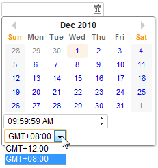
<datebox id="datebox1" format="M/d/yy KK:mm:ss a" width="150px" displayedTimeZones="GMT+12,GMT+8" timeZone="GMT+8" timeZonesReadonly="false"/>
Format
You are able to format the field by providing specifying the attribute
with a formatting string. The default value is null. When the
formatting of the datebox is null, it means the date will be outputted
using the format yyyy/MM/dd.
<datebox format="MM/dd/yyyy"/>
Like any other properties, you are able to change the format dynamically, as depicted below.
<datebox id="db"/>
<button label="set MM-dd-yyyy" onClick='db.setFormat("MM-dd-yyyy")'/>
Length Option
since 5.0.7
In addition to specifying the format explicitly, you could specify the length option. It supports four different length options mentioned at java.text.DateFormat:
- short
- medium
- long
- full
For example, you could specify the styling rather than the real format as follows.
<datebox format="short"/>
<datebox format="long"/>
Then the real format of the datebox will be decided at run-time depending on the configuration. For more information, please refer to ZK Developer’s Reference: Date and Time Formatting.
In addition, you could specify the format for both date and time by using the syntax:
format="option_for_date+option_for_time"
For example,
<datebox format="medium+full"/>
Warning
Because Java default locale provider changes since JDK 9, the built-in formats (e.g. long)
for some locales might change since JDK 9. We recommend you to use a
fixed format pattern.
Validation
If a user’s input doesn’t match the specified format, a Datebox will show an error message. It’s a client-side validation.
Locale
Default: depends on the current locale (i.e., org.zkoss.util.Locales#getCurrent()) at run-time
You can enforce the locale for an individual component such as:
<datebox locale="de-DE" format="full"/>
<datebox locale="fr" format="full"/>
Multiple-Eras Calendar
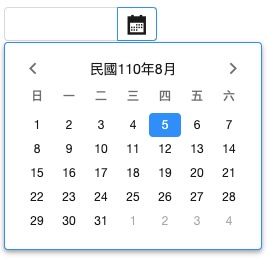
since 9.6.0 Datebox can display some multiple-eras calendar systems including:
- ROC(Taiwan):
locale="zh-TW-u-ca-roc" - Japan:
locale="ja-JP-u-ca-japanese" - Buddhist:
locale="th-TH-u-ca-buddhist"


See complete locale list.
Reference: Era
Position
since 8.0.3
By default, the popup position is set to after_start, for other
possible popup positions please refer to
Popup#Position.
The First Day of the Week
The first day of the week is decided by the locale by default. (actually
the return value of the getFirstDayOfWeek method in the
java.util.Calendar).
since 5.0.3 You can control the first day of the week by the use of the session attribute and the library property. Please refer to The First Day of the Week for details.
2DigitYearStart
since 8.6.2
You can control the 2DigitYearStart by the use of the library property, org.zkoss.web.preferred.2DigitYearStart.
Show Week Number
since 6.5.0
Datebox supports to show a week number of the year in a calendar.
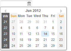
<datebox weekOfYear="true" />
Show Link of Today
Datebox supports a link to jump back to the date of today quickly
since 8.0.0
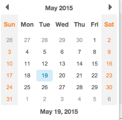
<datebox id="db" showTodayLink="true" ></datebox>
The format is the same with that specified on format attribute
Show Timebox
By default, there is no Timebox in the popup Calendar. If the specified
format attribute contains a time format (like below), it will show a
Timebox at the bottom of the popup Calendar.
<datebox format="yyyy-MM-dd HH:mm"/>
Monthly / yearly option
since 9.5.1
Default: day
You can specify the selectLevel attribute to restrict the date
granularity users can select. For example, you can limit users to just
select a month, it doesn’t show the day view to users to choose a day.
Available values are:
yearmonthday.
<datebox format="yyyy" selectLevel="year"/>
Close Popup OnTimezoneChange
since 9.6.0
Datebox supports switching whether to auto close the datebox popup after changing the timezone.
example:
<datebox closePopupOnTimezoneChange="false" displayedTimeZones="GMT+12,GMT+8" timeZone="GMT+8" timeZonesReadonly="false"/>
Supported Events
| Name | Event Type | Description |
|---|---|---|
onTimeZoneChange |
org.zkoss.zk.ui.event.Event | Denotes the time zone of the component is changed by user. |
- Inherited Supported Events: FormatInputElement
Supported Molds
Available molds of a component are defined in lang.xml embedded in zul.jar.
| Name | Snapshot |
|---|---|
| default |  |
| rounded |  ** ** |
** rounded:
since 5.0.0
Supported Children
Check inherited events
Inherited Functions
Please refer to FormatInputElement for inherited functions.