Colorbox
- Demonstration: Colorbox
- Java API: org.zkoss.zkex.zul.Colorbox
- JavaScript API: zkex.inp.Colorbox
Employment/Purpose
A Colorbox used to retrieve an input that the user can select a color.
Common Use Cases
- Theme or style pickers — let users choose a foreground or background color for a UI element, storing the hex value in a ViewModel and applying it via an EL expression.
- Inline color selection in menus — embed a Colorbox inside a
<menu>using thecontent="#color=..."shorthand to surface a compact color picker without a dedicated dialog. - Form fields with color metadata — use the
onChangeevent to capture the selected hex value and persist it alongside other form data (e.g. tag colors, label colors in project management UIs).
Example
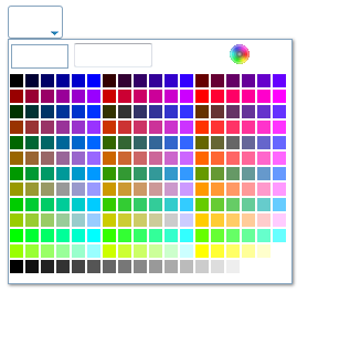
<colorbox color="#FFFFFF" />
Key control
since 6.0.0
Pressing left, right, up, or down arrow keys to change the selected color.
Colorbox in Menu
By setting content attribute of <menu> to create a colorbox in menu.
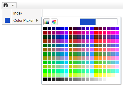
<menubar id="menubar" >
    <menu label="Color" iconSclass="z-icon-binoculars">
        <menupopup>
            <menuitem label="Index" onClick="alert(self.label)" />
            <menu label="Color Picker" content="#color=#184dc6"/>
        </menupopup>
    </menu>
</menubar>
Accessibility
since 9.5.0
Keyboard Support
| Key | Description |
|---|---|
| ArrowUp / ArrowDown / ArrowLeft / ArrowRight | Navigate colors. |
| Enter | Select the color. |
| Escape | Close the popup |
Labeling with ARIA
To name a component with ARIA attribute by adding the aria-label
client attribute to the component, please refer to
ZK Developer’s Reference/Accessibility#Specify_ARIA_Attributes
Properties
color
Default Value: #000000
Sets the selected color as a hexadecimal string in #RRGGBB format. Providing a value that does not match this seven-character format (leading # followed by exactly six hex digits) raises a runtime error.
<colorbox color="#1A73E8" />
value
Default Value: #000000
Alias for color — sets the selected color in #RRGGBB hexadecimal format. getValue() and getColor() return the same string. Prefer color for new code; value exists for consistency with other input components that expose a generic value attribute.
<colorbox value="#FF5733" />
Supported Events
| Name | Event Type | Description |
|---|---|---|
| onChange | InputEvent | Notifies the application when the selected color is changed. |
- Inherited Supported Events: XulElement
Supported Children
*None