Columns
- Demonstration: Grid (Simple Grid)
- Java API: org.zkoss.zul.Columns
- JavaScript API: zul.grid.Columns
Employment/Purpose
Defines the columns of a grid.
Each child of a columns element should be a org.zkoss.zul.Column element.
Common Use Cases
- Sortable grid headers — place
sort="auto"on each<column>and addmenupopup="auto"on<columns>to give users a built-in sort menu without any Java code. - Column visibility toggle — with
menupopup="auto"andcolumnshide="true"(the default), users can hide columns they do not need through the header context menu, keeping the view uncluttered. - Grouping rows by column value — with
menupopup="auto"andcolumnsgroup="true"(the default), users can group grid rows by any column directly from the header menu. - Custom header context menu — supply a
<menupopup>ID tomenupopupwhen you need actions beyond the built-in sort/hide/group set.
Example
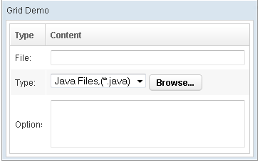
    <grid>
        <columns sizable="true">
            <column label="Type" hflex="min"/>
            <column label="Content"/>
        </columns>
        <rows>
            <row>
                <label value="File:"/>
                <textbox width="99%"/>
            </row>
            <row>
                <label value="Type:"/>
                <hbox>
                    <listbox rows="1" mold="select">
                        <listitem label="Java Files,(*.java)"/>
                        <listitem label="All Files,(*.*)"/>
                    </listbox>
                    <button label="Browse..."/>
                </hbox>
            </row>
            <row>
                <label value="Options:"/>
                <textbox rows="3" width="99%"/>
            </row>
        </rows>
    </grid>
Properties
Columnsgroup
Default Value: true
since 3.5.0
Sets whether the header context menu offers a Group action that lets users group rows by a column. This option is only active when menupopup is set to auto; it has no effect when a custom menupopup ID is provided.
<grid>
    <columns menupopup="auto" columnsgroup="false">
        <column label="Name" sort="auto"/>
        <column label="Score" sort="auto"/>
    </columns>
</grid>
Columnshide
Default Value: true
since 3.5.0
Sets whether the header context menu offers a Hide action that lets users hide individual columns. This option is only active when menupopup is set to auto; it has no effect when a custom menupopup ID is provided.
<grid>
    <columns menupopup="auto" columnshide="false">
        <column label="Name" sort="auto"/>
        <column label="Score" sort="auto"/>
    </columns>
</grid>
Menupopup
By default, the none is assumed, you can specify the auto to show a
default menu on each column. Or you can provide your own menupopup for
each column.
Auto
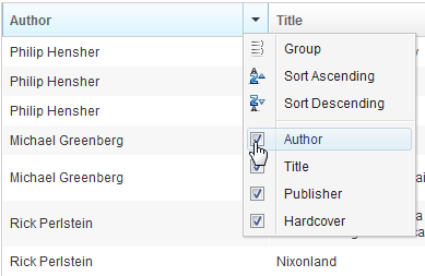
    <grid>
        <columns menupopup="auto">
            <column label="Author" sort="auto"/>
            <column label="Title" sort="auto"/>
            <column label="Publisher" sort="auto"/>
            <column label="Hardcover" sort="auto"/>
        </columns>
Customized Menupopup
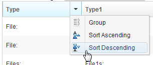
<window title="Column's Menu Demo" border="normal" width="500px">
<menupopup id="editPopup">
<menuitem label="Group" image="~./zul/img/grid/menu-group.png"/>
<menuitem label="Sort Ascending" image="~./zul/img/grid/menu-arrowup.png"/>
<menuitem label="Sort Descending" image="~./zul/img/grid/menu-arrowdown.png"/>
</menupopup>
<grid>
<columns sizable="true" menupopup="editPopup">
<column id="col" label="Type" sortAscending="${asc}" sortDescending="${dsc}"/>
<column id="col1" label="Type1" sortAscending="${asc}" sortDescending="${dsc}"/>
<column id="col2" label="Content"/>
</columns>
</grid>
</window>
As you can see, the example above specify a customized menupopup to the columns as its column menu.
Sizable
Specifies whether a user is allowed to resize a column’s width by dragging the vertical bar between two adjacent columns.
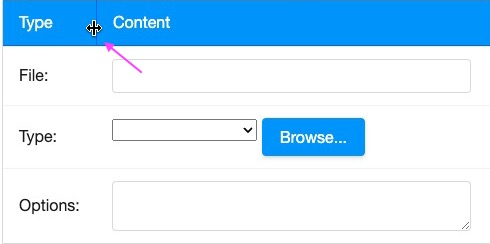
Double-Click to Auto-Fit
In additions to dragging, an end user can double-click on the vertical bar between two adjacent columns, such that the grid will automatically resize the column to fit its contents. In other words, all sizable column provides the auto-fitting feature.
Value
Default Value: null
since 3.6.0
Stores an arbitrary application-defined object on the Columns component. ZK does not interpret or render this value; it is purely a developer convenience for associating state with the header row (for example, storing a metadata object or a display label object). Because the value is a generic Java object (<T>), set it from a <zscript> block or a composer/ViewModel and reference it via EL — it cannot be expressed as a plain ZUL attribute literal.
<zscript>
    // store any application object — here a simple label string
    String headerMeta = "Q1 Results";
</zscript>
<grid>
    <columns value="${headerMeta}">
        <column label="Category"/>
        <column label="Amount"/>
    </columns>
</grid>
Supported Events
- Inherited Supported Events: HeadersElement
Supported Children
* Column