Paging
- Demonstration: Paging (with Grid), Paging (with Listbox), Paging (with Tree)
- Java API: org.zkoss.zul.Paging
- JavaScript API: zul.mesh.Paging
Employment/Purpose
A paging component is used with another component to separate long
content into multiple pages. If a component has long content to display,
you could separate them into pages, and then use a paging component as a
controller to allow the user decide which page to display.
The listbox, grid and tree components support the paging intrinsically, so you don’t need to specify a paging component explicitly. In other words, they will instantiate and manage a paging component automatically if the paging mold is specified. Of course, you could specify an external paging component, if you want to have different visual layout, or to control multiple listboxes, grids and/or trees with one single paging component.
Common Use Cases
The most common pattern is to bind an external <paging> to a data component and redraw content when the onPaging event fires.
<zk>
    <listbox id="lb" rows="5">
        <listhead>
            <listheader label="Item"/>
        </listhead>
    </listbox>
    <paging id="pg" totalSize="100" pageSize="5"/>

    <zscript><![CDATA[
        int PAGE_SIZE = 5;
        void loadPage(int activePage) {
            lb.getItems().clear();
            int start = activePage * PAGE_SIZE;
            for (int i = start; i < start + PAGE_SIZE && i < 100; i++)
                new Listitem("Item " + i).setParent(lb);
        }
        loadPage(0);
        pg.addEventListener("onPaging", event -> loadPage(((org.zkoss.zul.event.PagingEvent)event).getActivePage()));
    ]]></zscript>
</zk>
For components that manage paging internally (listbox, grid, tree with mold="paging"), you typically access the embedded paging component via getPagingChild() rather than declaring a standalone <paging>.
Example
For example, suppose you have 100 items and prefer to show 20 items at a time, then you can use the paging components as follows.
<paging totalSize="100" pageSize="20"/>

When a user clicks on the hyperlinks, the onPaging event is sent with
an instance of org.zkoss.zul.event.PagingEvent to the
paging component. To decide which portion of your 100 items are visible,
you should add a listener to the paging component. Please note that the
code below is pseudo code. For real examples, please refer to Common Use Cases above.
<zk>
    <div id="content"/> <!-- the long content is displayed here -->
    <paging id="paging" />

    <zscript>
    List result = new SearchEngine().find("ZK");
    //assume SearchEngine.find() will return a list of items.

    paging.setTotalSize(result.size());
    paging.addEventListener("onPaging", new org.zkoss.zk.ui.event.EventListener() {
        public void onEvent(Event event) {
            int pgno = event.getActivePage();
            int ofs = pgno * event.getPageable().getPageSize();

            new Viewer().redraw(content,
                result, ofs, ofs + event.getPageable().getPageSize() - 1);
            //assume redraw(Div content, List result, int b, int e) will display
            //the result to the content component from the b-th item to the e-th item
            }
        }
    );
    </zscript>
</zk>
Properties
ActivePage
Default Value: 0
Sets the zero-based index of the currently active (visible) page. The value must be in the range [0, pageCount - 1]; passing an out-of-range value throws a WrongValueException.
Note: On the server side the page index starts from 0, but the browser UI displays page numbers starting from 1.
<paging totalSize="100" pageSize="10" activePage="2"/>
Autohide
Default Value: false
When set to true, the paging component is automatically hidden when there is only one page to display (i.e., totalSize <= pageSize). This is useful to avoid rendering an empty pagination bar for small data sets.
<paging totalSize="5" pageSize="20" autohide="true"/>
Detailed
Default Value: false
When set to true, the paging component renders additional information about the total item count and the index range of items on the current page (e.g., “Displaying 21–40 of 100”).
<paging totalSize="100" pageSize="20" detailed="true"/>
PageIncrement
Default: 10 (desktop), 5 (mobile)
Under os mold, the component renders a list of paging anchors for
users to jump to the specific page:
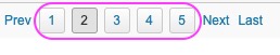
This attribute determines the max number of rendered paging anchors.
PageSize
Default Value: 20
Sets the number of items displayed on each page. The value must be a positive integer; passing 0 or a negative value throws a WrongValueException.
<paging totalSize="100" pageSize="10"/>
TotalSize
Default Value: 0
Sets the total number of items across all pages. The value must be non-negative; passing a negative value throws a WrongValueException. The component uses this value together with pageSize to compute the total page count.
<paging totalSize="250" pageSize="25"/>
Limitation
Paging can not apply stubonly at the same time. For example,
<listbox mold="paging" pageSize="1" >
    <listitem >
        <listcell stubonly="true"/>
    </listitem>
    <listitem>
        <listcell />
    </listitem>
</listbox>
Although paging will
invalidate
listbox and its children, stubonly needs the referred widget in
client side which is detached during paging and throws mounting error.
Supported Events
| Name | Event Type | Description |
|---|---|---|
onPaging |
org.zkoss.zul.event.PagingEvent | Notifies one of the pages of a multi-page component is selected by the user. |
- Inherited Supported Events: XulElement
Supported Molds
Available molds of a component are defined in lang.xml embedded in zul.jar.
| Name | Snapshot |
|---|---|
| default | |
| os |  |
Supported Children
*NONE