Column
- Demonstration: Grid (Simple Grid)
- Java API: org.zkoss.zul.Column
- JavaScript API: zul.grid.Column
Employment/Purpose
A single column in a Columns element. Each child of the Column element is placed in each successive cell of the grid. The column with the most child elements determines the number of rows in each column. The use of column is mainly to define attributes for each cell in the grid.
Common Use Cases
Columns define the structure and behavior of a grid’s vertical divisions:
- Configuring column headers and sizing — Set a label, width, and flex hints to control how columns distribute space
- Responsive design — Hide or show columns dynamically based on screen size using
responsiveVisible - Sorting columns — Attach custom comparators to enable ascending/descending sorts, with visual direction indicators
- Grouping rows — Apply grouping behavior and custom comparators for grouped row display
- Storing custom metadata — Attach application-defined values for use in event handlers (e.g., database column names, sort keys)
Example
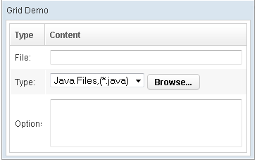
    <window title="Grid Demo" border="normal" width="50%">
        <grid>
            <columns sizable="true">
                <column label="Type" hflex="min"/>
                <column label="Content" />
            </columns>
            <rows>
                <row>
                    <label value="File:" />
                    <textbox width="99%" />
                </row>
                <row>
                    <label value="Type:" />
                    <hbox>
                        <listbox mold="select">
                            <listitem label="Java Files,(*.java)" />
                            <listitem label="All Files,(*.*)" />
                        </listbox>
                        <button label="Browse..." />
                    </hbox>
                </row>
                <row>
                    <label value="Options:" />
                    <textbox rows="3" width="99%" />
                </row>
            </rows>
        </grid>
    </window>
Properties
ResponsiveVisible
Default Value: true
Sets whether this column is visible when the grid is in responsive (stacking) mode. Set to false to hide the column in stacking mode while keeping it visible in normal table mode. The hiding behaviour requires ZK EE (zkmax); in CE the value is stored but not enforced.
since 10.4.0
<columns>
    <column label="Name" responsiveVisible="true"/>
    <column label="Detail" responsiveVisible="false"/>
</columns>
SortAscending
Sets the ascending sorter as a java.util.Comparator instance. When set, clicking the column header sorts the grid rows in ascending order using this comparator. Pass null to remove the ascending sorter. If you use the group feature, you may pass a GroupComparator for finer control over grouping vs. within-group ordering.
The value is a Comparator<?> object; assign it from a <zscript> block or a composer/ViewModel and reference it via EL.
<zscript>
    import java.util.Comparator;
    Comparator myAsc = new org.zkoss.zul.RowComparator(col, true, false, false);
</zscript>
<columns>
    <column id="col" label="Name" sortAscending="${myAsc}"/>
</columns>
SortDescending
Sets the descending sorter as a java.util.Comparator instance. When set, clicking the column header a second time sorts the grid rows in descending order using this comparator. Pass null to remove the descending sorter. Accepts a GroupComparator for group-aware sorting.
The value is a Comparator<?> object; assign it from a <zscript> block or a composer/ViewModel and reference it via EL.
<zscript>
    import java.util.Comparator;
    Comparator myDsc = new org.zkoss.zul.RowComparator(col, false, false, false);
</zscript>
<columns>
    <column id="col" label="Name" sortDescending="${myDsc}"/>
</columns>
SortDirection
Default Value: "natural"
Sets the sort direction indicator on this column. This attribute does not trigger a sort by itself — it only marks the column header to reflect the current sort state (unless the parent <grid> has autosort="true", in which case setting this attribute will also sort the rows). If you use sort(boolean) the direction is maintained automatically.
Accepted values:
| Value | Meaning |
|---|---|
"ascending" |
Marks the column as sorted ascending (default sort indicator shown). |
"descending" |
Marks the column as sorted descending. |
"natural" |
No sort indicator; the grid is in its natural (unsorted) order. |
<column label="Name" sortDirection="ascending"/>
Value
Default Value: null
Attaches an arbitrary application-defined value to this column. ZK does not interpret this value in any way; it is purely for the application to store and retrieve custom data associated with a column (for example, a field name or column identifier used in event handlers).
since 3.6.0
The value is a generic <T> object. Assign it from a <zscript> block or a composer/ViewModel and reference it via EL.
<zscript>
    String colKey = "firstName";
</zscript>
<column label="First Name" value="${colKey}"/>
Supported Events
| Name | Event Type | Description |
|---|---|---|
onSort |
org.zkoss.zk.ui.event.SortEvent | Denotes user has sorted the row of this column. |
onGroup |
org.zkoss.zk.ui.event.SortEvent | Denotes user has grouped all the cells under a column. |
onUngroup |
org.zkoss.zk.ui.event.SortEvent | Denotes user has ungrouped all the cells under a column. |
- Inherited Supported Events: HeaderElement
Supported Children
*ALL