Groupbox
- Demonstration: Groupbox Demo
- Java API: org.zkoss.zul.Groupbox
- JavaScript API: zul.wgt.Groupbox
Employment/Purpose
The Groupbox component in ZK is used to group related components together visually. It provides a border around the components to indicate their relationship. The label displayed at the top of the group box can be created using the Caption component, similar to the HTML legend element. Unlike the Window component, a group box does not own the ID space and cannot be overlapped or popped up.
Common Use Cases
Collapsible Content Panel
Use closable="true" (the default) together with the 3d mold to give users a toggle to collapse sections of a form or dashboard:
<groupbox mold="3d" closable="true" width="400px">
    <caption label="Advanced Settings"/>
    <vlayout>
        <checkbox label="Enable debug logging"/>
        <checkbox label="Show developer toolbar"/>
    </vlayout>
</groupbox>
Grouping Form Fields
Wrap related input fields in a groupbox to make long forms easier to scan. Use the title attribute for a quick label or a <caption> child for a richer header:
<groupbox title="Shipping Address" width="350px">
    <grid>
        <rows>
            <row>Street: <textbox/></row>
            <row>City: <textbox/></row>
            <row>Zip: <textbox/></row>
        </rows>
    </grid>
</groupbox>
Applying Custom Border Style to the Content Area
Use contentStyle or contentSclass to style the inner content block independently from the groupbox border:
<groupbox mold="3d" width="350px"
    contentStyle="background:#f9f9f9; padding:8px">
    <caption label="Summary"/>
    <label value="Your order has been placed."/>
</groupbox>
Setting the Default Mold Application-wide
To use the 3d mold for all groupboxes without specifying it on every component, add the following to /WEB-INF/zk.xml:
<library-property>
    <name>org.zkoss.zul.Groupbox.mold</name>
    <value>3d</value>
</library-property>
Example
In the provided example, a Groupbox is used to group a set of Radio components under the label “Fruits.”
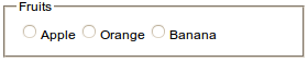
 <groupbox width="350px">
     <caption label="Fruits"/>
     <radiogroup>
         <radio label="Apple"/>
         <radio label="Orange"/>
         <radio label="Banana"/>
     </radiogroup>
 </groupbox>
Try it
Properties
ContentStyle
Specifies the CSS style for the content block of the groupbox.
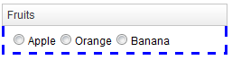
<groupbox width="350px" mold="3d"
    contentStyle="border: 3px blue dashed;border-top:0px">
    <caption label="Fruits"/>
    <radiogroup>
        <radio label="Apple"/>
        <radio label="Orange"/>
        <radio label="Banana"/>
    </radiogroup>
</groupbox>
Try it
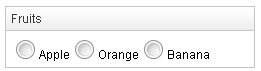
ContentSclass
Specifies the CSS class for the content block of the groupbox.
<zk>
    <style>
    .mygroupbox-cnt {
        border: 3px blue dashed;
        border-top:0px
    }
    </style>
    <groupbox width="350px" mold="3d"
        contentSclass="mygroupbox-cnt">
        <caption label="Fruits"/>
        <radiogroup>
            <radio label="Apple"/>
            <radio label="Orange"/>
            <radio label="Banana"/>
        </radiogroup>
    </groupbox>
</zk>
Try it
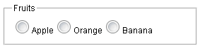
Closable
Default Value: true
Specifies whether the groupbox can be collapsed or not.
<groupbox width="350px" mold="3d" closable="true">
Note: the function can only be applied when the Caption or the title attribute exists.
Open
Default Value: true
Specifies the display of the groupbox, whether it is open or closed.
<groupbox width="250px" mold="3d" open="false">
Note: false means the groupbox is closed, i.e., no content can appear.
Title
Default Value: "" (empty string)
Sets a plain-text label displayed at the top of the groupbox, before any Caption child component. This attribute provides a lightweight alternative to adding a <caption> child when a simple text title is sufficient. When both title and a <caption> child are present, the title text is rendered first.
since 6.0.0
<groupbox title="Personal Information" width="350px">
    <vlayout>
        <textbox placeholder="First name"/>
        <textbox placeholder="Last name"/>
    </vlayout>
</groupbox>
Supported Events
| Name | Event Type | Description |
|---|---|---|
onOpen |
OpenEvent | The onOpen event signifies that the user has opened or closed a component. Unlike the onClose event, onOpen serves as a notification event sent after the opening or closing of the component. |
Supported Molds
The available molds for the Groupbox component are:
| Name | Snapshot |
|---|---|
default |
 |
3d |
 |
Supported Children
*ALL: Indicates that the Groupbox component can have any kind of ZK component as its child element. This allows you to include any ZK component within the Groupbox, providing flexibility and customization options for your designs.
Note: Only one Caption component is allowed in the Groupbox and it must be the first component.