Menuitem
- Demonstration: Menu and Fileupload
- Java API: org.zkoss.zul.Menuitem
- JavaScript API: zul.menu.Menuitem
Employment/Purpose
A single choice in a Menupopup element. It acts much like a button but
it is rendered on a menu. Default getZclass(): z-menu-item.
Within ZK 5, the file upload has been redesigned so it can be integrated with any widget. For example, the toolbarbutton can now be used to upload a file. In addition to this, the display of the upload status has been enhanced and can be customized easily.
Common Use Cases
- Action menuitem: Use
onClickto trigger server-side logic directly from a menu. - Checkable menuitem: Set
checkmark="true"so a tick mark appears beside the item; pair withautocheck="true"to let the user toggle it, or bindcheckedvia MVVM to track the state. - Navigation menuitem: Set
hrefto navigate the browser to another URL without a server round-trip; addtargetto open the URL in a named frame or new window. - File upload menuitem: Set
upload="true"to turn the menuitem into a file picker; handle theonUploadevent to process the uploaded file.
<menubar>
    <!-- Action -->
    <menuitem label="Save" onClick="service.save()"/>
    <!-- Checkable -->
    <menuitem label="Show Toolbar" checkmark="true" autocheck="true"/>
    <!-- Navigation -->
    <menuitem label="ZK Homepage" href="https://www.zkoss.org" target="_blank"/>
    <!-- File upload -->
    <menuitem label="Attach File" upload="true" onUpload='alert(event.media.getName())'/>
</menubar>
Example
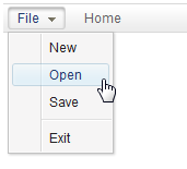
<menubar>
 <menu label="File">
     <menupopup>
         <menuitem label="New" onClick="alert(self.label)"/>
         <menuitem label="Open" onClick="alert(self.label)"/>
         <menuitem label="Save" onClick="alert(self.label)"/>
         <menuseparator/>
         <menuitem label="Exit" onClick="alert(self.label)"/>
     </menupopup>
 </menu>
 <menuitem label="Home"/>
</menubar>
Fileupload Example
<menuitem upload="true" label="Customized Attach" onUpload='alert("File is uploaded!")'/>
Properties
Autodisable
Default Value: null
since 5.0.7
org.zkoss.zul.Menuitem#setAutodisable(java.lang.String) is used to disable a menuitem automatically, when it is clicked. It is useful to prevent the user from clicking it twice (and firing redundant requests), which is common if the request takes too long to serve.
The simplest use is to specify it with self as follows. Then, the
menuitem is disabled when it is clicked.
<menuitem id="ok" label="OK" autodisable="self" />
If you’d like to disable several menuitems, you could specify all of them in this property by separating with a comma. For example, the following disables both menuitems, when one of them is clicked.
<menuitem id="ok" label="OK" autodisable="ok,cancel" />
<menuitem id="cancel" label="Cancel" autodisable="ok,cancel" />
The menuitem will be enabled automatically, after the request has been
served (i.e., the response has been sent back to the client). If you
prefer to enable them manually (i.e., by calling
org.zkoss.zul.Menuitem#setDisabled(boolean)
explicitly), you could prefix the ID with a plus (+). For example,
<menuitem id="ok" label="OK" autodisable="+self, +cancel" />
Then, you could enable them manually under the situation depending on your application’s requirement, such as
if (something_happens) {
   ok.setDisabled(false);
   cancel.setDisabled(false);
}
Enable Autodisable for All Menuitems
As described in ZK Developer’s Reference: Customization,
you could customize ZK to enable autodisable for all menuitem by
specifying the following in the custom language addon:
<language-addon>
    <component>
        <component-name>menuitem</component-name>
        <extends>menuitem</extends>
        <property>
            <property-name>autodisable</property-name>
            <property-value>self</property-value>
        </property>
    </component>
</language-addon>
Checkmark
Default Value: false
Sets whether a check mark (tick) is displayed in front of the menuitem. When checkmark="true", the menuitem can visually indicate a selected/active state. The check mark is only shown or toggled when checked or autocheck is also configured.
<menupopup>
    <menuitem label="Bold" checkmark="true" checked="true"/>
    <menuitem label="Italic" checkmark="true" autocheck="true"/>
</menupopup>
Href
In addition to handling the onClick event, you could specify the URL in the href property (org.zkoss.zul.Menuitem#setHref(java.lang.String)), such that the browser will navigate to the URL you specified directly (without sending back any request to the server). If you prefer to visit the URL in another browser window, you could specify the name in org.zkoss.zul.Menuitem#setTarget(java.lang.String) (just like using a HTML A tag).
Notice that the end user could hold the Control key and click on the
menuitem to visit the link in a new browser window (like a HTML A tag
does).
Href and the onClick Event
There are two ways to add behavior to a menuitem. Firstly, you can
specify a listener for the onClick event. Secondly, you could specify
a URL for the href property
(org.zkoss.zul.Menuitem#setHref(java.lang.String)).
If both are specified, the href property has the higher priority,
i.e., the onClick event won’t be sent.
<zk>
    <menubar>
        <menuitem label="click me" onClick="do_something_in_Java()"/>
        <menuitem label="don't click that one, click me" href="/another_page.zul"/>
    </menubar>
</zk>
Href and SendRedirect
The href property is processed at the client. In other words, the browser will jump to the URL specified in the href property, so your application running on the server has no chance to process it.
If you have to process it on the server or you have to decide whether to jump to another URL based on certain condition, you could listen to the onClick event, process it, and then invoke org.zkoss.zk.ui.Executions#sendRedirect(java.lang.String) if it jumps to another URL.
For end users, there is no difference between the use of org.zkoss.zul.Menuitem#setHref(java.lang.String) and org.zkoss.zk.ui.Executions#sendRedirect(java.lang.String).
<zk>
<menubar>
<menuitem label="redirect" onClick="Executions.sendRedirect("another.zul")"/>
<menuitem label="href" href="another.zul"/>
</menubar>
</zk>
Since the onClick event is sent to the server for processing, you are able to perform additional tasks before invoking org.zkoss.zk.ui.Executions#sendRedirect(java.lang.String), such as redirecting to another page only if certain conditions are satisfied.
On the other hand, the href property is processed at the client side.
Your application won’t be notified when users click the menuitem.
Target
Default Value: null
Sets the target frame or window for the URL specified by href. This behaves like the target attribute of an HTML <a> tag and is only meaningful when href is also set. Common values include _blank (new window/tab), _self (same frame), or any named frame.
<menuitem label="ZK Homepage" href="https://www.zkoss.org" target="_blank"/>
Upload
By specifying the upload property (org.zkoss.zul.Menuitem#setUpload(java.lang.String)), you could make a menuitem used for uploading files. For example,
<menuitem upload="true" label="Upload" onUpload='alert(event.media)'/>
Once the file(s) are uploaded, the onUpload event will be sent with an instance of org.zkoss.zk.ui.event.UploadEvent. And, you could retrieve the uploaded files from org.zkoss.zk.ui.event.UploadEvent#getMedia() and org.zkoss.zk.ui.event.UploadEvent#getMedias()
If you want to customize the handling of the file upload at the client, you can specify a JavaScript class when calling this method:
<menuitem upload="foo.Upload"/> <!-- assume you implement a JavaScript class: foo.Upload -->
Another options for the upload can be specified as follows:
<menuitem label="Upload" upload="true,maxsize=-1,native"/>
where
- maxsize: the maximal allowed upload size of the component, in kilobytes, or a negative value if no limit.
- native: treating the uploaded file(s) as binary, i.e., not to convert it to image, audio or text files.
Checked
Default Value: false
Sets whether the menuitem is in the checked state. This only has a visible effect when checkmark="true" is also set. Setting checked="true" will implicitly enable the check mark as well. Use autocheck="true" to let the user toggle this state interactively, or bind it via MVVM to track it programmatically.
<menupopup>
    <menuitem label="Show Grid" checkmark="true" checked="true"/>
</menupopup>
Autocheck
Default Value: false
Sets whether the check mark toggles automatically each time the user selects the menuitem. This only applies when checkmark="true" is also set. When enabled, clicking the menuitem flips the checked state on the client without requiring a server round-trip for the toggle itself; an onCheck event is still fired so the server can observe the new state.
<menupopup>
    <menuitem label="Auto-save" checkmark="true" autocheck="true"/>
</menupopup>
Value
Default Value: ""
Sets an arbitrary string value associated with this menuitem. The value is not displayed to the user; it is used to carry application-defined data (for example, a record ID or a command key) that can be read in an event listener via self.getValue().
<menupopup>
    <menuitem label="Edit" value="edit" onClick='alert(self.getValue())'/>
    <menuitem label="Delete" value="delete" onClick='alert(self.getValue())'/>
</menupopup>
Supported Events
| Name | Event Type | Description |
|---|---|---|
onCheck |
org.zkoss.zk.ui.event.CheckEvent | Denotes user has checked the item. |
onUpload |
org.zkoss.zk.ui.event.UploadEvent | Denotes user has uploaded a file to the component. |
- Inherited Supported Events: LabelImageElement
Supported Children
*NONE