Menubar
- Demonstration: Menu
- Java API: org.zkoss.zul.Menubar
- JavaScript API: zul.menu.Menubar
Employment/Purpose
A container usually contains more than one menu elements.
Common Use Cases
Horizontal Menubar with Autodrop
Combine autodrop="true" with a standard horizontal layout for an application-style menu bar where hovering opens submenus immediately.
<menubar autodrop="true">
    <menu label="File">
        <menupopup>
            <menuitem label="New" />
            <menuitem label="Save" />
        </menupopup>
    </menu>
    <menu label="View">
        <menupopup>
            <menuitem label="Zoom In" />
            <menuitem label="Zoom Out" />
        </menupopup>
    </menu>
</menubar>
Vertical Sidebar Navigation
Use orient="vertical" to build a side-navigation panel. Pair it with hflex="1" or a fixed width to control its footprint inside a layout.
<hlayout>
    <menubar orient="vertical" width="160px">
        <menu label="Dashboard" />
        <menu label="Reports">
            <menupopup>
                <menuitem label="Monthly" />
                <menuitem label="Annual" />
            </menupopup>
        </menu>
        <menu label="Settings" />
    </menubar>
    <div hflex="1"><!-- main content --></div>
</hlayout>
Scrollable Horizontal Menubar
When the menubar width is constrained and there are many top-level menus, enable scrollable="true" (horizontal orientation only) to show left/right scroll arrows automatically.
<menubar width="300px" scrollable="true">
    <menu label="File" />
    <menu label="Edit" />
    <menu label="View" />
    <menu label="Tools" />
    <menu label="Help" />
</menubar>
Example
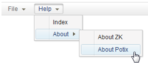
<menubar id="menubar">
    <menu label="File">
        <menupopup onOpen="alert(self.id)">
            <menuitem label="New" onClick="alert(self.label)" />
            <menuitem label="Open" onClick="alert(self.label)" />
            <menuitem label="Save" onClick="alert(self.label)" />
            <menuseparator />
            <menuitem label="Exit" onClick="alert(self.label)" />
        </menupopup>
    </menu>
    <menu label="Help">
        <menupopup>
            <menuitem label="Index" onClick="alert(self.label)" />
            <menu label="About">
                <menupopup>
                    <menuitem label="About ZK" onClick="alert(self.label)" />
                    <menuitem label="About Potix" onClick="alert(self.label)" />
                </menupopup>
            </menu>
        </menupopup>
    </menu>
</menubar>
Accessibility
since 9.5.0
Keyboard Support
| Key | Description |
|---|---|
| Horizontal root level: ArrowLeft / ArrowRight Vertical root level: ArrowUp / ArrowDown All Menupopup: ArrowUp / ArrowDown |
Navigate menu items |
| Horizontal root level: ArrowDown Vertical root level : ArrowRight |
Open the menu popup |
| All Menupopup: ArrowLeft / ArrowRight | Open / close the menu popup |
| Enter | Activate the menu item / Open the menu popup |
| Spacebar | Activate the menu item / Open the menu popup Toggle the checkbox without closing the menupopup (only apply to autocheck enabled) |
| Escape | Close all existing menu popups even if you open multiple ones |
Limitations
| Feature | Description |
|---|---|
| Autodrop | This feature only supports mouse. |
Labeling with ARIA
To name a component with ARIA attribute by adding the aria-label
client attribute to the component, please refer to
ZK Developer’s Reference/Accessibility#Specify_ARIA_Attributes
Properties
Autodrop
Default Value: false
When set to true, menus drop down automatically as the user moves the mouse over top-level menu items, without requiring a click. Only affects the topmost menu items in the menubar.
<menubar autodrop="true">
    <menu label="File">
        <menupopup>
            <menuitem label="New" />
            <menuitem label="Open" />
        </menupopup>
    </menu>
    <menu label="Edit">
        <menupopup>
            <menuitem label="Cut" />
            <menuitem label="Copy" />
        </menupopup>
    </menu>
</menubar>
Orient
Default Value: "horizontal"
Sets the orientation of the menubar. Accepted values:
| Value | Meaning |
|---|---|
horizontal |
(default) Menu items are laid out left-to-right in a horizontal bar. |
vertical |
Menu items are stacked top-to-bottom in a vertical bar. |
<!-- Horizontal menubar (default) -->
<menubar orient="horizontal">
    <menu label="File" />
    <menu label="Edit" />
</menubar>

<!-- Vertical menubar -->
<menubar orient="vertical">
    <menu label="File" />
    <menu label="Edit" />
</menubar>
Scrollable
The code below demonstrates how easy it is to make the Menubar scrollable!

<menubar width="200px" scrollable="true">
 ...
</menubar>
Supported Events
No own events — see Inherited Supported Events