Cell
- Demonstration: Grid (Spreadsheet Functionalities)
- Java API: org.zkoss.zul.Cell
- JavaScript API: zul.wgt.Cell
Employment/Purpose
This Cell must only be a child of Row, Hbox, or Vbox. Other components cannot be its parent. Use it to control alignment and row/column span.
Common Use Cases
Spanning rows and columns in a Grid
Use rowspan and colspan together to create complex grid layouts, such as a header cell spanning multiple columns or a label cell spanning multiple rows.
<grid>
    <columns>
        <column label="Name" />
        <column label="Mon" />
        <column label="Tue" />
    </columns>
    <rows>
        <row>
            <cell rowspan="2" valign="middle"><label value="Alice" /></cell>
            <cell><label value="Present" /></cell>
            <cell><label value="Present" /></cell>
        </row>
        <row>
            <!-- first cell omitted — covered by rowspan above -->
            <cell colspan="2" align="center"><label value="Leave" /></cell>
        </row>
    </rows>
</grid>
Centering content inside an Hbox
Cell can be placed inside an Hbox or Vbox to provide consistent alignment control across flex children.
<hbox width="400px">
    <cell hflex="1" align="center" valign="middle">
        <label value="Left pane" />
    </cell>
    <cell hflex="2" align="left" valign="top">
        <label value="Right pane" />
    </cell>
</hbox>
Example
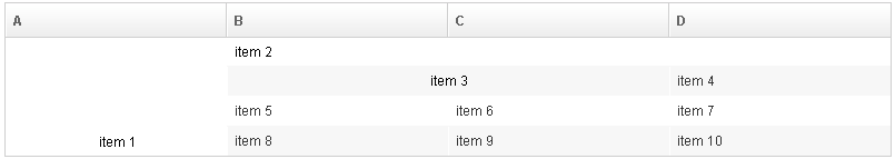
<zk>
    <grid>
        <columns>
            <column label="A" />
            <column label="B" />
            <column label="C" />
            <column label="D" />
        </columns>
        <rows>
            <row>
                <cell rowspan="4" align="center" valign="bottom">
                    <label value="item 1" />
                </cell>
                <cell colspan="3">
                    <label value="item 2" />
                </cell>
            </row>
            <row>
                <cell colspan="2"  align="center">
                    <label value="item 3" />
                </cell>
                <label value="item 4" />
            </row>
            <row>
                <label value="item 5" />
                <label value="item 6" />
                <label value="item 7" />
            </row>
            <row>
                <label value="item 8" />
                <label value="item 9" />
                <label value="item 10" />
            </row>
        </rows>
    </grid>
</zk>
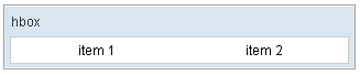
<zk>
    <window title="hbox" border="normal" width="320px">
        <hbox width="300px" pack="center">
            <cell hflex="1" align="center">
                <label value="item 1" />
            </cell>
            <cell hflex="1" align="center">
                <label value="item 2" />
            </cell>
        </hbox>
    </window>
</zk>
Comparison to the default (no Cell) scenario
The Cell component is designed to provide full control over the DOM structure, meaning developers should expect to handle some lower-level styling.
For example, consider the following scenario:
    <grid>
        <columns>
            <column label="A" />
            <column label="B" />
        </columns>
        <rows>
            <row>
                <label>A</label>
                <cell>
                    <label>B</label>
                </cell>
            </row>
        </rows>
    </grid>
In a browser, the 2 table cells visually look no difference.
DOM Structure Differences
When embedding components in a Grid row:
-
Regular items (without
<cell>): TheRowcomponent automatically wraps the child in a wrapper<td>with an inner<div>content wrapper:<td class="z-row-inner"> <div class="z-row-content"> <!-- Component HTML (e.g. <span class="z-label">) --> </div> </td> -
With
<cell>: The<cell>component renders its own<td>directly under the<tr>, with no inner<div>wrapper:<td class="z-cell"> <!-- Component HTML (e.g. <span class="z-label">) --> </td>
Rationale Behind the Design
This structural difference is by design to support row spanning (rowspan):
- HTML Specification Constraint: The HTML standard specifies that
rowspanandcolspanattributes must reside on a<td>element that is a direct child of a table row (<tr>). - Invalid HTML Prevention: If the parent
Rowcontinued to output its default<td>wrapper, any nested<cell>trying to output its own spanned<td>would result in nested table cells (<tr>-><td>-><td>), which is invalid HTML. - Control Delegated: Therefore, when
Rowdetects a<cell>child, it yields rendering responsibilities to the<cell>component, which outputs a single, directly attached<td>element.
CSS and Styling Implications
Because the inner wrapper div.z-row-content is absent when using <cell>, CSS selectors and styles apply differently:
- Padding: By default, regular items have their padding applied to the inner wrapper (
div.z-row-content), whereas<cell>elements have their padding applied directly to thetd.z-cellelement. - Hover and Text Colors: Hover background styles are applied to both, but text color inheritance paths differ since regular items inherit colors through
.z-row-content. - Custom Styles: If you write custom CSS selectors targeting
tdor direct cell wrappers, they may behave differently between regular cells and<cell>components.
Best Practice Recommendations
- Standard Usage: If you do not have any custom DOM-level styling (e.g., you rely purely on ZK’s default themes), mixing
<cell>and regular items is perfectly safe. - CSS Customization / DOM Consistency: If you apply custom CSS styling targeting the DOM element level (such as direct cell borders, paddings, or selector paths), mixing
<cell>and regular items can lead to layout inconsistency. In this case, it is highly recommended to wrap all child components of all rows in<cell>, ensuring the entire grid uses a uniformtd.z-cellDOM tree.
<!-- Recommended: Wrap all cells in <cell> for DOM and CSS consistency -->
<grid>
    <columns>
        <column label="A" />
        <column label="B" />
        <column label="C" />
    </columns>
    <rows>
        <row>
            <cell><label value="Item A1" /></cell> <!-- No span needed, but wrapped -->
            <cell><label value="Item A2" /></cell>
            <cell><label value="Item A3" /></cell>
        </row>
        <row>
            <cell colspan="2"><label value="Spans A & B" /></cell>
            <cell><label value="Item B3" /></cell>
        </row>
    </rows>
</grid>
Properties
rowspan
Default Value: 1
It specifies the number of rows this cell should occupy. It has the same
effect as HTML TR tag’s rowspan attribute does.
align
Default Value: null (browser default: left, unless overridden by CSS)
Sets the horizontal alignment of the cell content. Accepts the values listed below.
| Value | Meaning |
|---|---|
left |
Aligns content to the left (default browser behavior) |
right |
Aligns content to the right |
center |
Centers content horizontally |
justify |
Justifies content across the cell width |
char |
Aligns content around a specific character |
<grid>
    <columns>
        <column label="Name" />
        <column label="Value" />
    </columns>
    <rows>
        <row>
            <cell align="center"><label value="Centered" /></cell>
            <cell align="right"><label value="Right-aligned" /></cell>
        </row>
    </rows>
</grid>
colspan
Default Value: 1
Sets the number of columns this cell should span. Must be a positive integer. Equivalent to the HTML <td colspan> attribute.
<grid>
    <columns>
        <column label="A" />
        <column label="B" />
        <column label="C" />
    </columns>
    <rows>
        <row>
            <cell colspan="2"><label value="Spans A and B" /></cell>
            <cell><label value="C" /></cell>
        </row>
    </rows>
</grid>
valign
Default Value: null (browser default: top)
Sets the vertical alignment of the cell content. Accepts the values listed below.
| Value | Meaning |
|---|---|
top |
Aligns content to the top of the cell (default browser behavior) |
middle |
Centers content vertically |
bottom |
Aligns content to the bottom of the cell |
baseline |
Aligns content to the baseline of the first text line |
<grid>
    <columns>
        <column label="A" />
        <column label="B" />
    </columns>
    <rows>
        <row>
            <cell rowspan="3" valign="middle" align="center">
                <label value="Vertically centered" />
            </cell>
            <cell><label value="Row 1" /></cell>
        </row>
        <row>
            <cell><label value="Row 2" /></cell>
        </row>
        <row>
            <cell><label value="Row 3" /></cell>
        </row>
    </rows>
</grid>
Supported Events
- Inherited Supported Events: XulElement
Supported Children
*ALL