Box
- Demonstration: Box
- Java API: org.zkoss.zul.Box
- JavaScript API: zul.box.Box
Employment/Purpose
The box model of XUL is used to divide a portion of the display into a series of boxes. Components inside a box will orient themselves horizontally or vertically. By combining a series of boxes and separators, you can control the layout of the visual presentation.
A box can lay out its children in one of two orientations, either horizontally or vertically. A horizontal box lines up its components horizontally and a vertical box orients its components vertically. You can think of a box as one row or one column from an HTML table.
A box is the generic component that can be used for horizontal and vertical layouts. However, it is generally more convenient by the use of hbox and vbox directly.
Notice that hbox and vbox are designed to provide more sophisticated layout, such as splitter, alignment and packing. If you need only the layout feature, it is suggest to use Hlayout and Vlayout instead, since the performance is much better (due to the use of HTML DIV instead of TABLE).
Common Use Cases
Centering content horizontally and vertically
Combine align and pack to center children within a fixed-size box.
<hbox align="center" pack="center" width="300px" height="200px">
    <label value="Centered"/>
</hbox>
Side-by-side panels with a resizable splitter
Set sizedByContent="false" when placing a <splitter> between complex children to ensure smooth dragging.
<hbox sizedByContent="false" height="300px">
    <grid hflex="1">
        <columns><column label="Name"/></columns>
        <rows><row>Alice</row></rows>
    </grid>
    <splitter/>
    <vbox hflex="1">
        <label value="Detail panel"/>
    </vbox>
</hbox>
Custom spacing between children
Override the default CSS-controlled gap with an explicit spacing value.
<vbox spacing="10px">
    <textbox placeholder="First name"/>
    <textbox placeholder="Last name"/>
    <button label="Submit"/>
</vbox>
Example
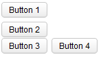
<zk>
    <box orient="vertical">
        <button label="Button 1"/>
        <button label="Button 2"/>
    </box>
    <box orient="horizontal">
        <button label="Button 3"/>
        <button label="Button 4"/>
    </box>
</zk>
Properties
Orient
Default Value: vertical
Sets the orientation of the box, which determines whether children are arranged in a row or a column. Accepts either "horizontal" or "vertical"; any other value throws a WrongValueException. Setting orient is equivalent to setting the mold — <hbox> is a <box orient="horizontal"> and <vbox> is a <box orient="vertical">.
| Value | Meaning |
|---|---|
horizontal |
Children are arranged left-to-right in a single row |
vertical |
Children are arranged top-to-bottom in a single column (default) |
<box orient="horizontal">
    <button label="Left"/>
    <button label="Right"/>
</box>
<box orient="vertical">
    <button label="Top"/>
    <button label="Bottom"/>
</box>
Align
Default Value: start
since 3.0.0
Sets the alignment of children in the cross-axis direction (the axis perpendicular to orient). For a horizontal box this controls vertical alignment; for a vertical box it controls horizontal alignment. Pass null or an empty string to use the browser’s default.
| Value | Meaning |
|---|---|
start |
Children are aligned at the top (horizontal box) or left (vertical box) edge |
center |
Children are centered in the cross-axis |
end |
Children are aligned at the bottom (horizontal box) or right (vertical box) edge |
stretch |
Children are stretched to fill the full cross-axis extent of the box |
See also pack, which controls alignment along the main axis.
<hbox align="center" height="100px">
    <button label="Vertically centered"/>
    <textbox/>
</hbox>
Pack
Default Value: start
since 3.0.0
Sets the alignment of children along the main axis (the axis that matches orient). For a horizontal box this controls horizontal positioning; for a vertical box this controls vertical positioning. Pass null or an empty string to default to "start". The stretch keyword is an extra modifier that can be combined with a positional value (e.g. "stretch,center") to distribute extra space proportionally among children. If a Splitter child is present the box behaves as if stretch is set regardless of this attribute.
| Value | Meaning |
|---|---|
start |
Children packed toward the start (left/top) edge; extra space at the end |
center |
Extra space split equally on both sides, centering the children |
end |
Children packed toward the end (right/bottom) edge; extra space at the start |
stretch |
Extra space distributed proportionally between children (same as stretch,start) |
stretch,start |
Extra per-child space placed after each child |
stretch,center |
Extra per-child space split evenly around each child |
stretch,end |
Extra per-child space placed before each child |
See also align, which controls alignment on the cross axis.
<hbox pack="center" width="400px">
    <button label="One"/>
    <button label="Two"/>
    <button label="Three"/>
</hbox>
Spacing
You can control the spacing among children of the box control. For example, the following example puts 5em at both the upper margin and the lower margin. Notice: the total space between two input fields is 10em.
<vbox spacing="5em">
    <textbox/>
    <datebox/>
</vbox>
Another example illustrated an interesting layout by the use of zero spacing.
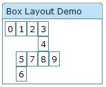
<window title="Box Layout Demo" border="normal">
    <hbox spacing="0">
        <window border="normal">0</window>
        <vbox spacing="0">
            <hbox spacing="0">
                <window border="normal">1</window>
                <window border="normal">2</window>
                <vbox spacing="0">
                    <window border="normal">3</window>
                    <window border="normal">4</window>
                </vbox>
            </hbox>
            <hbox spacing="0">
                <vbox spacing="0">
                    <window border="normal">5</window>
                    <window border="normal">6</window>
                </vbox>
                <window border="normal">7</window>
                <window border="normal">8</window>
                <window border="normal">9</window>
            </hbox>
        </vbox>
    </hbox>
</window>
SizedByContent
Default Value: true
since 5.0.4
Controls whether each cell’s size is determined by its content. When true (the default) each cell shrinks to fit its child. Set to false when the box contains a Splitter together with a grid or other complex component, so that the splitter resizes smoothly.
<hbox sizedByContent="false">
    <grid hflex="1">
        <!-- ... -->
    </grid>
    <splitter/>
    <vbox hflex="1">
        <!-- ... -->
    </vbox>
</hbox>
Supported Molds
| Name | Snapshot |
|---|---|
horizontal |
 |
vertical |
 |
The mold determines the default orientation of the box. horizontal is equivalent to using the <hbox> element; vertical is equivalent to using the <vbox> element. The mold can also be set via the orient attribute.
Supported Events
- Inherited Supported Events: XulElement
Supported Children
*ALL