Splitter
Deprecated since 10.3
- Demonstration: Splitter
- Java API: org.zkoss.zul.Splitter
- JavaScript API: zul.box.Splitter
Employment/Purpose
(Suggest to use Splitlayout)
When the splitter is dragged, the sibling components of the splitter are
resized. If getCollapse() is true, a grippy is placed inside the
splitter, and one sibling component of the splitter is collapsed when
the grippy is clicked.
This component can only be used inside a Box, Vbox, or Hbox.
Common Use Cases
| Version | Description | Example Location |
|---|---|---|
| 5.0 | Used to separate contents within hbox/vbox. |
http://www.zkoss.org/zksandbox/userguide/#l13 |
Example
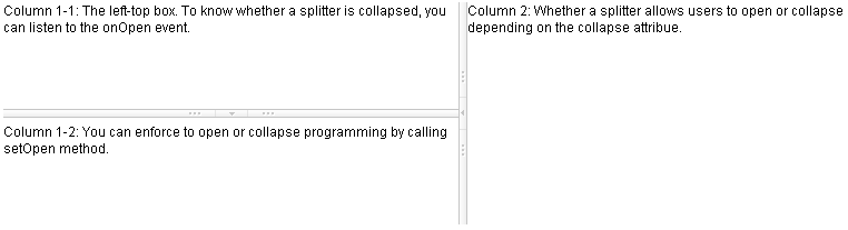
<hbox spacing="0" >
    <vbox height="200px">
        Column 1-1: The left-top box. To know whether a splitter is collapsed,
        you can listen to the onOpen event.
        <splitter collapse="after" />
        Column 1-2: You can enforce to open or collapse programming by calling
        setOpen method.
    </vbox>
    <splitter collapse="before" />
    Column 2: Whether a splitter allows users to open or collapse depending
    on the collapse attribue.
</hbox>
Accessibility
since 9.5.0
Keyboard Support
| Key | Description |
|---|---|
| ArrowUp / ArrowDown | When the splitter is focused, move the splitter vertically. |
| ArrowLeft / ArrowRight | When the splitter is focused, move the splitter horizontally. |
| Enter | If the primary pane is not collapsed, collapse the pane. If the pane is collapsed, restore the splitter to its previous position. |
Labeling with ARIA
To name a component with ARIA attribute by adding the aria-label
client attribute to the component, please refer to
ZK Developer’s Reference/Accessibility#Specify_ARIA_Attributes
Properties
Collapse
The collapse property (org.zkoss.zul.Splitter#setCollapse(java.lang.String)) specifies which side of the splitter is collapsed when its grippy (button) is clicked. If this property is not specified, the splitter will not cause a collapse (and the grippy/button won’t appear).
Allowed values and their meaning are as follows.
| Value | Description |
|---|---|
| none | No collapsing occurs. |
| before | When the grippy is clicked, the element immediately before the splitter in the same parent is collapsed so that its width or height is 0. |
| after | When the grippy is clicked, the element immediately after the splitter in the same parent is collapsed so that its width or height is 0. |
Open
To know whether a splitter is collapsed, you can check the value of the
open property
(org.zkoss.zul.Splitter#isOpen()). To open
or collapse dynamically, you are able to set the value of the open
property
(org.zkoss.zul.Splitter#setOpen(boolean)).
onOpen Event
When a splitter is collapsed or opened by a user, the onOpen event
(org.zkoss.zk.ui.event.OpenEvent) is sent to the
application.
OS Styling
If you want to change the styling to be more similar to OS’s look as follows.
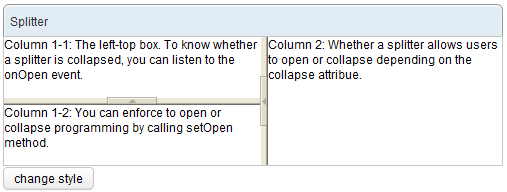
You could specify
org.zkoss.zk.ui.HtmlBasedComponent#setZclass(java.lang.String)
with z-splitter-os-ver or z-splitter-os-hor, depending on the orient
is vertical or horizontal.
Here is an example that switches the styling between the default and OS-look:
<window>
    <panel title="Splitter" border="normal" width="500px">
        <panelchildren>
            <hbox spacing="0"  height="100%">
                <vbox spacing="0"  heights="60px,60px">
                    Column 1-1: The left-top box. To know whether a splitter
                    is collapsed, you can listen to the onOpen event.
                    <splitter id="s1" collapse="before"/>
                    Column 1-2: You can enforce to open or collapse programming
                    by calling setOpen method.
                </vbox>
                <splitter id="s2" collapse="before"/>
                Column 2: Whether a splitter allows users to open or collapse
                depending on the collapse attribue.
            </hbox>
        </panelchildren>
    </panel>
    <button label="change style">
        <attribute name="onClick">
        if ("z-splitter-ver".equals(s1.getZclass()))
            s1.setZclass("z-splitter-os-ver");
        else
            s1.setZclass("z-splitter-ver");
        if ("z-splitter-hor".equals(s2.getZclass()))
            s2.setZclass("z-splitter-os-hor");
        else
            s2.setZclass("z-splitter-hor");
        </attribute>
    </button>
</window>
Supported Events
| Name | Event Type | Description |
|---|---|---|
onOpen |
OpenEvent | Fired when a splitter is collapsed or opened by the user. Use event.isOpen() to check the new state. |
- Inherited Supported Events: XulElement
Supported Molds
Available molds of a component are defined in lang.xml embedded in zul.jar.
| Name | Snapshot |
|---|---|
| default |  |
| os |  |
Supported Children
*NONE