Grid
- Demonstration: Grid
- Java API: org.zkoss.zul.Grid
- JavaScript API: zul.grid.Grid
Employment/Purpose
Components:
grid, columns and column, rows and row, Auxhead and Auxheader
A grid contains components that are aligned in rows like tables.
Inside a grid you place columns, rows, and headers.
Columns defines the header and column attributes. They are declared
with the columns component and assigned as a child element of the
grid. Column declares the common attributes of each column such as
the width and alignment. An optional column header may contain objects
such as a label and/or image. Although columns is optional, if it
exists, notice that the number of its child (column) should equal the
number of child in a row. If columns contains no child, the grid
will display nothing in its content.
Rows hold the content. They are declared with the rows component and
assigned as a child element of grid. Inside rows you should add one
row component for each row of the grid. Inside each row element
you should place child components which contain the content that you
want inside that row. Each child component should align with a
column of the specific row.
Additional auxiliary headers may be added with the auxhead
component. The auxhead must be closely tied with the columns
declaration. For more details see the section on Axillary Headers below.
Example
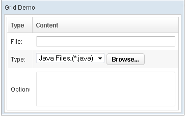
 <window title="Grid Demo" border="normal" width="360px">
     <zscript>
     class Comp implements Comparator {
         private boolean _asc;
         public Comp(boolean asc) {
             _asc = asc;
         }
         public int compare(Object o1, Object o2) {
             String s1 = o1.getChildren().get(0).getValue(),
                 s2 = o2.getChildren().get(0).getValue();
             int v = s1.compareTo(s2);
             return _asc ? v: -v;
         }
     }
     Comp asc = new Comp(true), dsc = new Comp(false);
     </zscript>
     <grid>
         <columns sizable="true">
             <column label="Type" sortAscending="${asc}" sortDescending="${dsc}" width="50px"/>
             <column label="Content"/>
         </columns>
         <rows>
             <row>
                 <label value="File:"/>
                 <textbox width="99%"/>
             </row>
             <row>
                 <label value="Type:"/>
                 <hbox>
                     <listbox rows="1" mold="select">
                         <listitem label="Java Files,(*.java)"/>
                         <listitem label="All Files,(*.*)"/>
                     </listbox>
                     <button label="Browse..."/>
                 </hbox>
             </row>
             <row>
                 <label value="Options:"/>
                 <textbox rows="3" width="99%"/>
             </row>
         </rows>
     </grid>
 </window>

<zk>
    <zscript><![CDATA[
        ListModelList lm = new ListModelList(Arrays.asList(new String[] { "David",
                "Thomas", "Steven" }));
    ]]></zscript>

    <grid model="${lm}" width="300px"
        onAfterRender='gridCount.setValue("row count: "+self.getRows().getChildren().size()+"");' />
    <label id="gridCount" />
</zk>
Common Use Cases
Simple Static Grid
Use inline <rows> and <row> children for small, fixed datasets where live-data model overhead is not warranted.
<grid>
    <columns>
        <column label="Name"/>
        <column label="Department"/>
    </columns>
    <rows>
        <row><label value="Alice"/><label value="Engineering"/></row>
        <row><label value="Bob"/><label value="Marketing"/></row>
    </rows>
</grid>
Model-Driven Grid with Template
Bind a ListModelList via the model attribute and declare the row layout with a <template name="model">. ZK renders only visible rows automatically (ROD).
<zscript><![CDATA[
    ListModelList model = new ListModelList(employees);
]]></zscript>
<grid model="${model}" height="300px">
    <columns>
        <column label="Name"/>
        <column label="Role"/>
    </columns>
    <template name="model">
        <row>
            <label value="${each.name}"/>
            <label value="${each.role}"/>
        </row>
    </template>
</grid>
Paged Grid
Switch to the paging mold to paginate large datasets without scrolling. Set pageSize to control how many rows appear per page.
<grid model="${model}" mold="paging" pageSize="10">
    <columns>
        <column label="Name"/>
    </columns>
    <template name="model">
        <row><label value="${each}"/></row>
    </template>
</grid>
Responsive Stacking Grid (EE)
Use responsive="stacking" with responsiveColumns to collapse columns into card-style blocks on small screens.
<grid model="${model}" responsive="stacking" responsiveColumns="sm-1 md-none">
    <columns>
        <column label="Name"/>
        <column label="Email"/>
        <column label="Phone"/>
    </columns>
    <template name="model">
        <row>
            <label value="${each.name}"/>
            <label value="${each.email}"/>
            <label value="${each.phone}"/>
        </row>
    </template>
</grid>
Master Detail
Grid supports master-detail layout which enables developers to add more information on each row. For example,
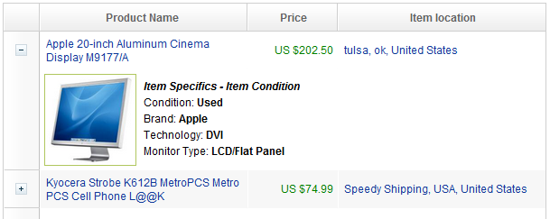
    <rows>
        <row>
            <detail open="true">
                <hlayout>
                    <image sclass="myimg" width="100px" height="100px"
                        src="/img/item1.jpg" />
                    // omitted...
                </hlayout>
            </detail>
- For further details, please refer to Detail component directly.
Columns Menu
For example,
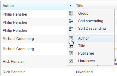
<zk>
    <grid>
        <columns menupopup="auto">
            <column label="Author" sort="auto"/>
            <column label="Title" sort="auto"/>
            <column label="Publisher" sort="auto"/>
            <column label="Hardcover" sort="auto"/>
        </columns>
        // omitted...
    </grid>
</zk>
- For further details, please refer to Columns component directly.
Ungroup Column Menu
When the user groups the content of the grid, the column’s menu will show an ungroup icon for user to reset the group.
since 6.5.0

Note: If the Grid contains with Model, GroupsModel, you have to register an onUngroup event for column to show an ungroup icon and then replace the current model with a ListModel to reset the group.
For example,
<zk>
    <zscript><![CDATA[
  int cnt = 0;
Object[][] foods = new Object[][] {
    new Object[] { "Vegetables", "Asparagus", "Vitamin K", 115, 43},
    new Object[] { "Vegetables", "Beets", "Folate", 33, 74},
    new Object[] { "Vegetables", "Tomatoes", "Vitamin C", 57, 37},
    new Object[] { "Seafood", "Salmon", "Tryptophan", 103, 261},
    new Object[] { "Seafood", "Cod", "Tryptophan", 90, 119}
};
public class FoodGroupRenderer implements RowRenderer {
    public void render(Row row, Object obj, int index) {
        if (row instanceof Group) {
            row.appendChild(new Label(obj.toString()));
        } else {
            Object[] data = (Object[]) obj;
            row.appendChild(new Label(data[0].toString()));
            row.appendChild(new Label(data[1].toString()));
            row.appendChild(new Label(data[2].toString()));
            row.appendChild(new Label(data[3].toString()));
            row.appendChild(new Label(data[4].toString()));
        }
    }
}
ListModelList listmodel = new ListModelList();
for (int i = 0; i < foods.length; i++)
    listmodel.add(foods[i]);
RowRenderer renderer = new FoodGroupRenderer();
GroupsModel model = new GroupsModelArray(foods, new ArrayComparator(0, true));
    ]]></zscript>
    <grid id="grid" model="${model}" rowRenderer="${renderer}">
        <columns menupopup="auto">
            <column label="Category" sort="auto(0)" onGroup='grid.setModel(model)' onUngroup='grid.setModel(listmodel);'/>
            <column label="Name" sort="auto(1)"/>
            <column label="Top Nutrients" sort="auto(2)"/>
            <column label="% of Daily" sort="auto(3)"/>
            <column label="Calories" sort="auto(4)"/>
        </columns>
    </grid>
</zk>
Cell Component
In ZK5, we have introduced a new component named Cell which can be embedded into a Grid or Box (Hbox and Vbox) to fully control the layout and the style. You can now use the rowspan or the colspan property to layout your Grid, for example a content cell can now cross over multiple rows. The code below demonstrates how to do this:
<row>
    <cell sclass="years" rowspan="12">
        ...
    </cell>
</row>
since 5.0.0
- For further details, please refer to Cell component directly.
Group Component
Both Grid, and Listbox support Grouping concept, it enables developers to display data in an advanced way. Moreover, live data are also supported in Grouping Grid, and Listbox with the org.zkoss.zul.GroupsModel interface..
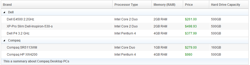
<zk>
    <zscript>
    import org.zkoss.zkdemo.userguide.*;
    Comparator asc = new RowLabelComparator(true),
        dsc = new RowLabelComparator(false);
    </zscript>
    <grid>
        <columns sizable="true">
            <column label="Brand" sortAscending="${asc}" sortDescending="${dsc}"/>
            <column label="Processor Type" width="150px"/>
            <column label="Memory (RAM)" width="120px"/>
            <column label="Price"  width="100px"/>
            <column label="Hard Drive Capacity" width="150px"/>
        </columns>
        <rows>
            <group label="Dell"/>
            <row>
                <label style="padding-left:15px" value="Dell E4500 2.2GHz"/>
                <label value="Intel Core 2 Duo"/>
                <label value="2GB RAM"/>
                <label value="$261.00" style="color:green"/>
                <label value="500GB"/>
            </row>
            <row>
                <label style="padding-left:15px" value="XP-Pro Slim Dell-Inspiron-530-s"/>
                <label value="Intel Core 2 Duo"/>
                <label value="2GB RAM"/>
                <label value="$498.93" style="color:green"/>
                <label value="500GB"/>
            </row>
            <row>
                <label style="padding-left:15px" value="Dell P4 3.2 GHz"/>
                <label value="Intel Pentium 4"/>
                <label value="4GB RAM"/>
                <label value="$377.99" style="color:green"/>
                <label value="500GB"/>
            </row>
            <group label="Compaq"/>
            <row>
                <label style="padding-left:15px" value="Compaq SR5113WM"/>
                <label value="Intel Core Duo"/>
                <label value="1GB RAM"/>
                <label value="$279.00" style="color:green"/>
                <label value="160GB"/>
            </row>
            <row>
                <label style="padding-left:15px" value="Compaq HP XW4200"/>
                <label value="Intel Pentium 4"/>
                <label value="4GB RAM"/>
                <label value="$980" style="color:green"/>
                <label value="500GB"/>
            </row>
            <groupfoot spans="5">
                <label value="This a summary about Compaq Desktop PCs"/>
            </groupfoot>
        </rows>
    </grid>
</zk>
*Available in ZK PE and EE only
For more information, please take a look at these smalltalks,
- Learn About Grouping with Listbox and Grid
- About How Grouping Works with Live Data
- Add Summary Field For Grouping.
Or refer to Group component directly.
Frozen Component
In ZK 5 you are now able to freeze columns within a Grid and Listbox. This mirrors functionality seen within Excel and makes data in these components easier to read, interpret and handle.
The following code demonstrates how to freeze a column within a Grid:
<grid>
    <frozen style="background: #dfded8" columns="3">
        ...
    </frozen>
</grid>
since 5.0.0
- For further details, please refer to Frozen component directly.
Custom Attributes
org.zkoss.zul.grid.rod
[default: false]
[inherit: true]1
It specifies whether to enable ROD (render-on-demand). For more information, please refer to ZK Developer’s Reference: Performance Tips.
org.zkoss.zul.grid.autoSort
[default: false]
[inherit: true]2
since 5.0.7 Specifies whether to sort the model when the following cases:
- org.zkoss.zul.Grid#setModel(ListModel)is called and org.zkoss.zul.Column#setSortDirection(String) is set.
- org.zkoss.zul.Column#setSortDirection(String) is called.
- Model receives org.zkoss.zul.event.ListDataEventand org.zkoss.zul.Column#setSortDirection(String) is set.
If you want to ignore sort when receiving org.zkoss.zul.event.ListDataEvent, you can specifies the value as ignore.change.
org.zkoss.zul.grid.preloadSize
[default: 50]
[inherit: true]3
since 6.0.1 Specifies the number of rows to preload when receiving the rendering request from the client. It is used only if live data (org.zkoss.zul.Grid#setModel(ListModel)) and not paging (org.zkoss.zul.Grid#getPagingChild()).
org.zkoss.zul.grid.initRodSize
[default: 50]
[inherit: true]4
since 6.0.1 Specifies the number of rows rendered when the Grid first render. It is used only if live data (org.zkoss.zul.Grid#setModel(ListModel)) and not paging (org.zkoss.zul.Grid#getPagingChild()).
org.zkoss.zul.grid.autohidePaging
[default: true]
[inherit: true]5
since 7.0.1
It specifies whether to enable autohide property for internal paging components.
Paging
The listbox and grid components support the paging intrinsically, so
you don’t need to specify a paging component explicitly as above unless
you want to have different visual layout or to control multiple
listbox and gridcontrols with one paging component.
Data Model with Paging
since 8.0.0
If listbox or grid component is used with a data model, we recommend
you control paging from the model directly. Although specifying page
size and active page on the component is still supported, model now
provides api for paging control, which makes using model more
convenient.
    <zscript><![CDATA[
    import org.zkoss.zul.ext.Pageable;

    List model = new ListModelList(Locale.getAvailableLocales());
    public void next(){
         int activePage = ((Pageable)model).getActivePage();
        ((Pageable)model).setActivePage(activePage + 1);
    }

    public void previous(){
        int activePage = ((Pageable)model).getActivePage();
        if (--activePage < 0 ){
            activePage = 0;
        }
        ((Pageable)model).setActivePage(activePage);
    }
    ]]></zscript>
    <grid model="${model}" mold="paging" pageSize="5">
        <columns>
            <column label="Locale"/>
        </columns>
        <template name="model">
            <row>
                ${each}
            </row>
        </template>
    </grid>
    <button label="Next" onClick="next()"/>
    <button label="Previous" onClick="previous()"/>
Grids with Paging
There are two ways to handle large content in a grid: scrolling and
paging. Scrolling is enabled by setting the height attribute as
discussed in the previous section. Paging is enabled by setting the
mold attribute to paging. Once paging is enabled, the grid separates
the content into several pages and displays one page at a time as
depicted below.
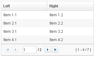
<grid width="300px" mold="paging" pageSize="4">
    <columns>
        <column label="Left"/>
        <column label="Right"/>
    </columns>
    <rows>
        <row>
            <label value="Item 1.1"/><label value="Item 1.2"/>
        </row>
        <row>
            <label value="Item 2.1"/><label value="Item 2.2"/>
        </row>
        <row>
            <label value="Item 3.1"/><label value="Item 3.2"/>
        </row>
        <row>
            <label value="Item 4.1"/><label value="Item 4.2"/>
        </row>
        <row>
            <label value="Item 5.1"/><label value="Item 5.2"/>
        </row>
        <row>
            <label value="Item 6.1"/><label value="Item 6.2"/>
        </row>
        <row>
            <label value="Item 7.1"/><label value="Item 7.2"/>
        </row>
    </rows>
</grid>
Once the paging mold is set, the grid creates an instance of a Paging
component as the Grid’s child and the paging component in turn
handles the Grid’s paging. Therefore, the number of the Grid’s
children includes the paging component. Also, if you remove all children
of the grid, the paging is also removed.
The PageSize Property
Having set the paging mold, you can specify how many rows are visible
at a time (i.e., the page size) by setting the pageSize attribute to a
numeric value. By default, it is 20.
The Paginal Property
If you prefer to place the Paging
component in a different location or if you want to control two or more
grids with the same Paging, you
can assign the paginal attribute explicitly. Note: if it is not set
explicitly, it is the same as the paging property.
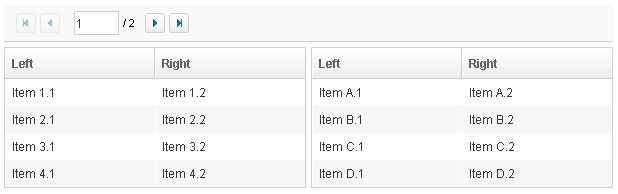
<vbox>
    <paging id="pg" pageSize="4"/>
    <hbox>
        <grid width="300px" mold="paging" paginal="${pg}">
            <columns>
                <column label="Left"/><column label="Right"/>
            </columns>
            <rows>
                <row>
                    <label value="Item 1.1"/><label value="Item 1.2"/>
                </row>
                <row>
                    <label value="Item 2.1"/><label value="Item 2.2"/>
                </row>
                <row>
                    <label value="Item 3.1"/><label value="Item 3.2"/>
                </row>
                <row>
                    <label value="Item 4.1"/><label value="Item 4.2"/>
                </row>
                <row>
                    <label value="Item 5.1"/><label value="Item 5.2"/>
                </row>
                <row>
                    <label value="Item 6.1"/><label value="Item 6.2"/>
                </row>
                <row>
                    <label value="Item 7.1"/><label value="Item 7.2"/>
                </row>
            </rows>
        </grid>
        <grid width="300px" mold="paging" paginal="${pg}">
            <columns>
                <column label="Left"/><column label="Right"/>
            </columns>
            <rows>
                <row>
                    <label value="Item A.1"/><label value="Item A.2"/>
                </row>
                <row>
                    <label value="Item B.1"/><label value="Item B.2"/>
                </row>
                <row>
                    <label value="Item C.1"/><label value="Item C.2"/>
                </row>
                <row>
                    <label value="Item D.1"/><label value="Item D.2"/>
                </row>
                <row>
                    <label value="Item E.1"/><label value="Item E.2"/>
                </row>
                <row>
                    <label value="Item F.1"/><label value="Item F.2"/>
                </row>
            </rows>
        </grid>
    </hbox>
</vbox>
The Paging Property
It is a read-only attribute representing the child Paging
component that is created automatically. It is null if you assign
external paging via the paginal attribute. You rarely need to access
this attribute as it is generally better to use the paginal attribute.
The PagingDisabled Property
since 8.0.3
Once the pagingDisabled is set to
true, users will be blocked from navigating through the pagination.
The onPaging Event and Method
Once a user clicks the page number of the paging component, an
onPaging event is sent the grid. It is then processed by the
onPaging method. By default, the method invalidates, i.e., redraws,
the content of rows.
If you want to implement “create-on-demand” feature, you can add a event
listener to the grid for the onPaging event. The line below
demonstrates how to add an EventListener.
grid.addEventListener(org.zkoss.zul.event.ZulEvents.ON_PAGING, new MyListener());
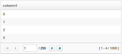
Autopaging
since 5.0.2
When using the paging mold and vflex, you could also turn on autopaging (org.zkoss.zul.Grid#setAutopaging(boolean)) such that the page size will be adjusted automatically based on the available space.
For example,
<grid id="grid" autopaging="true" mold="paging" vflex="1">
    <columns>
        <column label="column1"/>
    </columns>
    <rows>
        <row forEach="${items}">
         ${each}
        </row>
    </rows>
</grid>
Note: Autopaging depends on a fixed row height for all rows (i.e.
you can’t use line wrapping text in cells or the <details> component). Because of that, once enabled, ZK will apply fixed height
for each row with the following CSS by default. If you want to change
the height, please overwrite the CSS rule as your preference. But this
feature only works when each row has the same height.
.z-grid-autopaging .z-row-cnt {
    height: 30px;
    overflow: hidden;
}
since 5.0.8 Note: In ZK 7, we change the naming .z-row-cnt to .z-row-content. since 7.0.3
Sort
Sorting by Comparator
Grids support the direct sorting of rows. To enable ascending order
sorting for a particular column, you need to assign a
java.util.Comparator instance to the sortAscending attribute of the
column. Similarly, you assign a comparator to the sortDescending
property to enable the descending order.
As illustrated below, you first implement a comparator that compares any
two rows of the grid, and then assign its instances to the
sortAscending and/or sortDescending attributes. Notice: the
compare method is passed two org.zkoss.zul.Row
instances.
<zk>
    <zscript>
         class MyRowComparator implements Comparator {
             public MyRowComparator(boolean ascending) {
             ...
             }
             public int compare(Object o1, Object o2) {
                 Row r1 = (Row)o1, r2 = (Row)o2;
                 ....
             }
         }
         Comparator asc = new MyRowComparator(true);
         Comparator dsc = new MyRowComparator(false);
    </zscript>
    <grid>
        <columns>
            <column sortAscending="${asc}" sortDescending="${dsc}"/>
 ...
The onSort Event
When you assign at least one comparator to a column, an onSort event
is sent to the server if user clicks on it. The column component
implements a listener to automatically sort rows based on the assigned
comparator.
If you prefer to handle this manually, you can add your own listener to
the column for the onSort event. To prevent the default listener to
invoking the sort method, you have to call the stopPropagation
method for the event being received. Alternatively, you can override the
sort method, see below.
The sortDirection Property
The sortDirection property controls whether to show an icon to
indicate the order of a particular column. If rows are sorted before
being added to the grid, you should set this property explicitly.
<column sortDirection="ascending"/>
It is then maintained automatically by the grid as long as you assign the comparators to the corresponding column.
The sort Method
The sort method is the underlying implementation of the default
onSort event listener. It is also useful if you want to sort the rows
using Java code. For example, you might have to call this method after
adding rows (assuming they not in the proper order).
Row row = new Row();
row.setParent(rows);
row.appendChild(...);
...
if (!"natural".column.getSortDirection())
    column.sort("ascending".equals(column.getSortDirection()));
The default sorting algorithm is quick-sort (by use of the sort method
from the org.zkoss.zk.ui.Components class). You can
override it with your own implementation.
Note: the sort method checks the sort direction (by calling
getSortDirection). It sorts the rows only if the sort direction is
different. To enforce the sorting, do as follows.
column.setSortDirection("natural");
sort(myorder);
The above code is equivalent to the following.
sort(myorder, true);
See more about sorting Multiple Field Sorting onListbox.
Live Data
Like list boxes, grids support live data. With live data, developers are able to separate the data from the view. In other words, developers only need to provide the data by implementing the org.zkoss.zul.ListModel interface, rather than manipulating the grid directly. The benefits are twofold.
- It is easier to use different views to show the same set of data.
- The grid sends the data to the client only if it is visible. It saves a lot of network traffic if the amount of data is large.
There are three steps to make use of live data.
1 Prepare the data in the form of a ListModel. ZK has a concrete
implementation called org.zkoss.zul.SimpleListModel
for representing an array of objects. 2 Implement the
org.zkoss.zul.RowRenderer interface
for rendering a row of data into the grid.
-
- This is optional. If it is not specified the default renderer is used to render the data into the first column.
- You can implement different renderers for representing the same data in different views.
3 Set the data in the model attribute and, optionally, the renderer in
the rowRenderer attribute.
In the following example, we prepared a list model called strset,
assign it to a grid using the model attribute. Then, the grid will do
the rest.
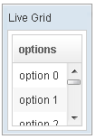
<window title="Live Grid" border="normal" width="100px">
    <zscript><![CDATA[
        String[] data = new String[30];
        for(int j=0; j < data.length; ++j) {
            data[j] = "option "+j;
        }
        ListModel strset = new SimpleListModel(data);
        ]]></zscript>
    <grid height="100px" model="${strset}">
        <columns>
            <column label="options"/>
        </columns>
    </grid>
</window>
Sorting with Live Data
If you allow users to sort a grid with live data, you have to implement the interface, org.zkoss.zul.ext.Sortable, in addition to the org.zkoss.zul.ListModel.
class MyListModel implements ListModel, Sortable {
    public void sort(Comparator cmpr, boolean ascending) {
        //do the real sorting
        //notify the grid (or listbox) that data is changed by use of ListDataEvent
    }
}
When a user wants to sort the grid, the grid will invoke the sort
method of Sortable to sort the data. In other words, the sorting
is done by the list model, rather than the grid.
After sorting, the list model will notify the grid by invoking the
onChange method of the grid’s registered
org.zkoss.zul.event.ListDataListener
instances. These are registered by the addListDataListener method. In
most cases, all the data is changed, so the list model usually sends the
following event:
new ListDataEvent(this, ListDataEvent.CONTENTS_CHANGED, -1, -1)
Scroll to a Specific Item
since 8.5.2
You can call scrollToIndex(int) to scroll a Grid to a specific item,
and this even works under ROD.
Scrollable Grid
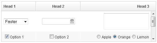
A grid can be scrollable and has a frozen header if you specify the
height attribute and there is not enough space to display all data.
<grid span="true" sizedByContent="true" width="500px" height="130px">
    <columns>
        <column label="Head 1"/>
        <column label="Head 2" align="center"/>
        <column label="Head 3" align="right"/>
    </columns>
    <rows>
        <row>
            <listbox mold="select">
                <listitem label="Faster"/>
                <listitem label="Fast"/>
                <listitem label="Average"/>
            </listbox>
            <datebox/>
            <textbox rows="2"/>
        </row>
        <row>
            <checkbox checked="true" label="Option 1"/>
            <checkbox label="Option 2"/>
            <radiogroup>
                <radio label="Apple"/>
                <radio label="Orange" checked="true"/>
                <radio label="Lemon"/>
            </radiogroup>
        </row>
        <row>
            <checkbox checked="true" label="Option 1"/>
            <checkbox label="Option 2"/>
            <radiogroup orient="vertical">
                <radio label="Apple"/>
                <radio label="Orange" checked="true"/>
                <radio label="Lemon"/>
            </radiogroup>
        </row>
    </rows>
</grid>
since 7.0.0
The browser’s default scrollbar is replaced by floating scrollbar and it is not visible unless user mouse over on the content. To turn off the floating scrollbar and use original scrollbar, please add the following configuration in zk.xml.
<library-property>
    <name>org.zkoss.zul.nativebar</name>
    <value>true</value>
</library-property>
Note: the value of org.zkoss.zul.nativebar is true by default (since 7.0.2)
Auxiliary Headers
In addition to column headers, you can specify auxiliary headers with
the auxhead and auxheader components as follows.
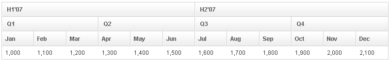
<grid>
    <auxhead>
        <auxheader label="H1'07" colspan="6"/>
        <auxheader label="H2'07" colspan="6"/>
    </auxhead>
    <auxhead>
        <auxheader label="Q1" colspan="3"/>
        <auxheader label="Q2" colspan="3"/>
        <auxheader label="Q3" colspan="3"/>
        <auxheader label="Q4" colspan="3"/>
    </auxhead>
    <columns>
        <column label="Jan"/><column label="Feb"/><column label="Mar"/>
        <column label="Apr"/><column label="May"/><column label="Jun"/>
        <column label="Jul"/><column label="Aug"/><column label="Sep"/>
        <column label="Oct"/><column label="Nov"/><column label="Dec"/>
    </columns>
    <rows>
        <row>
        <label value="1,000"/><label value="1,100"/><label value="1,200"/>
        <label value="1,300"/><label value="1,400"/><label value="1,500"/>
        <label value="1,600"/><label value="1,700"/><label value="1,800"/>
        <label value="1,900"/><label value="2,000"/><label value="2,100"/>
        </row>
    </rows>
</grid>
The auxiliary headers support the colspan and rowspan attributes
that the column headers don’t. Auxiliary headers must be placed in
relation to a column. Without the specific declaration of columns
auxiliary headers are ignored.
Unlike column/columns, which can only be used with grid,
auxhead/auxheader can be used with grid, listbox and tree.
The Limitation of rowspan
For better performance, every instance of
Column will create
an invisible HTML TH element called faker. However, with some complex
combination of rowspan and colspan, Grid might not be able to
generate the correct number of faker to represent each column.
For example, it is wrong if the number of the column components are not the same as the number of columns in each row as shown below:
<grid width="200px">
    <auxhead>
        <auxheader label="A" rowspan="2" />
        <auxheader label="BC" colspan="2" />
        <auxheader label="D" rowspan="2" />
    </auxhead>
    <columns><!-- this is wrong since the number of column components is smaller -->
        <column label="B"/>
        <column label="C"/>
    </columns>
    <rows>
        <row>
            <label forEach="E,F,G,H" value="${each}"/><!-- four columns -->
        </row>
    </rows>
</grid>
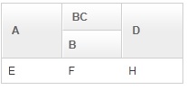
As shown above, the column with label C will be invisible, because the fakers are not created correctly. Here is the result but wrong DOM structure:
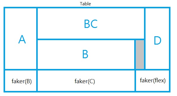
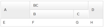
There is a simple workaround: specify all columns. If you don’t want to show all columns, you could use Auxheader instead of Column, and then add an empty Columns. For example, the code in the previous example can be fixed as follows:
<grid width="200px">
    <auxhead>
        <auxheader label="A" rowspan="2" />
        <auxheader label="BC" colspan="2" />
        <auxheader label="D" rowspan="2" />
    </auxhead>
    <auxhead>
        <auxheader label="B"/>
        <auxheader label="C"/>
    </auxhead>
    <columns/> <!-- use an empty columns to make fakers created correctly -->
    <rows>
        <row>
            <label forEach="E,F,G,H" value="${each}"/>
        </row>
    </rows>
</grid>
The other limitation is that the width of the Auxheader component will depend the Column component. Thus, if you’d like to specify the width in the Column component, please note that it will take some space even if there are no label in all Column components. The workaround is simple: make the empty Columns component invisible. For example,
<grid width="350px">
    <auxhead>
        <auxheader label="A" rowspan="2" />
        <auxheader label="BC" colspan="2" />
        <auxheader label="D" rowspan="2" />
    </auxhead>
    <auxhead>
        <auxheader label="B"/>
        <auxheader label="C"/>
    </auxhead>
    <columns visible="false"><!-- make it invisible -->
        <column width="100px"/><!-- specify width here -->
        <column width="150px"/>
        <column width="50px"/>
        <column width="50px"/>
    </columns>
    <rows>
        <row>
            <label forEach="E,F,G,H" value="${each}"/>
        </row>
    </rows>
</grid>
Properties
SizedByContent
By default, Grid evenly distributes the total width among each column, so each column has the same width. However, if you specify this attribute to true, Grid will adjust each column width to just fit its content automatically. However, as it is controlled by a browser, you will have no 100% control of it.
In general, we suggest specifying hflex="min" in a column, rather than
specifying sizedByContent a grid for a much more predictable result.
Span
By default, when sizedByContent is true, a column only takes the required space.
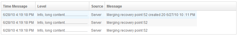
If you want to span the width of the columns to occupy the whole grid, you could specify true to this attribute
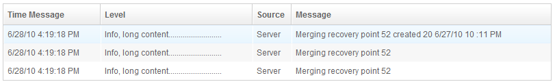
    <grid sizedByContent="true" span="true" width="800px">
        <columns>
            <column label="Time Message" />
            <column label="Level" />
            <column label="Source " />
            <column label="Message" />
        </columns>
        <rows>
            <row>
                <label value="6/28/10 4:19:18 PM" />
                <label value="Info, long content.........................." />
                <label value="Server" />
                <label value="Merging recovery point 52 created 20 6/27/10 10 :11 PM" />
            </row>
        </rows>
    </grid>
Conflict with hflex
hflex means to determine the width by specified proportion values, but
sizedbyContent means to determine the widths by content. By
definitions, these 2 attributes conflict with each other. You should use
either one of them.
emptyMessage
since 5.0.7 Specify a string at this attribute to show a message when a Grid has no items.
        <grid emptyMessage="No items match your search">
        </grid>
Sizable
If you allow users to resize the width of your columns, you can set the
sizable attribute of your columns as true. Once allowed, users can
resize the widths of columns by dragging the border between adjacent
column components.
<window>
    <grid>
        <columns id="cs" sizable="true">
            <column label="AA"/>
            <column label="BB"/>
            <column label="CC"/>
        </columns>
        <rows>
            <row>
                <label value="AA01"/>
                <label value="BB01"/>
                <label value="CC01"/>
            </row>
            <row>
                <label value="AA01"/>
                <label value="BB01"/>
                <label value="CC01"/>
            </row>
            <row>
                <label value="AA01"/>
                <label value="BB01"/>
                <label value="CC01"/>
            </row>
        </rows>
    </grid>
    <checkbox label="sizeable" checked="true" onCheck="cs.sizeable = self.checked"/>
</window>
Auto Fitting Columns
since 5.0.0 When you want to resize a column of a Grid or Listbox, all you now need to do is double-click the column when the mouse is over where the columns meet and the column will automatically resize to fit its contents. To enable this functionality Grid’s columns need the attribute sizable=”true”. In other words, all sizable column provides the auto-fitting functionality.
The onColSize Event
Once a user resizes the width, the onColSize event is sent with an
instance of org.zkoss.zul.event.ColSizeEvent. Notice
that the column’s width is adjusted before theonColSize event is sent.
In other words, the event serves as a notification that you can ignore.
Of course, you can do whatever you want in the event listener.
Column Span and Row Span (colspan, rowspan)
Removed Since 10.0
Using the spans attribute of row is no longer supported since ZK 10.
Instead, you should use the cell component with colspan and rowspan attributes to span cells over multiple columns or rows. Compared to the legacy row-level spans attribute (which only allowed column spanning), using the <cell> component provides the following benefits:
- Cell-Level Control: You can control alignment and spanning directly on the individual cell level, rather than being restricted to row-level configurations.
- Support for both Row and Column Spanning: By supporting both horizontal column spanning (
colspan) and vertical row spanning (rowspan) (similar to standard HTML<td>behaviors), it offers much greater layout flexibility.
[!IMPORTANT] DOM Structure and CSS Styling Implications Under the hood, using
<cell>generates a different DOM structure compared to regular row items (it lacks the innerdivwrapper and uses thez-cellclass). Mixing<cell>and regular components in the same grid can lead to an inconsistent DOM structure, which may cause unexpected behavior when applying custom DOM-level CSS styling. Before mixing<cell>and regular components, please review the styling impacts and best practice recommendations in the Comparison to the default (no Cell) scenario section under the Cell component reference.
For example,
<grid>
    <columns>
        <column label="Left" align="left"/>
        <column label="Center" align="center"/>
        <column label="Right" align="right"/>
        <column label="Column 4"/>
        <column label="Column 5"/>
        <column label="Column 6"/>
    </columns>
    <rows>
        <row>
            <label value="Item A.1"/>
            <label value="Item A.2"/>
            <label value="Item A.3"/>
            <label value="Item A.4"/>
            <label value="Item A.5"/>
            <label value="Item A.6"/>
        </row>
        <row>
            <label value="Item B.1"/>
            <label value="Item B.2"/>
            <cell colspan="2">
                <label value="Item B.4"/>
            </cell>
            <cell colspan="2">
                <label value="Item B.6"/>
            </cell>
        </row>
        <row>
            <cell colspan="3">
                <label value="Item C.1"/>
            </cell>
            <label value="Item C.4"/>
            <label value="Item C.5"/>
            <label value="Item C.6"/>
        </row>
        <row>
            <label value="Item D.1"/>
            <label value="Item D.2"/>
            <cell colspan="2">
                <label value="Item D.3"/>
            </cell>
            <cell colspan="2">
                <label value="Item D.5"/>
            </cell>
        </row>
    </rows>
</grid>
Visible Rows
since 8.5.0
The visibleRows attribute is used to control how many rows are
visible. By setting it to zero, the grid will resize itself to hold as
many as items if possible.
Sticky Header
since 9.6.0
After adding a sclass “z-sticky-header”, when we scroll down a page and make a Grid’s header out of visible range in a viewport, the Grid’s header becomes floating and sticky on the top of the page.
  <grid sclass="z-sticky-header">
    <!-- columns, rows... -->
  </grid>
InnerWidth
Default Value: "100%"
Sets the inner width of the inner table rendered by the grid. By default the inner width equals the component width. Developers typically need to set this only when restoring user-resized column widths across page loads — store both the column widths and the innerWidth, then reapply them when the component is recreated.
<grid innerWidth="600px">
    <columns>
        <column label="Name" width="200px"/>
        <column label="Value" width="400px"/>
    </columns>
    <rows/>
</grid>
Model
since 3.5.0
Associates a ListModel (or GroupsModel) with the grid to enable live data rendering. When a model is set the grid renders only the visible rows on demand (ROD), which dramatically reduces network traffic for large datasets. If you pass a GroupsModel, the grid wraps it internally so getModel() still returns a ListModel instance.
Pairing model with a rowRenderer lets you control exactly how each row is rendered. If no renderer is provided the default renderer places each element into the first column.
<zscript><![CDATA[
    ListModelList model = new ListModelList(Arrays.asList("Alpha", "Beta", "Gamma"));
]]></zscript>
<grid model="${model}">
    <columns>
        <column label="Item"/>
    </columns>
    <template name="model">
        <row>
            <label value="${each}"/>
        </row>
    </template>
</grid>
OddRowSclass
Default Value: "{zclass}-odd" (e.g. "z-grid-odd")
Sets the CSS style class applied to odd-numbered rows to produce a zebra-striped effect. If the specified class does not exist in the stylesheet the striping effect disappears. Pass an empty string or null to restore the default class.
<grid oddRowSclass="my-odd-row">
    <columns>
        <column label="Name"/>
        <column label="Value"/>
    </columns>
    <rows>
        <row><label value="A"/><label value="1"/></row>
        <row><label value="B"/><label value="2"/></row>
    </rows>
</grid>
Paginal
Specifies an external Paging component that controls this grid’s paging. Useful when you want the paging bar in a different location on the page, or when a single paging component drives multiple grids simultaneously. Only relevant when the grid mold is "paging"; setting it for other molds has no effect.
If paginal is not set explicitly and the mold is "paging", the grid creates its own internal child Paging component automatically.
<paging id="pg" pageSize="5"/>
<grid mold="paging" paginal="${pg}">
    <columns>
        <column label="Name"/>
    </columns>
    <rows>
        <row forEach="${items}"><label value="${each}"/></row>
    </rows>
</grid>
Responsive
since 10.4.0
Default Value: null (inherits from org.zkoss.zul.grid.responsive library property)
Sets the responsive policy for the grid. When set to "stacking", columns collapse into vertical key-value card blocks when the container width falls below the configured breakpoint (ZK EE). Set to "none" to explicitly disable responsive behaviour even if a global setting is active.
| Value | Meaning |
|---|---|
"stacking" |
Columns stack vertically at narrow widths (EE only). |
"none" |
Disables responsive mode, overriding any global library setting. |
null |
Inherits from org.zkoss.zul.grid.responsive library property; no responsive if unset. |
Any value other than the three above throws WrongValueException.
<grid responsive="stacking" responsiveColumns="sm-1 md-none">
    <columns>
        <column label="Name"/>
        <column label="Value"/>
    </columns>
    <rows/>
</grid>
ResponsiveColumns
since 10.4.0
Default Value: null (inherits from org.zkoss.zul.grid.responsive.columns library property; framework default resolved by the client is "sm-1 md-none")
Sets the responsive columns token string used in stacking mode. The value is a whitespace-separated list of Bootstrap-style breakpoint tokens in the form <breakpoint>-<value>, where breakpoint is one of sm, md, lg, xl, xxl and value is either a positive integer (number of cards per row in stacking layout) or none (switch back to table layout at and above this breakpoint). The string is stored verbatim; parsing and cascade resolution happen on the client side. Invalid tokens are silently dropped by the client resolver.
This attribute has no effect unless responsive="stacking" is also set (or inherited).
<grid responsive="stacking" responsiveColumns="sm-1 md-2 lg-none">
    <columns>
        <column label="Name"/>
        <column label="Department"/>
        <column label="Salary"/>
    </columns>
    <rows/>
</grid>
RowRenderer
Sets a custom renderer used to populate each Row when the grid is driven by a model. If no renderer is set, the default renderer places each data element as a label in the first column.
Changing the renderer after a model is already attached does not automatically re-render the grid. To force a re-render, re-assign the same model: grid.setModel(grid.getModel()).
<zscript><![CDATA[
    import org.zkoss.zul.*;
    ListModelList model = new ListModelList(Arrays.asList("Alice", "Bob", "Carol"));
    RowRenderer renderer = new RowRenderer() {
        public void render(Row row, Object data, int index) {
            row.appendChild(new Label(String.valueOf(index + 1)));
            row.appendChild(new Label(data.toString()));
        }
    };
]]></zscript>
<grid model="${model}" rowRenderer="${renderer}">
    <columns>
        <column label="#"/>
        <column label="Name"/>
    </columns>
</grid>
Vflex
since 3.5.0
Default Value: false
Enables vertical flexibility so the grid grows and shrinks to fill its available vertical space. Cannot be combined with visibleRows — setting both throws UiException. Commonly used together with autopaging="true" and mold="paging" to let the grid auto-calculate the page size based on visible height.
<vlayout height="400px">
    <grid vflex="1" mold="paging" autopaging="true">
        <columns>
            <column label="Name"/>
            <column label="Value"/>
        </columns>
        <rows>
            <row forEach="${items}">
                <label value="${each.name}"/>
                <label value="${each.value}"/>
            </row>
        </rows>
    </grid>
</vlayout>
Supported Events
| Name | Event Type | Description |
|—|—|—|
| onPageSize | Event: org.zkoss.zul.event.PageSizeEvent | Notifies the paging size has been changed when the autopaging (org.zkoss.zul.Grid#setAutopaging(boolean)) is enabled and user changed the size of the content. |
| onRender | Event: org.zkoss.zul.event.RenderEvent | Notifies the grid to render a set of rows that the client has requested. Used internally by the ROD (render-on-demand) mechanism; rarely handled by application code directly. |
| onInnerWidth | Event: org.zkoss.zk.ui.event.Event | Sent by the client when the user resizes a column, causing the inner table width to change. The grid updates its innerWidth field automatically; application code can listen to this event to persist the new width. |
| onScrollPos | Event: org.zkoss.zk.ui.event.Event | Sent by the client when the grid’s scroll position changes. The grid updates its internal currentTop and currentLeft fields; application code rarely needs to handle this event directly. |
| onTopPad | Event: org.zkoss.zk.ui.event.Event | Sent by the client to report the top padding offset used by the ROD virtual scroller. Handled internally; not typically used by application code. |
| onDataLoading | Event: org.zkoss.zul.event.DataLoadingEvent | Fired when the grid requests a new batch of rows from the server under ROD. Applications can listen to this event to intercept or react to data loading, e.g., showing a loading indicator. |
| onResponsiveModeChange | Event: org.zkoss.zk.ui.event.Event |
since 10.4.0
Fired by the client when the grid’s resolved stacking mode transitions between "table" and "stacking" (ZK EE). Applications can listen to adapt UI elements to the current layout mode. |
- Inherited Supported Events: XulElement
Supported Molds
Available molds of a component are defined in lang.xml embedded in zul.jar.
| Name | Snapshot |
|---|---|
| default |  |
| paging |  |