Coachmark
- Demonstration: Coachmark
- Java API: org.zkoss.zkmax.zul.Coachmark
- JavaScript API: zkmax.nav.Coachmark
since 9.0.0
Employment/Purpose
Coachmark is used to attract users’ attention to the target component and display a dialog. Once a coachmark is opened, the background mask will be displayed and the target component will be highlighted.The content of coachmark should be as relevant as possible to the context. You can use more than one coachmarks to guide users to perform a series of operations in the desired order.
Common Use Cases
Single-Step Onboarding Highlight
Use a single coachmark to draw attention to a new or important UI element when the page loads. By default the coachmark opens immediately; set visible="false" and call open() programmatically when you want to delay it.
<button id="saveBtn" label="Save" />
<coachmark target="saveBtn">
    <label>New! Click Save to store your changes automatically.</label>
    <button label="Got it" onClick="self.parent.close()" />
</coachmark>
Multi-Step Guided Tour
Chain multiple coachmarks with the next attribute to walk the user through a sequence of steps. Set every coachmark after the first to visible="false" so only the first one opens on load. Use onTargetClick to advance automatically when the highlighted element is clicked, or call next() from any event handler.
<button id="step1Btn" label="Step 1" />
<coachmark target="step1Btn" next="cm2" onTargetClick="self.next()">
    Click here to begin.
</coachmark>

<button id="step2Btn" label="Step 2" />
<coachmark id="cm2" target="step2Btn" next="cm3" onTargetClick="self.next()" visible="false">
    Now click Step 2.
</coachmark>

<button id="step3Btn" label="Step 3" />
<coachmark id="cm3" target="step3Btn" onTargetClick="self.close()" visible="false">
    Finally, click Step 3 to finish.
</coachmark>
Controlling Position
Use the position attribute to place the coachmark dialog relative to its target. The default is after_center (below the target, centered). Change it when the default placement overlaps other content.
<button id="topBtn" label="Top Action" />
<coachmark target="topBtn" position="before_center">
    This action appears at the top of the toolbar.
</coachmark>
Example
Basic
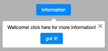
    <button id="infoButton" label="Information" />
    <coachmark target="infoButton" onTargetClick="self.close()">
        <label>Wellcome! click here for more information!</label>
        <button style="display: block;margin: 10px auto 0" label="got it!" onClick="self.parent.close()"/>
    </coachmark>
Multiple Steps
        <button label="Step 1" sclass="big-margin"/>
        <coachmark target="${self.previousSibling}" next="mark2" onTargetClick="self.next()" >
            click here
        </coachmark>
        <button id="s2" label="Step 2" sclass="big-margin"/>
        <coachmark id="mark2" target="${self.previousSibling}" next="mark3" onTargetClick="self.next()" visible="false">
            click here
        </coachmark>
        <button label="Step 3" sclass="big-margin"/>
        <coachmark id="mark3" target="${self.previousSibling}" onTargetClick="self.next()" visible="false">
            click here
        </coachmark>
- Line 2: need to specify
nextandonTargetClick
Supported Browsers
This component uses CSS keyframes. Browsers that support CSS keyframes (IE10+, Edge, Chrome, Firefox, Safari) are compatible with this feature. Please check browser compatibility.
Open / Close the Coachmark
By default, a Coachmark opens itself after a page loading without user
interaction. If you want to open a Coachmark in a specific timing,
please set visible="false".
Both visible attribute and open/close methods allow you to open or
close the Coachmark.
Properties
Target
The target component that the Coachmark will point itself to. You need
to specify a component’s id or an EL expression that resolved to a
component e.g. ${self.previousSibling}
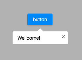
    <button id="infoButton" label="button"/>
    <coachmark target="infoButton">
            <label>Wellcome!</label>
    </coachmark>
Position
Default: after_center
The positions of a coachmark. Below are the available values:
| start/before | center | end/after | |
|---|---|---|---|
| top | before_start | before_center | before_end |
| bottom | after_start | after_center | after_end |
| left | start_before | start_center | start_after |
| right | end_before | end_center | end_after |
See Popup#Position
Next
You need to specify a Coachmark’s id or an EL expression that resolved
to a Coachmark e.g. ${self.previousSibling}
The next Coachmark will be opened when the onTargetClick event or the
next() is called.
Note: if you call next(Coachmark coachmark), it will open the
specified coachmark instead of the predefined “next” coachmark.
Open Next Coachmark Programmatically
next(): Closes the current coachmark and opens the next one.next(Coachmark coachmark): Close the current coachmark and open the one you passed. (ignore the next coachmark you already set)
Supported Events
| Name | Event Type | Description |
|---|---|---|
onOpen |
org.zkoss.zk.ui.event.OpenEvent | Denotes that the user has opened or closed a component. Note: unlike onClose, this event is only a notification. The client sends this event after the component is opened or closed. |
onTargetClick |
org.zkoss.zk.ui.event.MouseEvent | Represents an event caused by a user’s click on a highlighted target component. |
- Inherited Supported Events: XulElement
Supported Children
*ALL