Treeitem
- Demonstration: Tree (Dynamic Styling)
- Java API: org.zkoss.zul.Treeitem
- JavaScript API: zul.sel.Treeitem
Employment/Purpose
Treeitemcontains a row of data (treerow),and an optional
treechildren.
If the component doesn’t contain a treechildren,it is a leaf node that
doesn’t accept any child items.
If it contains a treechildren,it is a branch node that might contain
other items.
For a branch node, an +/- button will appear at the beginning of the row, such that user could open and close the item by clicking on the +/- button.
Example
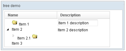
<window title="tree demo" border="normal" width="400px">
    <tree id="tree" width="90%">
        <treecols sizable="true">
            <treecol label="Name" />
            <treecol label="Description" />
        </treecols>
        <treechildren>
            <treeitem>
                <treerow>
                    <treecell>
                        <image src="/img/folder.gif" />
                        Item 1
                    </treecell>
                    <treecell>
                        <textbox value="Item 1 description" />
                    </treecell>
                </treerow>
            </treeitem>
            <treeitem>
                <treerow>
                    <treecell label="Item 2" />
                    <treecell label="Item 2 description" />
                </treerow>
                <treechildren>
                    <treeitem open="false">
                        <treerow>
                            <treecell label="Item 2.1">
                                <image src="/img/folder.gif" />
                            </treecell>
                        </treerow>
                        <treechildren>
                            <treeitem>
                                <treerow>
                                    <treecell label="Item 2.1.1" />
                                </treerow>
                            </treeitem>
                        </treechildren>
                    </treeitem>
                </treechildren>
            </treeitem>
            <treeitem label="Item 3" />
        </treechildren>
    </tree>
 </window>
More examples please refer to Tree
Label and Image
Treeitem provides org.zkoss.zul.Treeitem#setImage(java.lang.String) and org.zkoss.zul.Treeitem#setLabel(java.lang.String) to simplify the assignment of image and label to a treeitem. However, they are actually placed in the first treecell (of the child treerow). Furthermore, if the treecell or treerow are not created, they will be created automatically. For example,
<treeitem label="hello"/>
is equivalent to
<treeitem>
  <treerow>
    <treecell label="hello"/>
  </treerow>
It also means you cannot attach a treerow child to the treeitem, after setImage or setLabel was invoked. It means, though a bit subtle, the following will cause an exception:
<treeitem label="hello"> <!-- treerow is created automatically because of setLabel -->
  <treerow/> <!-- exception since only one treerow is allowed per treeitem -->
</treeitem>
Properties
label
Default Value: null
Sets a text label on the first treecell of this treeitem. If the treerow or treecell do not exist, they are created automatically. This is a convenience accessor that avoids writing explicit treerow and treecell elements.
<treeitem label="Item Label"/>
image
Default Value: null
Sets an image icon on the first treecell of this treeitem. If the treerow or treecell do not exist, they are created automatically.
<treeitem image="/img/folder.gif" label="Folder"/>
open
Default Value: true
Controls whether this branch node is expanded (open) or collapsed. When set to false, the node’s children are hidden; setting it to true expands the node and reveals its child items. This attribute has no effect on leaf nodes (those without a treechildren child).
<tree>
  <treechildren>
    <treeitem open="false">
      <treerow>
        <treecell label="Collapsed Branch"/>
      </treerow>
      <treechildren>
        <treeitem label="Child Item"/>
      </treechildren>
    </treeitem>
  </treechildren>
</tree>
selectable
Default Value: true
since 8.0.0
Controls whether this treeitem can be selected by the user (via mouse click or keyboard). When set to false, the item cannot be selected and any checkmark icon is hidden in checkmark mode. Setting this attribute to false also clears the item’s current selection state.
Note: when the parent tree uses a TreeModel that implements org.zkoss.zul.ext.TreeSelectableModel, the model’s SelectionControl takes precedence and this attribute is ignored.
<tree>
  <treechildren>
    <treeitem selectable="false">
      <treerow>
        <treecell label="Non-selectable Item"/>
      </treerow>
    </treeitem>
    <treeitem selectable="true">
      <treerow>
        <treecell label="Selectable Item"/>
      </treerow>
    </treeitem>
  </treechildren>
</tree>
selected
Default Value: false
Marks this treeitem as selected. When set to true in ZUL, the item is pre-selected when the page loads. This attribute controls selection state — use selectable to control whether the item can be selected at all.
<tree>
  <treechildren>
    <treeitem selected="true">
      <treerow>
        <treecell label="Pre-selected Item"/>
      </treerow>
    </treeitem>
  </treechildren>
</tree>
value
Default Value: null
Associates an arbitrary Java object with this treeitem. The value is stored server-side only and is never sent to the browser, so it may hold any serializable or non-serializable object. This is commonly used to attach a domain object (such as a record from a data model) to a tree node for easy retrieval in event handlers.
A String value can be assigned directly as a literal attribute in ZUL. For non-String domain objects, construct the object in <zscript>, a composer, or a ViewModel and bind it via EL expression.
<treeitem value="ZK"/>
<zscript>
    import com.example.Product;
    Product p = new Product("ZK", 42);
</zscript>
<tree>
  <treechildren>
    <treeitem value="${p}">
      <treerow>
        <treecell label="ZK"/>
      </treerow>
    </treeitem>
  </treechildren>
</tree>
Common Use Cases
Pre-selecting an Item on Load
Use the selected attribute to pre-select a treeitem when the page initializes:
<tree>
  <treechildren>
    <treeitem label="Option A" selected="true"/>
    <treeitem label="Option B"/>
  </treechildren>
</tree>
Building a Collapsible Branch
Use open="false" to render a branch node in its collapsed state by default:
<tree>
  <treechildren>
    <treeitem open="false">
      <treerow><treecell label="Projects (collapsed)"/></treerow>
      <treechildren>
        <treeitem label="Project Alpha"/>
        <treeitem label="Project Beta"/>
      </treechildren>
    </treeitem>
  </treechildren>
</tree>
Preventing Selection of Specific Items
Use selectable="false" to create non-selectable header or category nodes within the tree:
<tree checkmark="true">
  <treechildren>
    <treeitem selectable="false">
      <treerow><treecell label="--- Category Header ---"/></treerow>
    </treeitem>
    <treeitem label="Item under category"/>
  </treechildren>
</tree>
Attaching Domain Data via value
Store a domain object on each treeitem to retrieve it conveniently in an onSelect event handler:
<zscript>
    import com.example.Department;
    Department dept = new Department("Engineering", 101);
</zscript>
<tree onSelect="alert(self.selectedItem.value.name)">
  <treechildren>
    <treeitem value="${dept}">
      <treerow><treecell label="Engineering"/></treerow>
    </treeitem>
  </treechildren>
</tree>
Selectable Treeitem
By default, all treeitems are selectable (they can be selected with mouse or keyboard).
It is possible to set a Treeitem to non-selectable, using either
myTreeitem.setSelectable(false) or <treeitem selectable="false"> in ZUL.
If the tree uses a TreeModel which implements
org.zkoss.zul.ext.TreeSelectableModel, the selectable status of
individual treeitems will be ignored, and the selectable status will be
retrieved from the treemodel instead.
NOTE: the out-of-the-box org.zkoss.zul.DefaultTreeModel<E> implements
org.zkoss.zul.ext.TreeSelectableModel with a default SelectionControl
always returning True (meaning that by default, all TreeItems will be
marked as selectable during rendering)
Refer to /zk_dev_ref/mvc/tree_model#Selection in regard to SelectionControl customization.
Supported Events
| Name | Event Type | Description |
|---|---|---|
onOpen |
org.zkoss.zk.ui.event.OpenEvent | Denotes user has opened or closed a component. It is useful to implement load-on-demand by listening to the onOpen event, and creating components when the first time the component is opened. |
- Inherited Supported Events: XulElement