Caption
- Demonstration: Groupbox
- Java API: org.zkoss.zul.Caption
- JavaScript API: zul.wgt.Caption
Employment/Purpose
The Caption component serves as a header for various UI components such as Groupbox, Window, Panel, Tab, and LayoutRegion. It provides the functionality to display a simple text label using the setLabel method or to include child elements for a more complex caption design.
Common Use Cases
Caption as a Text Title
The most common use is providing a plain-text title for a container component such as <window>, <groupbox>, or <panel>:
<groupbox width="300px">
    <caption label="Order Details"/>
    <!-- groupbox content -->
</groupbox>
Caption with an Icon and Label
Combine an image (or icon font) with a label to create a richer header:
<window border="normal" width="400px">
    <caption image="/img/icon.png" label="My Window"/>
    <!-- window content -->
</window>
Caption with Arbitrary Child Components
Because Caption accepts any ZK component as a child, you can embed buttons, links, or other widgets directly into the header area:
<groupbox width="400px">
    <caption label="Shopping Cart">
        <button label="Clear" onClick="cart.clear()"/>
    </caption>
    <!-- groupbox content -->
</groupbox>
Example
The example showcases the usage of the Caption component within a Window and Groupbox components, both of which support Caption as their title.
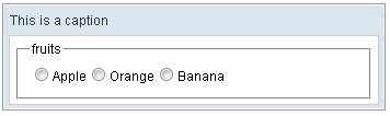
<zk>
    <window border="normal" width="350px">
        <caption label="This is a caption"/>
        <groupbox width="300px">
            <caption label="fruits"/>
            <radiogroup onCheck="fruit.value = self.selectedItem.label">
                <radio label="Apple"/>
                <radio label="Orange"/>
                <radio label="Banana"/>
            </radiogroup>
        </groupbox>
    </window>
</zk>
Try it
Preload Image
Since: 6.0.0
The preload image feature is applicable to all LabelImageElement and Image components. By default, the preload function is disabled, and users need to specify custom attributes and set them to true. For instance:
<caption image="xxx.png" label="caption">
  <custom-attributes org.zkoss.zul.image.preload="true"/>
</caption>
Alternatively, the custom attributes can be specified below the root component as shown in the following example:
<window>
  <custom-attributes org.zkoss.zul.image.preload="true"/>
  <caption image="xxx.png" label="caption">
    <image src="xxx.png"/>
  </caption>
</window>
The custom attributes will be checked recursively in the component tree.
Supported Children
*ALL: Indicates that the Caption component can have any kind of ZK component as its child element. This means that you can include any ZK component within the Caption component, allowing for flexible and customizable caption designs.