Splitlayout
- Demonstration: Spltlayout
- Java API: org.zkoss.zkmax.zul.Splitlayout
- JavaScript API: zkmax.layout.Splitlayout
since 8.5.0
Employment/Purpose
Splitlayout is a layout container, which is used to divide a component into two components.
These two components inside Splitlayout, the splitlayouts, are placed either horizontally or vertically by setting the orientation, and users can easily resize these two viewports by dragging the splitter bar. Also, like other ZK layout components, it supports hflex and vflex, indicating that users can divide the area into three or more spaces by putting the splitlayouts into the outer Splitlayout.
Comparing to Splitter, this component has several advantages:
- Splitter can only be used inside Hbox/ Vbox. Splitlayout has no such limitation.
- Hbox/Vbox are both rendered with HTML which is heavy for a browser. Splitlayout is rendered with div which is more light-weighted.
Common Use Cases
- Side-by-side panels: Use
orient="horizontal"to create a master/detail or editor/preview layout where the user can drag the divider to rebalance space. - Top/bottom split: Use
orient="vertical"(the default) for a query-results pattern — a filter form on top and a result grid below. - Nested splits: Nest
<splitlayout>inside another<splitlayout>to build three- or four-pane layouts without<hbox>/<vbox>overhead. - Fixed-size pane: Set
resizable="false"to lock the splitter so a sidebar or toolbar pane keeps a fixed size regardless of user interaction. - Collapsible pane: Combine
collapse="before"(or"after") with theonOpenevent listener to show or hide an optional panel, such as a navigation tree.
Example
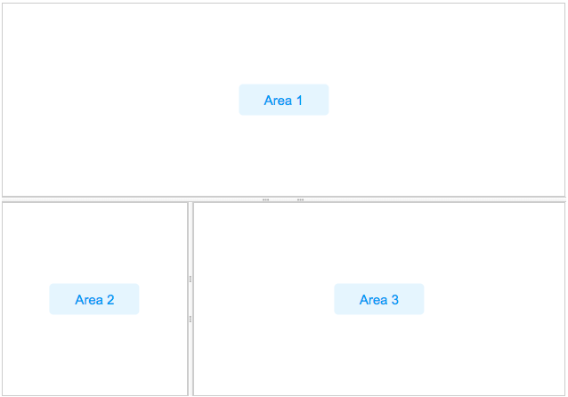
    <splitlayout  vflex="1" hflex="1">
        <div sclass="area" hflex="1" vflex="1">
            <label value="Area 1"/>
        </div>
        <splitlayout vflex="1" hflex="1" orient="horizontal" >
            <div sclass="area" vflex="1" hflex="1">
                <label value="Area 2"/>
            </div>
            <div sclass="area" vflex="1"  hflex="2">
                <label value="Area 3"/>
            </div>
        </splitlayout>
    </splitlayout>
Accessibility
since 9.5.0
Keyboard Support
| Key | Description |
|---|---|
| ArrowUp / ArrowDown | When the splitter is focused, move the splitter vertically. |
| ArrowLeft / ArrowRight | When the splitter is focused, move the splitter horizontally. |
| Enter | If the primary pane is not collapsed, collapses the pane. If the pane is collapsed, restores the splitter to its previous position. |
Labeling with ARIA
To name a component with ARIA attribute by adding the aria-label
client attribute to the component, please refer to
ZK Developer’s Reference/Accessibility#Specify_ARIA_Attributes
Properties
Orient
Default: vertical
Supported values: ”vertical” (default) or ”horizontal”.
The orient attribute specifies how the two child areas are arranged inside Splitlayout.
-
vertical— The two children are stacked top and bottom, separated by a horizontal splitter bar. Dragging the bar adjusts height.+---------------------------+ | Child 1 | +---------------------------+ <-- splitter bar (drag up/down) | Child 2 | +---------------------------+ -
horizontal— The two children are placed side by side (left and right), separated by a vertical splitter bar. Dragging the bar adjusts width.+-----------+---+-----------+ | | ↕ | | | Child 1 | | Child 2 | | | | | +-----------+---+-----------+ ^ splitter bar (drag left/right)
Example — set orient in ZUL:
<splitlayout orient=”horizontal” vflex=”1” hflex=”1”>
    <div hflex=”1” vflex=”1”><label value=”Left”/></div>
    <div hflex=”1” vflex=”1”><label value=”Right”/></div>
</splitlayout>
Resizable
Default Value: true
Controls whether the user can resize the two areas by dragging the splitter bar. When set to false the splitter bar is displayed but drag-resizing is disabled, locking the layout at its current proportions.
<splitlayout resizable=”false” vflex=”1” hflex=”1”>
    <div hflex=”1” vflex=”1”><label value=”Fixed Left”/></div>
    <div hflex=”1” vflex=”1”><label value=”Fixed Right”/></div>
</splitlayout>
Collapse
The collapse property (org.zkoss.zkmax.zul.Splitlayout#setCollapse(java.lang.String)) specifies which side of the splitter is collapsed when its grippy (button) is clicked. If this property is not specified, the splitter will not cause a collapse.
Supported value: (default) “none”, “before” or “after”. “before” means that the splitter in splitlayout would collapse to the left/top, and “after means splitter in splitlayout would collapse to the right/button.
Open
This method would not be able to work if the “collapse” attribute is not specified.
onOpen Event
When a splitlayout is collapsed or opened by a user, the onOpen event
(org.zkoss.zk.ui.event.OpenEvent) is sent to the
application.
Widths and Heights
specify widths or heights with a list of numbers(in pixel) separated
by a comma to denote the width/height of two areas in splitlayout.
Notice that you should use them while using flex in the children
component.
Specify Children Size in Proportion
Specify hflex/vflex on 2 children like:
        <splitlayout  vflex="1" >
            <div sclass="area" vflex="2">
                ...
            </div>
            <div sclass="area" vflex="3">
               ...
            </div>
        </splitlayout>
MinWidths and MinHeights
User setMinWidths(String minWidths) and setMinHeights(String minHeights) to sets the minimum widths/heights in the same format of setWidths/setHeights. When user drag the splitter, the two areas will not be smaller than the minWidths/minHeights.
Supported Events
| Name | Event Type | Description |
|---|---|---|
onOpen |
org.zkoss.zk.ui.event.OpenEvent | When a splitter is collapsed or opened by a user, the onOpen event is sent to the application. |
onDivisionSize |
org.zkoss.zkmax.zul.event.DivisionSizeEvent | Represents an event that indicates two inner size of splitlayout. |
- Inherited Supported Events: XulElement
Supported Children
*ALL