Nav
Employment/Purpose
A container is used to display navitem, it should be placed inside a
navbar.
Common Use Cases
Collapsible Navigation Group
Use <nav> to group related <navitem> elements under a single collapsible label inside a <navbar>. The label attribute names the group; the iconSclass attribute decorates it with a Font Awesome icon.
<navbar orient="vertical" width="200px">
    <navitem label="Home" iconSclass="z-icon-home" />
    <nav label="Get Started" iconSclass="z-icon-th-list">
        <navitem label="Step One" />
        <navitem label="Step Two" />
        <navitem label="Step Three" />
    </nav>
    <navitem label="About" iconSclass="z-icon-flag" />
</navbar>
Badge Count on a Nav Group
Add a badgeText attribute to surface a count badge on the group header without requiring the user to expand it.
<navbar orient="vertical" width="200px">
    <nav label="Messages" iconSclass="z-icon-envelope" badgeText="5">
        <navitem label="Inbox" />
        <navitem label="Sent" />
    </nav>
</navbar>
Nested Nav Groups
<nav> elements can be nested to create multi-level navigation hierarchies.
<navbar orient="vertical" width="220px">
    <nav label="Settings" iconSclass="z-icon-cog">
        <nav label="Account">
            <navitem label="Profile" />
            <navitem label="Password" />
        </nav>
        <navitem label="Notifications" />
    </nav>
</navbar>
Example
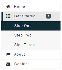
<navbar orient="vertical" width="200px">
    <navitem label="Home" iconSclass="z-icon-home" />
    <nav label="Get Started" iconSclass="z-icon-th-list" badgeText="3">
        <navitem label="Step One" />
        <navitem label="Step Two" />
        <navitem label="Step Three" />
    </nav>
    <navitem label="About" iconSclass="z-icon-flag" />
    <navitem label="Contact" iconSclass="z-icon-envelope"/>
</navbar>
- Inherited Supported Events: LabelImageElement