Lineitem
- Demonstration: Linelayout
- Java API: org.zkoss.zkmax.zul.Lineitem
- JavaScript API: zkmax.layout.Lineitem
since 9.0.0
Employment/Purpose
Lineitem is the child of Linelayout, it can contain up to 2 components inside. The content of Lineitem is placed separately in different areas of linelayout.
Example
A basic timeline using <linelayout> with two <lineitem> children. The first item uses default (right/bottom) placement; the second uses opposite="true" to flip the content to the left/top area.
<zk>
    <linelayout height="300px">
        <lineitem>
            <label>Step 1</label>
            <label style="color: gray;">Initialized</label>
        </lineitem>
        <lineitem opposite="true">
            <label>Step 2</label>
            <label style="color: gray;">In Progress</label>
        </lineitem>
        <lineitem frontSpace="10px">
            <label>Step 3</label>
            <label style="color: gray;">Completed</label>
        </lineitem>
    </linelayout>
</zk>
Common Use Cases
Custom point icon via sclass
Use pointIconSclass to display a Font Awesome or ZK icon at the timeline point instead of the default dot.
<linelayout>
    <lineitem pointIconSclass="z-icon-check-circle">
        <label>Delivered</label>
        <label>Order complete</label>
    </lineitem>
</linelayout>
Custom point image
Use pointImageSrc to display an image at the timeline point.
<linelayout>
    <lineitem pointImageSrc="/img/milestone.png">
        <label>Milestone</label>
        <label>Q2 2024</label>
    </lineitem>
</linelayout>
To supply an in-memory org.zkoss.image.Image object (for example, a programmatically generated image), use pointImageContent with a <zscript> block or a ViewModel binding:
<zscript>
    import org.zkoss.image.Images;
    org.zkoss.image.Image img = Images.encode("dot.png",
        javax.imageio.ImageIO.read(new java.io.File("/path/to/dot.png")));
</zscript>
<linelayout>
    <lineitem pointImageContent="${img}">
        <label>Custom image point</label>
        <label>Details here</label>
    </lineitem>
</linelayout>
Adjusting spacing between items
Use frontSpace and backSpace to fine-tune the gap between consecutive items.
<linelayout>
    <lineitem backSpace="20px">
        <label>First</label>
        <label>Extra space below</label>
    </lineitem>
    <lineitem frontSpace="20px">
        <label>Second</label>
        <label>Extra space above</label>
    </lineitem>
</linelayout>
Properties
Note: Lineitem does not support inline style, but you can still set height/width and vflex/hflex to customize spacing.
PointVisible
Sets whether the point is visible, the default value is true. This property only affects the point.
PointStyle
The CSS inline style for the point.
PointImageSrc
The source URI of the point background image.
PointImageContent
The point background Image content.
PointIconSclass
Specify the sclass name of the point icon.
Opposite
Set whether the first child is displayed in the first area(left when it is vertical / top when it is horizontal). The default value is false. Once the first child is displayed in the first or last area, the second child will be displayed in the other area.
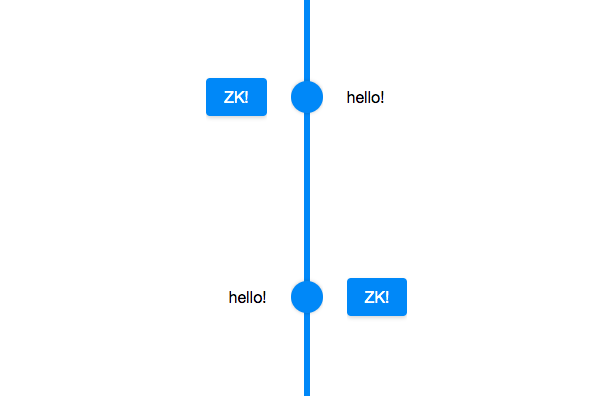
<zk>
    <linelayout height="400px">
        <lineitem>
            <label>hello!</label>
            <button label="ZK!"></button>
        </lineitem>
        <lineitem opposite="true">
            <label>hello!</label>
            <button label="ZK!"></button>
        </lineitem>
    </linelayout>
</zk>
FrontSpace
Sets additional spacing from the previous lineitem. (such as “5px” or “5em”). If null or empty (“”), the default spacing is used (i.e., controlled by CSS alone).
BackSpace
Sets additional spacing to the next lineitem. (such as “5px” or “5em”). If null or empty (“”), the default spacing is used (i.e., controlled by CSS alone).
Supported Children
* ALL