Navbar
Employment/Purpose
Provide a roadmap to help user navigate through website. It’s a container that usually contains nav elements.
Common Use Cases
Vertical Navigation with Collapsible Groups
Use orient="vertical" with nested <nav> elements to build a side menu. Set collapsed="true" to start in a compact icon-only mode, and use autoclose="true" (the default) to keep only one branch open at a time.
<navbar orient="vertical" width="200px" autoclose="true">
    <navitem label="Home" iconSclass="z-icon-home" />
    <nav label="Products" iconSclass="z-icon-th-list">
        <navitem label="Category A" />
        <navitem label="Category B" />
    </nav>
    <navitem label="Contact" iconSclass="z-icon-envelope" />
</navbar>
Horizontal Top Navigation Bar
Use orient="horizontal" to render the navbar as a top navigation bar. Drop-down sub-menus are supported via nested <nav> elements.
<navbar orient="horizontal">
    <navitem label="Home" iconSclass="z-icon-home" />
    <nav label="About">
        <navitem label="Team" />
        <navitem label="History" />
    </nav>
    <navitem label="Contact" />
</navbar>
Programmatic Selection via ViewModel
Bind selectedItem to a ViewModel property to control which navitem is highlighted from Java.
<navbar selectedItem="@bind(vm.currentPage)" orient="vertical" width="220px">
    <navitem id="homeItem" label="Home" />
    <navitem id="settingsItem" label="Settings" />
</navbar>
Example
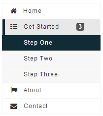
<navbar orient="vertical" width="200px">
    <navitem label="Home" iconSclass="z-icon-home" />
    <nav label="Get Started" iconSclass="z-icon-th-list" badgeText="3">
        <navitem label="Step One" />
        <navitem label="Step Two" />
        <navitem label="Step Three" />
    </nav>
    <navitem label="About" iconSclass="z-icon-flag" />
    <navitem label="Contact" iconSclass="z-icon-envelope"/>
</navbar>
Accessibility
since 9.5.0
Keyboard Support
| Key | Description |
|---|---|
| ArrowLeft / ArrowRight | Horizontal: Navigate nav items Vertical: Close / open the nav menu popup |
| ArrowUp / ArrowDown | Horizontal: Close / open the nav menu popup Vertical: Navigate nav items |
| Enter / Spacebar | Select the nav item / Open the nav menu popup |
| Escape | Close the nav menu popup |
Labeling with ARIA
To name a component with ARIA attribute by adding the aria-label
client attribute to the component, please refer to
ZK Developer’s Reference/Accessibility#Specify_ARIA_Attributes
Properties
Orient
A navbar could be placed in a vertical or horizontal orientation, the
orient attribute decides.
| Orient | Snapshot |
|---|---|
| horizontal |  |
| vertical | |
Collapsed
A navbar can be collapsed, the collapsed attribute decides.
| Collapsed | Orient | Snapshot |
|---|---|---|
| true | horizontal | 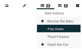 |
| false | horizontal |  |
| true | vertical | 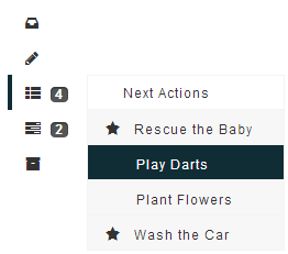 |
| false | vertical | 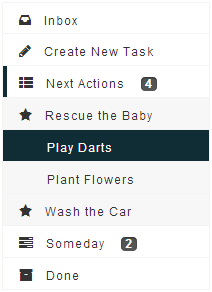 |
Autoclose
since 8.0.4
By default only a single
nav-element is open at any time - automatically closing other
nav-elements which are not on the current open path. This behavior can
be disabled setting autoclose="false", which keeps nav elements open
until they are clicked again by the user.
    <navbar orient="vertical" autoclose="false">
        <nav label="nav 1">
            <navitem label="nav 1.1"/>
            <navitem label="nav 1.2"/>
        </nav>
        <nav label="nav 2">
            <navitem label="nav 2.1"/>
            <navitem label="nav 2.2"/>
        </nav>
    </navbar>
SelectedItem
Deselects the currently selected item and selects the given item. Accepts a Navitem instance that is a direct or indirect child of the navbar. Passing null clears the selection (equivalent to calling clearSelection()).
The value is a Navitem object — construct it in a <zscript> block or bind it from a ViewModel.
<zscript>
    import org.zkoss.zkmax.zul.Navitem;
    Navitem target = (Navitem) myNavbar.query("navitem[label='Step Two']");
    myNavbar.setSelectedItem(target);
</zscript>
<navbar id="myNavbar" orient="vertical" width="200px">
    <navitem label="Home" />
    <navitem label="Step Two" />
    <navitem label="About" />
</navbar>
In MVVM, bind via a ViewModel property:
<navbar selectedItem="@bind(vm.selectedNavitem)" orient="vertical" width="200px">
    <navitem label="Home" />
    <navitem label="Step Two" />
    <navitem label="About" />
</navbar>
Supported Events
| Name | Event Type | Description |
|---|---|---|
onSelect |
SelectEvent | Notifies one that the user has selected a navitem in the navbar. |
- Inherited Supported Events: LabelImageElement
Supported Children
* Nav, Navitem, Navseparator