Multislider
- Demonstration:
- Java API: Multislider
- JavaScript API: Multislider
since 9.0.0
Employment/Purpose
A multislider component represents a slider with multiple ranges. It includes sliderbuttons, which can be used to let user select a start value and an end value. A multislider accepts a range of values starting from 0 to a maximum value you defined. The default maximum value is 100. You can change the maximum value by setting the max property. Notice that the value of max property is always larger than the value of min property.
Common Use Cases
- Multi-range selection: When users need to select several non-overlapping or overlapping ranges on a single axis — for example, defining multiple time windows, price bands, or age brackets — Multislider lets each pair of
<sliderbuttons>represent one independent range. - Visual range comparison: Displaying several ranges side-by-side on the same scale makes it easy for users to compare or adjust intervals (e.g., comparing work shift durations or budget allocation spans).
- Bounded numeric input: Any scenario that requires more than two boundary values on a continuous scale, such as configuring multi-tier thresholds for alerts or quotas, benefits from Multislider over a plain slider or rangeslider.
Example
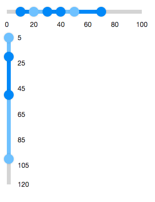
  <multislider>
    <sliderbuttons startValue="10" endValue="70"/>
    <sliderbuttons startValue="20" endValue="50"/>
    <sliderbuttons startValue="30" endValue="40"/>
  </multislider>
  <multislider min="5" max="120" orient="vertical">
    <sliderbuttons startValue="5" endValue="100"/>
    <sliderbuttons startValue="20" endValue="50"/>
  </multislider>
Accessibility
since 9.5.0
Keyboard Support
| Key | Description |
|---|---|
| ArrowUp / ArrowDown | Move the slider button. |
| ArrowLeft / ArrowRight | Move the slider button. |
| Home / End | Move the slider button to the minimum/maximum. |
| PageUp / PageDown | Move the slider button in the large step. |
ARIA Attributes
| Attributes | Description |
|---|---|
| data-ariaStartLabel | Describe the the slider button (start) on SliderButtons. |
| data-ariaEndLabel | Describe the the slider button (end) on SliderButtons. |
| data-largeStep-multiplier (optional) | Describe the moving step of pressing PageUp/PageDown. |
ARIA Example
<zk xmlns:ca="client/attribute">
  <multislider ca:aria-label="range value">
    <sliderbuttons startValue="0" endValue="100" ca:data-ariaStartLabel="minimal range value"
      ca:data-ariaEndLabel="maximal range value"/>
    <sliderbuttons startValue="10" endValue="50" ca:data-ariaStartLabel="minimal range value"
      ca:data-ariaEndLabel="maximal range value"/>
  </multislider>
</zk>
Labeling with ARIA
To name a component with ARIA attribute by adding the aria-label
client attribute to the component, please refer to
ZK Developer’s Reference/Accessibility#Specify_ARIA_Attributes
Properties
Max
Default: 100
Defines the max value of the multislider. It can be changed by the max property.
Min
Default: 0
Defines the minimal value of the multislider. It can be changed by the min property.
Supported Events
- Inherited Supported Events: Rangeslider