Chosenbox
- Demonstration: Chosenbox
- Java API: org.zkoss.zkmax.zul.Chosenbox
- JavaScript API: zkmax.inp.Chosenbox
since 6.0.1
Employment/Purpose
A component similar to Combobox but handles the multi-selection and the select order.
Common Use Cases
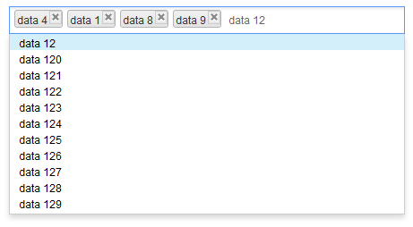
- Multi-select from a bounded list — use Chosenbox with a
ListModelListwhen all options should be pre-loaded and available for instant filtering. - Lazy / autocomplete multi-select — pair Chosenbox with a
ListSubModel(viaListModels.toListSubModel) so the server returns only matching items as the user types, keeping page load fast for large data sets. - Tag creation — set
creatable="true"and handleonSearchto let users add new values that do not yet exist in the model. - Inline display — set
inplace="true"to show the current selection as a compact comma-separated label that expands into the full widget on click, useful inside tight layouts such as table cells.
Example
Typical Usage
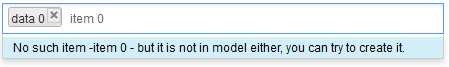
- creatable attribute denotes whether or not to display createMessage when a user inputs a value that is non-existing in the model, and sends it back to the server along with an onSearch event when user clicks the ENTER key or separator.
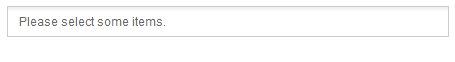
- emptyMessage will be displayed as a placeholder if nothing is selected or focused.
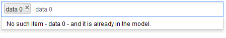
- noResultText will be displayed if nothing matches the input value and it cannot be created either; syntax “{0}” will be replaced with the input value at client side.
- createMessage will be displayed in popup if nothing matches the input value but can be created as new label; syntax “{0}” will be replaced with the input value at the client-side.
When no item is selected or focused, emptyMessage is visible.
When there is no data to be shown in the model and data 0 already selected, noResultText appears.
When there is no item in the model but it is creatable, createMessage appears.
    <zscript>
        ListModelList model = new ListModelList(Locale.getAvailableLocales());
    </zscript>
    <chosenbox width="400px"
               model="${model}" creatable="true"
               emptyMessage=" Please select some items."
               noResultsText=" No such item - {0} - and it is already in the model."
               createMessage=" No such item -{0} - but it is not in model either, you can try to create it.">
        <attribute name="onSearch">
            Object obj = event.getValue();
            ((ListModelList)model).add(obj);
            self.addItemToSelection(obj);
        </attribute>
    </chosenbox>
Rendering All
Here, all the content will be sent to and processed at the client side. The rendering process is pretty fast with a few items but may cause performance issue when the model exceeds 40,000 items and rendering them all at once.
    <zscript>
        ListModelList model = new ListModelList(Locale.getAvailableLocales());
    </zscript>
    <chosenbox width="400px" model="${model}"/>
Lazy Rendering
With ListSubModel, Chosenbox doesn’t render any DOM elements in the
drop-down list at first. Until a user enters a character, it retrieves
‘matched’ items from the server-side and renders them in the drop-down
list. This might produce some delay at the client side because of server
processing time and network latency.
See also: Combobox#Autocomplete_by_ListSubModel
    <zscript><![CDATA[
        ListModelList model = new ListModelList(Locale.getAvailableLocales());
        ListSubModel subModel = ListModels.toListSubModel(model);
    ]]></zscript>
    <chosenbox width="400px" model="${subModel}"/>
Custom Item Rendering
Since this component has no child component like Listbox, if you want
to render its items differently, there are 2 ways:
Change text
If you just want to change the text e.g. enclosing it with brackets, just put as its child and add characters with `${each}`:
      <cascader>
              <template name="model">[${each}]</template>
      </cascader>
- The template only allows text that can be converted into a ZK
Label. - could be
<cascader>,<chosenbox>,<selectbox>,<searchbox>
Change HTML Structure
If you want to make more changes e.g. adding tooltips by setting title
attributes, you need to create your own ItemRenderer. See Item_Renderer.
Accessibility
since 9.5.0
Keyboard Support
| Key | Description |
|---|---|
| ArrowUp / ArrowDown | Open the popup and navigate options. |
| ArrowLeft / ArrowRight | Move focus between selected item(s) and the input field. |
| Enter / specified separator | Select the focused option. |
| Escape | Clear input and close the drop-down list. |
| Delete | Delete the focused item and move focus to the next item (or input field). |
| Backspace | Delete the focused item and move focus to the previous item (or input field). |
Labeling with ARIA
To name a component with ARIA attribute by adding the aria-label
client attribute to the component, please refer to
ZK Developer’s Reference/Accessibility#Specify_ARIA_Attributes
Properties
creatable
Default: false
specify whether to send an event to a server when user inputs a non-existing value by clicking ENTER or separator.
createMessage
displayed a popup if nothing matches the input value and creatable is true; syntax “{0}” will be replaced with the input value at the client side
emptyMessage
displayed as placeholder in input if nothing is selected or focused
model
specify the ListModel of this chosenbox
If you set ListModelList to the model of chosenbox, all the content will be sent to and processed at the client-side, The rendering process is pretty fast with a few items but may cause performance issue when the model exceeds 40,000 items and rendering them all at once
If you set ListSubModel to the chosenbox model, the content of the drop-down list will not be rendered to the client-side,and will remain blank until user enters an input. The server will then provide a ‘matched’ content for the input. This will cause some delay at the client side because of server processing time and network transfer time. See Lazy Rendering
itemRenderer
Sets a custom renderer that returns the HTML snippet shown for each element of the model; when null, the default renderer uses the data’s toString(). Because it is a Java object (org.zkoss.zul.ItemRenderer), supply it from a <zscript> block, composer, or ViewModel and reference it via EL.
<chosenbox model="${model}" itemRenderer="${myRenderer}"/>
See the Custom Item Rendering section on this page and Item Renderer for the renderer interface, escaping rules, and a complete example.
name
specify the name of the input element of this component
noResultsText
displayed a popup window if nothing matches the input value and creatable is false; syntax “{0}” will be replaced with the input value at client-side
open
Default: false
specify whether or not to open the drop-down list.
inplace
Default Value: false
since 8.5.2
When inplace="true" the current selection is displayed as a comma-separated label instead of the normal tag-style chosenbox widget. Clicking the label switches the component back into the full chosenbox input, allowing the user to modify the selection.
<chosenbox width="400px" model="${model}" inplace="true"/>
selectedIndex
Default Value: -1 (nothing selected)
The zero-based index of the first selected item in the model. Returns -1 when nothing is selected. Setting a value less than -1 is treated as -1; setting a value equal to or greater than the model size selects the last item.
When a ListModel is already attached, updating selectedIndex also updates the model’s selection state.
<chosenbox width="400px" model="${model}" selectedIndex="0"/>
selectedObjects
Default Value: null (no model attached) or an empty Set (model attached, nothing selected)
Returns the currently selected objects as a LinkedHashSet that preserves insertion order. Setting a collection of objects marks each matching model element as selected; if any object is not found in the model a UiException is thrown.
Because the value is a Java object, assign it from a <zscript> block or a ViewModel:
<zscript><![CDATA[
import org.zkoss.zul.ListModelList;
import java.util.LinkedHashSet;
import java.util.Locale;

ListModelList model = new ListModelList(Locale.getAvailableLocales());
LinkedHashSet preselect = new LinkedHashSet();
preselect.add(Locale.ENGLISH);
preselect.add(Locale.FRENCH);
]]></zscript>
<chosenbox width="400px" model="${model}" selectedObjects="${preselect}"/>
separator
the separate characters will work as ‘Enter’ key when clicked on; it will not be considered as an input value. Upon releasing
the key, it will an send onSearch or onSelect event depending on the situation. Supports: 0-9, A-Z (case insensitive), and ,.;'[]/\-=
Supported Events
| Name | Event Type | Description |
|—|—|—|
| onSelect | SelectEvent | Fired when the selection is changed at the client. This also covers selecting or deselecting an item while the component is backed by a ListSubModel. |
| onOpen | OpenEvent | Fired when the drop-down list is opened or closed. |
| onSearch | InputEvent | Fired when the user inputs a non-existing value by clicking ENTER or a separator character. |
| onSearching | InputEvent | Fired as the user types in the input field. |
| onItemClick | Event | Fired when the user clicks a selected tag.
since 8.0.2
|
| onFocus | Event | Fired when the component gains focus. |
| onBlur | Event | Fired when the component loses focus. |
Also inherit Supported Events from HtmlBasedComponent.
Supported Molds
- The default mold
Supported Children
None