Searchbox
- Demonstration: zkoss-demo/zksearchbox-demo
- Java API: org.zkoss.zkmax.zul.Searchbox
- JavaScript API: zkmax.inp.Searchbox
since 9.0.0
Employment/Purpose
A dropdown list that allows users to search and select items. Since it contains a separate search field (unlike Combobox), it can avoid end-users from inputting a non-existed item.
Common Use Cases
- Single-value selection with type-ahead — Replace a plain
<combobox>wherever users must pick from a fixed list and must not enter free text. Setautoclose="true"so the dropdown closes immediately after a pick. - Multi-value tag-style selection — Enable
multipleon the backingListModelList(model.setMultiple(true)) to let users build a set of selected values (e.g. tag filters, recipient lists). - Server-side filtered large datasets — Supply a
ListSubModelto keep initial payload small; as the user types, the server returns only the matching subset, enabling scalable autocomplete over thousands of rows. - Custom item appearance — Provide an
itemRendererto render rich markup (icons, secondary labels, avatars) inside each dropdown row while still benefiting from the built-in keyboard navigation and selection model. - Pre-filtering on page load — Set
searchTextto pre-populate the search input so the dropdown opens with an already-filtered list, useful in search result pages that reconstruct UI state from URL parameters.
Example
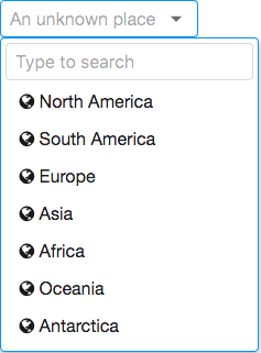
<zscript>
ListModel model = new ListModelArray(new String[] {
  "North America", "South America", "Europe", "Asia", "Africa", "Oceania", "Antarctica"
});
</zscript>
<searchbox model="${model}" placeholder="An unknown place" autoclose="true">
   <template name="model">
       <html><![CDATA[
       <i class="z-icon-globe"></i> ${each}
       ]]></html>
   </template>
</searchbox>
Accessibility
since 9.5.0
Keyboard Support
| Key | Description |
|---|---|
| ArrowDown | Open the popup and navigate options. |
| ArrowUp | Navigate options. |
| Home / End / PageUp / PageDown | Change the selection of the item in the list. |
| Enter | Select / confirm the option. |
| Escape | Close the popup. |
| Delete / Backspace | Clear the selection. |
Labeling with ARIA
To name a component with ARIA attribute by adding the aria-label
client attribute to the component, please refer to
ZK Developer’s Reference/Accessibility#Specify_ARIA_Attributes
Properties
Autoclose
Default: false
Sets whether to automatically close the list if a user selects any item.
It means even if the user selects an item, the list still remains open.
You might want to set it as true in single selection mode
(multiple=false).
ItemConverter
By implementing your own org.zkoss.util.Converter
using the org.zkoss.util.Converter interface, you can generate the
label that represents the selected items. The default implementation is
joining all the toString() result of items by commas.
Can accept a Class name as a string, in which case an instance of that class will be created automatically, or an object already instantiated.
    <searchbox model="${model}" itemConverter="foo.bar.MyConverter" />
    <searchbox model="${model}" itemConverter="${myConverterObject}" />
Model
Since this component doesn’t accept any child, you must specify a model object.
Search at Client-side
If you assign a ListModel, it renders all data to a browser and searches the matched items in JavaScript.
Search at Server-side
When a org.zkoss.zul.ListSubModel is provided, not
all items are rendered to the client initially. Instead, as a user types
into the search input, the entered text is sent to the server where it
is used to filter the ListSubModel and retrieve only the subset of items
that match the search term. The default String-based filtering uses
startsWith() for a simple prefix-match search.
ItemRenderer
Sets a custom renderer that returns the HTML snippet shown for each element of the model; when null, the default renderer uses the data’s toString(). Because it is a Java object (org.zkoss.zul.ItemRenderer), supply it from a <zscript> block, composer, or ViewModel and reference it via EL.
<searchbox model="${model}" itemRenderer="${myRenderer}"/>
See the Custom Item Rendering section on this page and Item Renderer for the renderer interface, escaping rules, and a complete example.
Multiple
Sets whether multiple selections are allowed.
If you assign a model object to a searchbox, you should enable multiple
selections with ListModel API, e.g. model.setMultiple(true). Please do
not set multiple on searchbox directly. You should set multiple on the
model instead.
List Items = new ArrayList();
for (int i = 0; i < 1000; i++) {
    Items.add("data "+i);
}
ListModelList model = new ListModelList(Items);
model.setMultiple(true);
Open
Drops down or closes the list of items.
Placeholder
Sets the placeholder text that is displayed when there’s nothing selected.
SearchMessage
Sets the placeholder message of the search text field. The default is “Type to search”.
SearchText
since 10.2.0
Sets the current value of the search input field. Use this to pre-populate the search text or to reset/clear it programmatically.
<searchbox model="${model}" searchText="Eur"/>
SelectedItem
Returns the selected item, or null if no item is selected. When multiple is true, it returns the first of the selected items.
Don’t use MVVM annotations in both selectedItem and selectedItems at
the same time since @save selectedItem will deselect all of the
currently selected items first.
SelectedItems
Returns all selected items.
Custom Item Rendering
Since this component has no child component like Listbox, if you want
to render its items differently, there are 2 ways:
Change text
If you just want to change the text e.g. enclosing it with brackets, just put as its child and add characters with `${each}`:
      <cascader>
              <template name="model">[${each}]</template>
      </cascader>
- The template only allows text that can be converted into a ZK
Label. - could be
<cascader>,<chosenbox>,<selectbox>,<searchbox>
Change HTML Structure
If you want to make more changes e.g. adding tooltips by setting title
attributes, you need to create your own ItemRenderer. See Item_Renderer.
Supported Events
| Name | Event Type | Description |
|---|---|---|
onSelect |
org.zkoss.zk.ui.event.SelectEvent | Represents an event caused by the user that the list selection is changed at the client. |
onOpen |
org.zkoss.zk.ui.event.OpenEvent | Denotes that the user has opened or closed a component. Note: unlike onClose, this event is only a notification. The client sends this event after opening or closing the component. |
onSearching |
org.zkoss.zk.ui.event.InputEvent | Notifies one that the user is searching by keywords. |
onFocus |
org.zkoss.zk.ui.event.Event | Fired when the searchbox gains focus. |
onBlur |
org.zkoss.zk.ui.event.Event | Fired when the searchbox loses focus. |
- Inherited Supported Events: HtmlBasedComponent
Supported Children
* none