Step
- Demonstration: Step
- Java API: org.zkoss.zkmax.zul.Step
- JavaScript API: zkmax.wgt.Step
since 9.0.0
Employment/Purpose
A step is used for displaying user navigation, it should be placed inside a Stepbar and shouldn’t be used without a Stepbar.
Common Use Cases
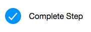
Marking a Step as Complete
Set complete="true" to visually indicate that a step has been finished. This is typically updated programmatically as the user advances through the workflow.
<stepbar width="600px">
    <step title="Personal Info" complete="true"/>
    <step title="Review" complete="true"/>
    <step title="Submit"/>
</stepbar>
Flagging a Step With an Error
Set error="true" to highlight that a step requires attention. When both complete and error are set on the same step, the error state takes visual precedence.
<stepbar width="600px">
    <step title="Upload File" complete="true"/>
    <step title="Validate" error="true"/>
    <step title="Process"/>
</stepbar>
Using a Custom Icon
Use iconSclass to replace the default step icon with any ZK icon font class. The custom icon overrides both the complete and error icons when set.
<stepbar width="600px">
    <step title="Account" iconSclass="z-icon-user"/>
    <step title="Payment" iconSclass="z-icon-credit-card"/>
    <step title="Confirm" iconSclass="z-icon-check"/>
</stepbar>
Example
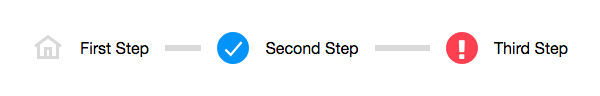
<zk>
    <stepbar linear="false" activeIndex="2" width="600px">
        <step title="First Step" iconSclass="z-icon-home"/>
        <step title="Second Step" complete="true" />
        <step title="Third Step" error="true" />
    </stepbar>
</zk>
Properties
Complete
Whether this step is completed. (Default: false)
The default visual style:
Error
Whether this step is in error. (Default: false)
The default visual style:

The priority of error is higher than complete. If both properties
are set, the result will be an error state visually.
IconSclass
Set the icon CSS class to apply a custom icon.
If you set this property, it will override the complete and error icons accordingly.
    <stepbar width="800px">
        <step title="Custom Step icon" iconSclass="z-icon-star-o"/>
        <step title="Custom Error" error="true" iconSclass="z-icon-bug"/>
        <step title="Custom Complete" iconSclass="z-icon-home"/>
    </stepbar>
Please read /zk_component_ref/labelimageelement#IconSclass to know more available build-in icons.
Title
Set the title (label) of each step. (Default: empty)
Supported Events
| Name | Event Type | Description |
|---|---|---|
| (Inherited) | XulElement | See parent component for supported events |
Supported Children
* None