Combobox
- Demonstration: Combobox
- Java API: org.zkoss.zul.Combobox
- JavaScript API: zul.inp.Combobox
Employment/Purpose
Components: combobox and comboitem.
A combobox is a special text box that embeds a drop-down list. With
comboboxes, users are allowed to select from a drop-down list, in
addition to entering the text manually.
The authoritative field of the combobox is the text value accessed by the value field. While the Combobox provides a selectedItem field and onSelect event, the selected item may be null if the user typed in any text that is not part of the list of prefilled values.
For the use case of searching and selecting items in a list of options, without allowing custom text, refer to the Searchbox component instead.
Common Use Cases
- Free-text entry with suggestions — users can type any value or pick from a pre-populated list; the authoritative field is always the text
value. - Autocomplete from a large dataset — assign a
ListSubModel-backed model so the drop-down filters as the user types, avoiding loading thousands of items at once. - Constrained selection with read-only mode — set
readonly="true"to prevent free-text entry while still letting users pick from the list (for strict selection without free-text, prefer Searchbox). - Dynamic list population — listen to
onOpenoronChangingto build or refresh the list ofcomboitemchildren on demand.
Example
Selection Only
Recommend to use Searchbox, Listbox select mold or Selectbox.
<style>
.z-combobox-readonly>input{
    background-color: initial;
}
</style>

<combobox model="${model}" readonly="true"/>
- a read-only combobox can avoid users from entering non-existed items
AutoComplete by Default
When you type a character, this component will auto-complete your typing with first-matched, existing items.
Assume you create a combobox like:
 <combobox>
     <comboitem label="Simple and Rich"/>
     <comboitem label="Cool!"/>
     <comboitem label="Ajax and RIA"/>
 </combobox>
When you type ‘C’, it will auto-complete with “Cool”.
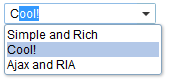
Be aware that a user still can enter a non-existing item.
Default Selection

    <zscript><![CDATA[
        ListModelList model = new ListModelList(Arrays.asList(new String[] { "David",
                "Thomas", "Steven" }));
        model.addToSelection(model.get(2));
    ]]></zscript>

    <combobox model="${model}"/>
- Line 4: When you assign a model object to a component, set the
selection through the model object e.g.
model.addToSelection()
Accessibility
Keyboard Support
| Key | Description |
|---|---|
| Alt + ArrowDown | Open the popup list. |
| Alt + ArrowUp / Escape | Close the popup list. |
| ArrowUp / ArrowDown | Change the selection of the items in the list. |
| Enter | Confirm the change of selection. |
| Escape | Abort the change of selection (meaningful if instantSelect is false). |
Labeling with ARIA
To name a component with ARIA attribute by adding the aria-label
client attribute to the component, please refer to
ZK Developer’s Reference/Accessibility#Specify_ARIA_Attributes
Live Data
Selectable
By specifying the selection, you can invoke the addSelection() to select a default value, For example,
<combobox id="combobox" width="100px">
    <attribute name="onCreate"><![CDATA[
        List list2 = new ArrayList();
        list2.add("David");
        list2.add("Thomas");
        list2.add("Steven");
        ListModelList lm2 = new ListModelList(list2);
        lm2.addToSelection(lm2.get(0));
        combobox.setModel(lm2);
    ]]></attribute>
</combobox>
since 5.0.4
Properties
Value and selectedItem
The value stores the selected `comboitem`’s label value and
selectedItem stores the selected `comboitem`’s value value:
If you select the 1st item:
        <combobox value="@bind(vm.inputValue)" selectedItem="@bind(vm.selectedValue)" >
            <comboitem label="label 1" value="value1" />
            <comboitem label="label 2" value="value2" />
        </combobox>
vm.inputValueislabel 1.vm.selectedValueisvalue1.
Autocomplete
By default, it will autocomplete your input with the first item in the list that has the same starting string in a case-insensitive way.
Autocomplete in a Brute-force Way
The straightforward way to implement the autocomplete feature is to listen to the onChanging event. For example,
<combobox>
  <attribute name="onChanging"><![CDATA[
  self.getChildren().clear(); //remove all children
  for (String value: getMatched(event.getValue())
    self.appendChild(new Comboitem(value));
  ]]></attribute>
</combobox>
Line 4: We assume getMatched() is an application-specific method that
returns a collection of matched values.
Autocomplete by ListSubModel
To separate the data from the view (Combobox) better, we can implement org.zkoss.zul.ListSubModel and set it to Combobox. There are 2 ways:
Use org.zkoss.zul.SimpleListModel
Unlike org.zkoss.zul.ListModelList and others, org.zkoss.zul.SimpleListModel implements org.zkoss.zul.ListSubModel by default. You can use org.zkoss.zul.SimpleListModel directly but it handles only an array of data.
Convert org.zkoss.zul.ListModel with org.zkoss.zul.ListModels#toListSubModel(org.zkoss.zul.ListModel)
The methods convert ListModel to ListSubModel which proxies the original ListModel.
For example,
<combobox apply="org.zkoss.reference.component.input.MyAutoCompleteComposer"/>
public class MyAutoCompleteComposer extends SelectorComposer<Component> {
    @Wire("combobox")
    private Combobox combobox;
    private List<Locale> items = Arrays.asList(Locale.getAvailableLocales());

    @Override
    public void doAfterCompose(Component comp) throws Exception {
        super.doAfterCompose(comp);
        combobox.setModel(ListModels.toListSubModel(new ListModelList(getAllItems())));
    }

    List getAllItems() {
        return items;
    }
}
Default Matching Rule
By default, it shows the first 15 items whose prefix starts with the user input. If you want to have a different value or a different comparator to find out matched items, you can invoke org.zkoss.zul.ListModels#toListSubModel(org.zkoss.zul.ListModel, java.util.Comparator, int) instead.
Note: Passing an instance of org.zkoss.zul.ListModelList directly to a combobox will show up all items in the list model, since it doesn’t implement org.zkoss.zul.ListSubModel.
Readonly
Default:false
Once set, a user is not allowed to type characters, but he still can select the items in the Combobox.
Autodrop
By default, the drop-down list won’t be opened until the user clicks the button, or presses Alt+DOWN. However, you could set the autodrop property to true, meaning as soon as the user types a character the drop-down list will be opened. This is helpful for novice users, but it might be annoying for experienced users.
If you prefer the combobox to drop down the list when the user types a character, you could specify the autodrop attribute as follows.
<combobox autodrop="true"/>
If you prefer to drop down the list when gaining the focus, you could provide a client-side listener as follows.
<combobox w:onFocus="this.open()" xmlns:w="client"/>
Description
You are able to add a description to each combo item to make it more descriptive or assign an image to every item.
<zk>
    <combobox>
        <comboitem label="Simple and Rich"
            image="/img/Centigrade-Widget-Icons/GoldBar-32x32.gif"
            description="The simplest way to make Web applications rich" />
        <comboitem label="Cool!"
            image="/img/Centigrade-Widget-Icons/CogwheelEye-32x32.gif"
            description="The coolest technology" />
        <comboitem label="Ajax and RIA"
            image="/img/Centigrade-Widget-Icons/WindowGlobe-32x32.gif"
            description="Rich Internet Application by Ajax" />
    </combobox>
</zk>

Akin to other components that support images, you are able to use the
setImageContent method to assign a dynamically generated image to the
comboitem component. Please refer to the Image section for
details.
The onOpen Event
The onOpen event is sent to the application when a user opens the
drop-down list. To defer the creation of combo items, you can use the
fulfill attribute as shown below.
<zk>
    <combobox fulfill="onOpen">
        <comboitem label="Simple and Rich"/>
        <comboitem label="Cool!"/>
        <comboitem label="Ajax and RIA"/>
    </combobox>
</zk>
Alternatively, you can listen to the onOpen event and prepare the
drop-down list or change it dynamically as demonstrated below.
<zk>
    <zscript>
        void prepare()
        {
            if (combo.getItemCount() == 0)
            {
                combo.appendItem("Simple and Rich");
                combo.appendItem("Cool!");
                combo.appendItem("Ajax and RIA");
            }
        }
    </zscript>
    <combobox id="combo" onOpen="prepare()" />
</zk>
The appendItem method is equivalent to creating a combo item and then
setting the combobox as its parent.
The onChanging Event
Since a combobox is also a text box, you are also able to listen to an
onChanging event. By listening to this event, you can manipulate the
drop-down list as demonstrated by Google Suggests
(http://www.google.com/webhp?complete=1&hl=en). This feature is
sometimes called auto-complete.
As illustrated below, you can populate the drop-down list based on what user is entering.
<zk>
    <zscript>
         void suggest()
         {
             combo.getItems().clear();
             if (event.value.startsWith("A")) {
                 combo.appendItem("Ace");
                 combo.appendItem("Ajax");
                 combo.appendItem("Apple");
             } else if (event.value.startsWith("B")) {
                 combo.appendItem("Best");
                 combo.appendItem("Blog");
             }
         }
    </zscript>

    <combobox id="combo" autodrop="true" onChanging="suggest()"/>
</zk>
Notice that, when the onChanging event is received, the content of the
combobox has not changed. Therefore, you cannot use the value property
of the combobox. Instead, you should use the value property of the
org.zkoss.zk.ui.event.InputEvent.
Constraint
Please see /zk_component_ref/inputelement#Constraint.
PopupWidth
since 8.0.3
By specifying this property, the
width of the popup will be set and ignore the default behavior.
If percentage is specified to this property, the width of the popup will
be calculated with the width of the bandbox.
For example, if it’s set to 130%, and the width of the bandbox is 300px,
the popup of the bandbox will be 300px * 130% = 390px
If others is specified, it will be set to the width of the popup
directly.
InstantSelect
since 8.6.1
By default, any change of selection
using the keyboard will trigger onSelect and onChange events
instantly. Once set this property false, users need to confirm the
change by pressing Enter key or make combobox lose its focus so
onSelect and onChange events will be triggered. And pressing Esc key
can abort the change and revert to previous selection.
IconSclass
since 8.6.2 Specify the sclass name of the Combobox button icon.
ButtonVisible
Default Value: true
Controls whether the drop-down button on the right side of the text field is rendered. Set to false to hide the button while still allowing the drop-down list to open via keyboard shortcut (Alt+DOWN) or programmatically.
<combobox buttonVisible="false"/>
EmptySearchMessage
Default Value: null
since 8.5.1
Sets the message displayed in the drop-down popup when a model-backed search yields no matching items. This property is only meaningful when a model is assigned; it has no effect on a static list of comboitem children.
<zscript>
    ListModel model = new ListModelList(new String[]{"Apple", "Banana", "Cherry"});
</zscript>
<combobox model="${model}" emptySearchMessage="No results found"/>
ItemRenderer
since 3.0.2
Assigns a custom ComboitemRenderer that controls how each model element is rendered as a Comboitem when a model is set. When null (the default), ZK uses a built-in renderer that calls toString() on each element.
Note: changing the renderer after a model has already been rendered does not automatically re-render the list. To force a re-render, re-assign the same model: combobox.setModel(combobox.getModel()).
<zscript>
    // both the model and the renderer are Java objects; build them in code and reference via EL
    ListModel model = new ListModelList(new String[]{"Option A", "Option B", "Option C"});
    ComboitemRenderer renderer = new MyCustomRenderer();
</zscript>
<combobox model="${model}" itemRenderer="${renderer}"/>
Model
since 3.0.2
Assigns a ListModel as the data source for the combobox, replacing any statically declared comboitem children. The model must also implement Selectable; if it does not, an UiException is thrown at runtime.
For autocomplete with filtering, use a model that implements ListSubModel (e.g. SimpleListModel, or wrap any ListModel with ListModels.toListSubModel(...)). A plain ListModelList does not implement ListSubModel and will show all items regardless of user input.
Assigning a new model (even the same instance) always triggers a full re-render of the drop-down items.
<zscript>
    ListModel model = new ListModelList(new String[]{"Option A", "Option B", "Option C"});
</zscript>
<combobox model="${model}"/>
Open
Default Value: false
since 6.0.0
Controls whether the drop-down list is currently open. Setting this property to true opens the list; false closes it. The setter only has an effect while the component is visible; calling setOpen on a hidden combobox is a no-op.
For unconditional programmatic control (bypassing the visibility check), use the open() and close() Java methods directly.
<combobox open="true">
  <comboitem label="Option A"/>
  <comboitem label="Option B"/>
</combobox>
SelectedIndex
Default Value: -1 (nothing selected)
since 3.0.2
Deselects the currently selected item and selects the Comboitem at the given zero-based index. Pass -1 to clear the selection. Throws UiException if the index is out of range.
When using a ListSubModel for autocomplete, the displayed list is a filtered subset of the full model, so the index refers to the rendered items, not the underlying model positions.
<combobox selectedIndex="0">
  <comboitem label="Option A"/>
  <comboitem label="Option B"/>
</combobox>
Supported Events
| Name | Event Type | Description |
|---|---|---|
| onSelect | org.zkoss.zk.ui.event.SelectEvent | Represents an event caused by user’s the list selection is changed at the client. |
| onOpen | org.zkoss.zk.ui.event.OpenEvent | Denotes that the user has opened or closed a component. Note: unlike onClose, this event is only a notification. The client sends this event after opening or closing the component. It is useful to implement load-on-demand by listening to the onOpen event, and creating components when the first time the component is opened. |
- Inherited Supported Events: Textbox
Supported Molds
Available molds of a component are defined in lang.xml embedded in zul.jar.
| Name | Snapshot |
|—|———————————————————|
| default |  |
| rounded |
|
| rounded |  since 5.0.0
|
since 5.0.0
|
Supported Children
Inherited Functions
Please refer to Textbox for inherited functions.