Listitem
- Demonstration: Listbox (Keystroke Command)
- Java API: org.zkoss.zul.Listitem
- JavaScript API: zul.sel.Listitem
Employment/Purpose
A list item.
Common Use Cases
Listitem is used to represent a single row within a Listbox component. Each item can display multiple columns via nested Listcell children, display an icon, and carry arbitrary application data via the value property. Use Listitem to build data-driven lists where users need to view structured information and select rows.
Example
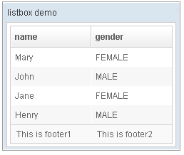
 <window title="listbox demo" border="normal" width="250px">
    <listbox id="box">
        <listhead sizable="true">
            <listheader label="name" sort="auto" />
            <listheader label="gender" sort="auto" />
        </listhead>
        <listitem>
            <listcell label="Mary" />
            <listcell label="FEMALE" />
        </listitem>
        <listitem>
            <listcell label="John" />
            <listcell label="MALE" />
        </listitem>
        <listitem>
            <listcell label="Jane" />
            <listcell label="FEMALE" />
        </listitem>
        <listitem>
            <listcell label="Henry" />
            <listcell label="MALE" />
        </listitem>
        <listfoot>
            <listfooter>
                <label value="This is footer1" />
            </listfooter>
            <listfooter>
                <label value="This is footer2" />
            </listfooter>
        </listfoot>
    </listbox>
</window>
Properties
Image
Sets the image of the first Listcell this item contains. If the first Listcell does not yet exist, ZK creates it automatically.
<listitem image="/img/icon.png" label="Item One"/>
Label
Sets the label text of the first Listcell this item contains. If the first Listcell does not yet exist, ZK creates it automatically.
<listitem label="Hello World"/>
Selectable
Default Value: true
since 8.0.0
Controls whether this item can be selected by the user. When set to false, the item cannot be selected — and if the parent Listbox is in checkmark mode, the checkbox icon is hidden. Setting selectable="false" also deselects the item if it was already selected.
<listbox checkmark="true">
    <listitem label="Selectable" selectable="true"/>
    <listitem label="Not selectable" selectable="false"/>
</listbox>
Selected
Default Value: false
Sets whether this item is initially selected. If the item belongs to a Listbox, the listbox manages the selection state and this attribute simply toggles the item’s membership in the selection.
<listbox>
    <listitem label="Pre-selected item" selected="true"/>
    <listitem label="Normal item"/>
</listbox>
Value
Default Value: null
Attaches an arbitrary application value to this item. The value is not displayed; it is application-defined and can hold any object (e.g. a domain model object, an ID, a String). When using Listitem inside an HTML form with a name attribute, prefer a String-typed value.
For a primitive or String value the attribute can be set directly in ZUL:
<listitem label="Alice" value="user-001"/>
For an arbitrary Java object, set the value via EL referencing a variable created in <zscript> or bound from a ViewModel:
<zscript>
    import com.example.User;
    User alice = new User("Alice", 30);
</zscript>
<listitem label="Alice" value="${alice}"/>
Supported Events
- Inherited Supported Events: XulElement
Supported Molds
Available molds of a component are defined in lang.xml embedded in zul.jar. The mold of listitem is decided by the mold of listbox.
| Name | Snapshot |
|---|---|
| default |  |
| select |  |
Supported Children
* Listcell