Tree
- Demonstration: Tree
- Java API: org.zkoss.zul.Tree
- JavaScript API: zul.sel.Tree
Employment/Purpose
A tree consists of three parts, the set of columns, the set of footers, and the tree body. The set of columns is defined by a number of treecol components, one for each column. Each column will appear as a header at the top of the tree. The second part, The set of footers is defined by a number of treefooter components, one for each column also. Each column will appear as a footer at the bottom of the tree. The third part, the tree body, contains the data to appear in the tree and is created with a treechildren component.
Although treecols is optional, if it exists, notice that the number of its child (treecol) should equal the number of treecell, so that tree can display its content correctly. If treecols contains no treecol, the tree will display nothing in its content.
Common Use Cases
Bind a TreeModel for Dynamic Data
Assign a TreeModel (which must also implement TreeSelectableModel) so the tree renders items directly from the model without inline ZUL markup:
<zscript><![CDATA[
    import org.zkoss.zul.*;
    DefaultTreeNode root = new DefaultTreeNode(null, new DefaultTreeNode[] {
        new DefaultTreeNode("Fruits", new DefaultTreeNode[]{ new DefaultTreeNode("Apple"), new DefaultTreeNode("Banana") }),
        new DefaultTreeNode("Vegetables", new DefaultTreeNode[]{ new DefaultTreeNode("Carrot") })
    });
    TreeModel treeModel = new DefaultTreeModel(root);
]]></zscript>
<tree model="${treeModel}" itemRenderer="com.example.MyTreeitemRenderer"/>
Enable Multi-Selection with Checkmarks
Combine multiple and checkmark to give users a checkbox-style selection experience:
<tree multiple="true" checkmark="true">
  <treechildren>
    <treeitem label="Option A"/>
    <treeitem label="Option B"/>
  </treechildren>
</tree>
Paginate a Large Tree
Switch to the paging mold and set pageSize to limit the number of visible root-level items:
<tree mold="paging" pageSize="20">
  <treechildren>
    <treeitem label="Item 1"/>
  </treechildren>
</tree>
To share a paging bar placed elsewhere in the layout, point paginal at an external <paging> component:
<paging id="pg" pageSize="20"/>
<tree mold="paging" paginal="${pg}">
  <treechildren>
    <treeitem label="Node"/>
  </treechildren>
</tree>
Suppress Selection when Clicking Embedded Widgets
Use nonselectableTags to prevent clicks on buttons or links inside tree cells from selecting the row:
<tree nonselectableTags="button,a">
  <treechildren>
    <treeitem>
      <treerow>
        <treecell>Node label <button label="Edit"/></treecell>
      </treerow>
    </treeitem>
  </treechildren>
</tree>
Example
2-Column Tree
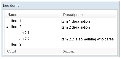
<window title="tree demo" border="normal" width="400px" >
    <tree id="tree" rows="5">
        <treecols sizable="true">
            <treecol label="Name" />
            <treecol label="Description" />
        </treecols>
        <treechildren>
            <treeitem>
                <treerow>
                    <treecell label="Item 1" />
                    <treecell label="Item 1 description" />
                </treerow>
            </treeitem>
            <treeitem>
                <treerow>
                    <treecell label="Item 2" />
                    <treecell label="Item 2 description" />
                </treerow>
                <treechildren>
                    <treeitem>
                        <treerow>
                            <treecell label="Item 2.1" />
                        </treerow>
                    </treeitem>
                    <treeitem>
                        <treerow>
                            <treecell label="Item 2.2" />
                            <treecell
                                label="Item 2.2 is something who cares" />
                        </treerow>
                    </treeitem>
                </treechildren>
            </treeitem>
            <treeitem label="Item 3" />
        </treechildren>
        <treefoot>
            <treefooter label="Count" />
            <treefooter label="Summary" />
        </treefoot>
    </tree>
</window>
Default Selection

    <zscript><![CDATA[
    DefaultTreeModel stm = new DefaultTreeModel(new DefaultTreeNode("ROOT",
        Arrays.asList(new DefaultTreeNode[]{
                new DefaultTreeNode("David",new ArrayList()),
                new DefaultTreeNode("Thomas",new ArrayList()),
                new DefaultTreeNode("Steven",new ArrayList())})));
    ]]></zscript>

    <tree width="300px" model="${stm}" onAfterRender="self.setSelectedItem(self.getTreechildren().getLastChild())"/>
Change Style
To change the style of tree icon, you may call setZclass(String style). Four built in style includes “z-tree”,”z-dottree”,”z-filetree”,”z-vfiletree”
Deprecated Since 7.0
Since ZK 7.0.0, the dottree, filetree and vfiletree styles are deprecated because designs are changed.
Keyboard Navigation Tree
- Press
UPandDOWNto move the selection up and down by one tree item. - Press
PgUpandPgDnto move the selection up and down by one page. - Press
HOMEto move the selection to the first item, andENDto the last item. - Press
RIGHTto open a tree item, andLEFTto close a tree item. - Press
Ctrl+UPandCtrl+DOWNto move the focus up and down by one tree item without changing the selection. - Press
SPACEto select the item in focus.
Paging
Autopaging
When using the paging mold and vflex, you could also turn on autopaging (org.zkoss.zul.Tree#setAutopaging( boolean)) such that the page size will be adjusted automatically based on the available space. since 5.0.2
Note: If enable the autopaging, the height of each row will be applied the following CSS by default. If you want to change the height, please overwrite the CSS rule as your preference.
.z-tree-autopaging .z-treecell-cnt,
.z-dottree-autopaging .z-treecell-cnt,
.z-filetree-autopaging .z-treecell-cnt,
.z-vfiletree-autopaging .z-treecell-cnt {
    height: 30px;
    overflow: hidden;
}
since 5.0.8
Note: In ZK 7, we change the naming .z-treecell-cnt to
.z-treecell-content.
since 7.0.3
PagingDisabled
since 8.0.3
Once the pagingDisabled is set to
true, users will be blocked from navigating through the pagination.
The onPaging and onPageSize Event
When a user clicks to scroll up and down the page, the onPaging event
is sent along with a org.zkoss.zul.event.PagingEvent instance.
Similarly, the onPageSize event is sent along with an
org.zkoss.zul.event.PageSize instance.
Frozen Component
In ZK 7 you are now able to freeze columns within a Tree. This mirrors functionality seen within Excel and makes data in these components easier to read, interpret and handle.
The following code demonstrates how to freeze a column within a Tree:
<tree id="tree" rows="5" width="600px">
    <frozen columns="2" start="1" />
    <treecols sizable="true">
        <treecol width="100px">ID</treecol>
        <treecol width="50px">Priority</treecol>
        <treecol width="50px">Status</treecol>
        <treecol width="150px">Summary</treecol>
        <treecol width="250px">Detail</treecol>
    </treecols>
    <treechildren>
        <treeitem>
            <treerow>
                <treecell>0001</treecell>
                <treecell>1</treecell>
                <treecell>closed</treecell>
                <treecell>Fix login issue</treecell>
                <treecell>Login does not work at all</treecell>
            </treerow>
        </treeitem>
        <treeitem>
            <treerow>
                <treecell>0002</treecell>
                <treecell>3</treecell>
                <treecell>open</treecell>
                <treecell>Button style broken</treecell>
                <treecell>Check main.css</treecell>
            </treerow>
            <treechildren>
                <treeitem>
                    <treerow>
                        <treecell>00021</treecell>
                        <treecell>1</treecell>
                        <treecell>closed</treecell>
                        <treecell>Fix logout issue</treecell>
                        <treecell>Logout does not work at all</treecell>
                    </treerow>
                </treeitem>
            </treechildren>
        </treeitem>
        <treeitem>
            <treerow>
                <treecell>0003</treecell>
                <treecell>2</treecell>
                <treecell>open</treecell>
                <treecell>Client search result</treecell>
                <treecell>Search service returns incomplete result</treecell>
            </treerow>
        </treeitem>
    </treechildren>
</tree>
since 7.0.0
- For further details, please refer to Frozen component directly.
Selection
Nonselectable Tags
since 5.0.5
By default, when a user clicks on an HTML element like <button>, <input>, <textarea>, or <a> tag, the selection state of the item won’t be changed.
For example, when a user clicks the textbox in the following example,
the selection state of the item won’t be changed (only the textbox gains
the focus).
<treeitem>
  <treerow>
    <treecell><textbox/></treecell>
Sometimes it is not intuitive, such as using with inplace editing (org.zkoss.zul.impl.InputElement#isInplace()). If you want to have more control of whether to select an item, you could specify a list of tags in the nonselectableTags property (org.zkoss.zul.Tree#setNonselectableTags(java.lang.String)). For example, if you want to select the item, no matter what tag the user clicks, you could specify an empty string as follows.
<tree nonselectableTags="">
  <treechildren>
    <treeitem>
      <treerow>
        <treecell><textbox/></treecell>
since 5.0.6
If you want to toggle the selection
only when the user clicks on the checkmark, you could specify *.
Notice that you have to specify checkmark=”true” as well (otherwise, no
item is selectable).
<tree checkmark="true" nonselectableTags="*">
Multiple Selection
When the user clicks on a tree item, the whole item is selected and the
onSelect event is sent back to the server to notify the application.
You can control whether a tree control allows multiple selections by
setting the multiple attribute to true. The default value is false.
Note: If you use a model, the multiple attribute should be set to the model instead of the tree itself.
The Checkmark Property
The checkmark attribute controls whether to display a checkbox or a
radio button in front of each tree item. If the multiple attribute is
set to true and the checkmark is set to true then a checkbox will be
displayed in front of every item. However, if multiple is set to false
then a radio button will be displayed instead.
Deselect Others when Clicking an Item with Checkmark
If a tree’s checkmark (org.zkoss.zul.Tree#isCheckmark()) is enabled, the selection will be toggled when an user clicks an item. In other words, all other items will remain the same.
If you prefer to deselect all other items and select the item being
clicked (which the behavior of ZK 5.0.4 and earlier), you could specify
true to this library property called
org.zkoss.zul.tree.checkmarkDeselectOthers in WEB-INF/zk.xml:
<library-property>
    <name>org.zkoss.zul.tree.checkmarkDeselectOthers</name>
    <value>true</value>
</library-property>
Toggle Selection when Right Clicking an Item with Checkmark
If a tree’s checkmark (org.zkoss.zul.Tree#isCheckmark()) is enabled, the selection will be toggled when user right click on item.
If you prefer not to select/deselect item on right click, you could
specify false to this library property called
org.zkoss.zul.tree.rightSelect in WEB-INF/zk.xml:
<library-property>
    <name>org.zkoss.zul.tree.rightSelect</name>
    <value>false</value>
</library-property>
since 5.0.5
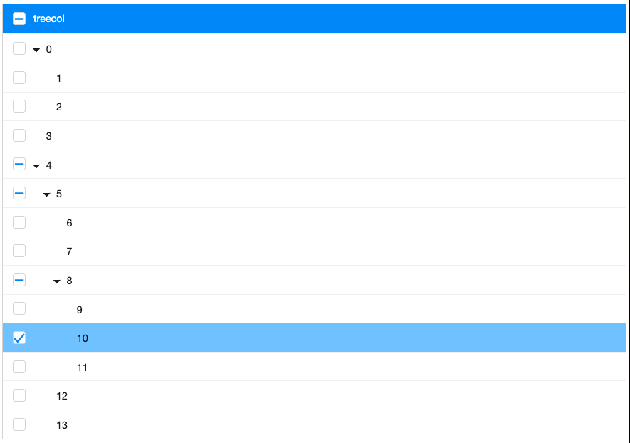
Tristate Selection
since 10.0.0
Allowing users to enable tristate selection with Model. In tristate mode, when users click on the checkbox, depending on whether the current checkbox is checked or unchecked, it will perform 2 actions:
1. Update all the descendants checkboxes to the selection state of the current checkbox (UNSELECTED or SELECTED).
2. Update all the ancestors checkboxes into tristate selection (UNSELECTED, SELECTED or PARTIAL).
How to enable
1. Build tree using a model that is an instance of TristateModel.
2. Set attribute multiple = true, if you don’t set it to multiple, will throw a IllegalArgumentException.
DefaultTristateTreeModel
If you don’t want to implement yourself, there’s a default tristate tree model is provided in ZK EE, let’s take a look at a simple demonstration.
DefaultTristateTreeModel model = new DefaultTristateTreeModel(
    new DefaultTreeNode(null,
        new DefaultTreeNode[] {
            new DefaultTreeNode("0",
                new DefaultTreeNode[] {
                    new DefaultTreeNode("1"),
                    new DefaultTreeNode("2")
                }
            ),
            new DefaultTreeNode("3"),
            new DefaultTreeNode("4",
                new DefaultTreeNode[] {
                    new DefaultTreeNode("5",
                        new DefaultTreeNode[] {
                            new DefaultTreeNode("6"),
                            new DefaultTreeNode("7"),
                            new DefaultTreeNode("8",
                                new DefaultTreeNode[] {
                                    new DefaultTreeNode("9"),
                                    new DefaultTreeNode("10"),
                                    new DefaultTreeNode("11"),
                                }
                            )
                        }
                    ),
                    new DefaultTreeNode("12"),
                    new DefaultTreeNode("13")
                }
            )
        }
    )
);
tree.setModel(model);
tree.setMultiple(true);
Treecols’s header checkmark also support tristate
Properties
ActivePage
Sets the active page so that the specified tree item is visible. When paging mold is active, this scrolls to the page that contains the given item. Has no effect when the item is invisible or does not belong to this tree.
since 3.0.4
<tree mold="paging" pageSize="10">
  <treechildren>
    <treeitem id="targetItem" label="Target"/>
  </treechildren>
</tree>
Set programmatically to navigate to a specific item:
<tree mold="paging" pageSize="10">
  <treechildren>
    <treeitem id="targetItem" label="Target"/>
  </treechildren>
</tree>
Checkmark
Default Value: false
Sets whether a check-mark column is displayed in front of each tree item. Typically combined with multiple="true" to allow checkbox-style multi-selection. When checkmark is true and multiple is false, only one item can be checked at a time.
<tree checkmark="true" multiple="true">
  <treechildren>
    <treeitem label="Option A"/>
    <treeitem label="Option B"/>
  </treechildren>
</tree>
InnerWidth
Default Value: "100%"
Sets the inner width of the tree’s internal table. The inner width controls the width of the scrollable content area; setting it wider than the component’s outer width causes a horizontal scrollbar to appear.
since 3.0.0
<tree width="400px" innerWidth="600px">
  <treecols>
    <treecol label="Name" width="300px"/>
    <treecol label="Description" width="300px"/>
  </treecols>
  <treechildren>
    <treeitem>
      <treerow>
        <treecell label="Root"/>
        <treecell label="A long description text"/>
      </treerow>
    </treeitem>
  </treechildren>
</tree>
ItemRenderer
Sets the renderer used to render each tree item when a model is assigned. If null, a default renderer is used. The renderer is a TreeitemRenderer implementation responsible for populating each Treeitem from the corresponding model node.
This property has no effect when no model is set. To trigger a re-render after assigning a new renderer, reassign the model (e.g., setModel(getModel())) or fire a TreeDataEvent.
since 5.0.6
<zscript><![CDATA[
    import org.zkoss.zul.*;
    DefaultTreeNode root = new DefaultTreeNode(null, new DefaultTreeNode[] {
        new DefaultTreeNode("Fruits", new DefaultTreeNode[]{ new DefaultTreeNode("Apple"), new DefaultTreeNode("Banana") }),
        new DefaultTreeNode("Vegetables", new DefaultTreeNode[]{ new DefaultTreeNode("Carrot") })
    });
    TreeModel treeModel = new DefaultTreeModel(root);
]]></zscript>
<tree model="${treeModel}" itemRenderer="com.example.MyTreeitemRenderer"/>
Model
Sets the TreeModel associated with this tree. The model must also implement TreeSelectableModel. When a model is set, any existing <treechildren> markup is detached and items are rendered by the framework (using the assigned itemRenderer or a default renderer).
Set to null to dissociate the model; the tree reverts to inline markup. When paging mold is active and the model implements Pageable, page size and active page are synchronized between the model and the built-in paging controller.
since 3.0.0
<zscript><![CDATA[
    import org.zkoss.zul.*;
    DefaultTreeNode root = new DefaultTreeNode(null, new DefaultTreeNode[] {
        new DefaultTreeNode("Fruits", new DefaultTreeNode[]{ new DefaultTreeNode("Apple"), new DefaultTreeNode("Banana") }),
        new DefaultTreeNode("Vegetables", new DefaultTreeNode[]{ new DefaultTreeNode("Carrot") })
    });
    TreeModel treeModel = new DefaultTreeModel(root);
]]></zscript>
<tree model="${treeModel}"/>
Multiple
Default Value: false
Sets whether multiple tree items can be selected simultaneously. When changed from true to false, all selected items except the first one are automatically deselected. When a model implementing TreeSelectableModel is assigned, the model’s own multiple-selection state is kept in sync.
<tree multiple="true">
  <treechildren>
    <treeitem label="Item A"/>
    <treeitem label="Item B"/>
  </treechildren>
</tree>
Name
Sets the name attribute submitted with an HTML form. This is only relevant for legacy web applications that process form submissions via servlets. It does not work with non-HTTP clients and should not be used in purely event-driven ZK applications.
<tree name="categoryTree">
  <treechildren>
    <treeitem label="Root"/>
  </treechildren>
</tree>
NonselectableTags
Default Value: null (equivalent to "button,input,textarea,a")
Sets a comma-separated list of HTML tag names whose clicks should not trigger tree item selection. Useful when embedding interactive widgets (buttons, inputs, links) inside tree cells without inadvertently selecting the row.
Specify an empty string ("") to make every tag click selectable. Specify null to restore the default exclusion list (button, input, textarea, a).
since 5.0.5
<tree nonselectableTags="button,a">
  <treechildren>
    <treeitem>
      <treerow>
        <treecell>
          Item with <button label="action"/> button
        </treecell>
      </treerow>
    </treeitem>
  </treechildren>
</tree>
PageSize
Sets the number of tree items displayed per page when the paging mold is active. Throws WrongValueException if the value is negative. Has no effect when the mold is not "paging". When a Pageable model is assigned, the page size is also propagated to the model.
since 2.4.1
<tree mold="paging" pageSize="20">
  <treechildren>
    <treeitem label="Item 1"/>
  </treechildren>
</tree>
Paginal
Sets an external paging controller (Paginal) to use instead of the built-in paging child component. Use this when you want to share a single <paging> component across multiple trees or position it independently in the layout.
When mold is "paging" and paginal is null, a paging child is created automatically. When an external controller is supplied it must be set before the tree is rendered.
since 3.0.7
<paging id="pg" pageSize="10"/>
<tree mold="paging" paginal="${pg}">
  <treechildren>
    <treeitem label="Node"/>
  </treechildren>
</tree>
SelectedItem
Deselects all currently selected items and selects the specified Treeitem. Equivalent to calling selectItem(item). Returns the currently selected item (the first selected item in multiple-selection mode), or null if none is selected.
<tree selectedItem="${defaultItem}">
  <treechildren>
    <treeitem id="defaultItem" label="Default Selection"/>
    <treeitem label="Other"/>
  </treechildren>
</tree>
Seltype
Default Value: "single"
Sets the selection type of the tree. This is a convenience alias for the multiple property: setting seltype="multiple" is equivalent to multiple="true", and seltype="single" is equivalent to multiple="false". Any other value throws a WrongValueException.
| Value | Meaning |
|---|---|
single (default) |
Only one item can be selected at a time. |
multiple |
Multiple items can be selected simultaneously. |
<tree seltype="multiple">
  <treechildren>
    <treeitem label="Item A"/>
    <treeitem label="Item B"/>
  </treechildren>
</tree>
Auxiliary Headers
Like grids, you can specify auxiliary headers with the auxhead and
auxheader components.
Please refer to the Grid for more details.
SizedByContent
By default, the widths of columns have to be specified explicitly, or
they will be split equally among columns regardless of what content they
might have. If you want to have the minimal width (that fit the
content), you could specify hflex="min" at the column (not the tree).
However, the tree has a special mode called sized-by-content (org.zkoss.zul.Tree#setSizedByContent(boolean)). By specifying it to true, the column width will be adjusted automatically. However, it is controlled by the browser, so you have no 100% control of it. For example, if a user resized a column, the final width might not be exactly the same as what he resized.
In general, we suggest specifying hflex in columns, rather than
specifying sizedByContent at a tree for a much more predictable
result.
Rows
The rows attribute is used to control how many rows are visible. By
setting it to zero, the tree control will resize itself to hold as many
as items as possible.
Vflex
The vflex attribute controls whether to grow or shrink vertically to
fit their given space. It is so-called vertical flexibility. For
example, if the tree is too big to fit in the browser window, it will
shrink to make the whole tree visible in the browser window.
This property is ignored if the rows attribute is specified.
Maxlength
The maxlength attribute defines the maximal allowed characters being
visible at the browser. By setting this property, you can make a
narrower tree control.
Sizable
Like columns, you can set the sizable attribute of treecols to
true in order to allow users to resize the width of the tree headers.
Similarly, the onColSize event is sent when a user resizes the widths.
Auto Fitting Columns
since 5.0.0 When you want to resize a column of a Tree or Listbox, all you now need to do is double click the column when the mouse is over where the columns meet and the column will automatically resize to fit its contents. To enable this functionality Tree’s treecols need the attribute sizable=”true”. In other words, all sizable column provides the auto-fitting functionality.
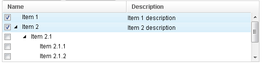
Scrollable Tree
A tree will be scrollable if you specify the rows attribute or the height attribute and there is not enough space to display all the tree items.

<tree rows="4">
    <treecols>
        <treecol label="Name"/>
        <treecol label="Description"/>
    </treecols>
    <treechildren>
        <treeitem>
            <treerow>
                <treecell label="Item 1"/>
                <treecell label="Item 1 description"/>
            </treerow>
        </treeitem>
        <treeitem>
            <treerow>
                <treecell label="Item 2"/>
                <treecell label="Item 2 description"/>
            </treerow>
            <treechildren>
                <treeitem>
                    <treerow>
                        <treecell label="Item 2.1"/>
                    </treerow>
                    <treechildren>
                        <treeitem>
                            <treerow>
                                <treecell label="Item 2.1.1"/>
                            </treerow>
                        </treeitem>
                        <treeitem>
                            <treerow>
                                <treecell label="Item 2.1.2"/>
                            </treerow>
                        </treeitem>
                    </treechildren>
                </treeitem>
                <treeitem>
                    <treerow>
                        <treecell label="Item 2.2"/>
                        <treecell label="Item 2.2 is something who cares"/>
                    </treerow>
                </treeitem>
            </treechildren>
        </treeitem>
        <treeitem label="Item 3"/>
    </treechildren>
</tree>
since 7.0.0
The browser’s default scrollbar is replaced by floating scrollbar and it is not visible unless user mouse over on the content. To turn off the floating scrollbar and use original scrollbar, please add the following configuration in zk.xml.
<library-property>
    <name>org.zkoss.zul.nativebar</name>
    <value>true</value>
</library-property>
Note: the value of org.zkoss.zul.nativebar is true by default
since 7.0.2
)
The Open Property and the onOpen Event
Each tree item contains the open property which is used to control
whether to display its child items if the Tree is not controlled by a
org.zkoss.zul.ext.TreeOpenableModel.
The default value is true. By setting this property to false, you are
able to control what part of the tree is invisible.
If the Tree is controlled by a org.zkoss.zul.ext.TreeOpenableModel such as org.zkoss.zul.AbstractTreeModel or org.zkoss.zul.DefaultTreeModel, the model open state is authoritative and will override the individual component’s open state. please refer to the TreeModel documentation on this topic.
<treeitem open="false">
When a user clicks on the +/- button, he opens the tree item and makes
its children visible. The onOpen event is then sent to the server to
notify the application.
For sophisticated applications, you can defer the creation of the
content of the tree item or manipulate its content dynamically until the
onOpen event is received. Refer to the Load on Demand section in
the ZK User Interface Markup Language chapter for details.
Sticky Header
since 9.6.0
After adding a sclass “z-sticky-header”, when we scroll down a page and make a Tree’s header out of visible range in a viewport, the Tree’s header becomes floating and sticky on the top of the page.
  <tree sclass="z-sticky-header">
    <!-- treecols, treeitem... -->
  </tree>
Create-on-Open for Tree Controls
As illustrated below, you could listen to the onOpen event, and then
load the children of a tree item. You can do the same thing using group
boxes.
<zk>
    <tree width="200px">
        <treecols>
            <treecol label="Subject"/>
            <treecol label="From"/>
        </treecols>
        <treechildren>
            <treeitem open="false" onOpen="load()">
                <treerow>
                    <treecell label="Intel Snares XML"/>
                    <treecell label="David Needle"/>
                </treerow>
                <treechildren/>
            </treeitem>
        </treechildren>
        <zscript>
            void load() {
                Treechildren tc = self.getTreechildren();
                if (tc.getChildren().isEmpty()) {
                    Treeitem ti = new Treeitem();
                    ti.setLabel("New added");
                    ti.setParent(tc);
                }
            }
        </zscript>
    </tree>
</zk>
Custom Attributes
org.zkoss.zul.tree.rightSelect
[default: true]
[inherit: true]
It specifies the selection should be toggled when user right clicks on an item, if the checkmark is enabled (org.zkoss.zul.Tree#isCheckmark()). If it is turned off, right clicking on an item will change its selection state.
org.zkoss.zul.tree.autoSort
[default: false]
[inherit: true]1
since 5.0.7 It specifies whether to sort the model when the following cases:
- org.zkoss.zul.Tree#setModel (TreeModel)is called and org.zkoss.zul.Treecol#setSortDirection(String) is set.
- org.zkoss.zul.Treecol#setSortDirection(String) is called.
- Model receives org.zkoss.zul.event.TreeDataEvent and org.zkoss.zul.Treecol#setSortDirection(String) is set.
If you want to ignore sort when receiving org.zkoss.zul.event.TreeDataEvent, you can specifies the value as ignore.change.
org.zkoss.zul.tree.autohidePaging
[default: true]
[inherit: true]2
since 7.0.1
It specifies whether to enable autohide property for internal paging component.
Supported Events
| Name | Event Type | Description |
|---|---|---|
onSelect |
org.zkoss.zk.ui.event.SelectEvent | Notifies one that the user has selected a new item in the tree. |
onFocus |
org.zkoss.zk.ui.event.Event | Denotes when a component gets the focus. Remember event listeners execute at the server, so the focus at the client might be changed when the event listener for onFocus got executed. |
onBlur |
org.zkoss.zk.ui.event.Event | Denotes when a component loses the focus. Remember event listeners execute at the server, so the focus at the client might be changed when the event listener for onBlur got executed. |
onPageSize |
org.zkoss.zul.event.PageSizeEvent | Notifies the paging size has been changed when the autopaging (org.zkoss.zul.Tree#setAutopaging(boolean)) is enabled and user changed the size of the content. |
onRender |
org.zkoss.zul.event.RenderEvent | Notifies the tree that a set of items needs to be rendered. Fired as a client AU request; carries the set of Treeitem instances that require rendering. |
onInnerWidth |
org.zkoss.zk.ui.event.Event | Notifies the server that the browser has updated the inner width of the tree’s content area. The server-side innerWidth field is updated accordingly. |
onScrollPos |
org.zkoss.zk.ui.event.Event | Notifies the server of the current scroll position (top/left offsets) of the tree’s content area. The server stores these values to restore scroll position after updates. |
onAnchorPos |
org.zkoss.zk.ui.event.Event | Notifies the server of the anchor position (top/left offsets) used for virtual rendering alignment. The server stores these values for consistent item positioning. |
onCheckSelectAll |
org.zkoss.zk.ui.event.CheckEvent | Fired when the user clicks the select-all checkbox in the column header. Delegates to the model’s SelectionControl.setSelectAll(boolean). Only fired when a TreeSelectableModel with SelectionControl is assigned. |
- Inherited Supported Events: XulElement
Supported Molds
Available molds of a component are defined in lang.xml embedded in zul.jar.
| Name | Snapshot |
|---|---|
| default |  |
| paging |  |
Supported Children
* Treecols, Treechildren, Treefoot
Use Cases
| Version | Description | Example Location |
|---|---|---|
| 3.6 | Smalltalk: Building a Complex Tree with Grid-in-Grid | Building a Complex Tree with Grid-in-Grid |
| 3.6 | Expand all items of a Tree at start | http://www.zkoss.org/forum/listComment/9379 |
Browser Limitations
Chrome & Safari
When a Tree is placed inside certain container layouts (for example an hbox) in WebKit-based browsers (Chrome and Safari), the computed width may become zero. To avoid this, set an explicit width on the tree. Example:
<zk>
    <hbox>
        <tree width="300px">
            <treecols>
                <treecol label="Name" />
                <treecol label="Description" />
            </treecols>
            <treechildren>
                <treeitem>
                    <treerow>
                        <treecell label="Item 1" />
                        <treecell label="Item 1 description" />
                    </treerow>
                </treeitem>
            </treechildren>
        </tree>
    </hbox>
</zk>
The width of the tree will be zero in Chrome and Safari if no width is specified because WebKit may consider the tree’s natural width to be zero. Specify the width (or use a layout/column sizing approach that yields a non-zero width) to work around this.
-
The custom attribute could be specified in this component, or any of its ancestor. In addition, it could be specified asa library propertyto enable or disable it for the whole application.↩ -
Same as above.↩