Radio
- Demonstration: Radio
- Java API: org.zkoss.zul.Radio
- JavaScript API: zul.wgt.Radio
Employment/Purpose
A radio button is a component that can be turned on and off. Radio
buttons are grouped together in a group, called radiogroup. Only one
radio button with the same group may be selected at a time.
Common Use Cases
- Mutually exclusive choice within a form — group several
<radio>buttons inside a<radiogroup>so only one option can be active at a time (e.g. gender, payment method, shipping speed). - Radio buttons outside their group container — when the radio needs to appear in a different layout element (e.g. a grid row or a separate panel), set the
radiogroupattribute to the ID of the target<radiogroup>to maintain mutual exclusion across the page. - Pre-selecting a default option — use
selected="true"on the desired<radio>to present a sensible default to the user without requiring an explicit click.
Example
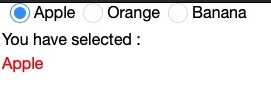
    <vlayout>
        <radiogroup onCheck="fruit.value = self.selectedItem.label">
            <radio label="Apple"/>
            <radio label="Orange"/>
            <radio label="Banana"/>
        </radiogroup>
        You have selected :
        <label id="fruit" style="color:red"/>
    </vlayout>
Properties
Radiogroup
since 5.0.4
Sets the Radiogroup this radio button belongs to. By default a radio automatically joins the nearest ancestor <radiogroup>. Use this attribute only when the radiogroup is not an ancestor of the radio — for example, when radio buttons are scattered across different table rows or panels.
Accepts either the component ID of a <radiogroup> element, or the UUID form uuid(comp_uuid).
<radiogroup id="myGroup"/>
<!-- radio placed outside the radiogroup -->
<radio label="Option A" radiogroup="myGroup"/>
<radio label="Option B" radiogroup="myGroup"/>
Selected
Default Value: false
Sets whether this radio button is selected (checked). Setting this to true automatically deselects any other radio in the same group, keeping mutual exclusion. This attribute is an alias of checked.
<radiogroup>
    <radio label="Yes" selected="true"/>
    <radio label="No"/>
</radiogroup>
Supported Events
- Inherited Supported Events: Checkbox
Supported Children
*NONE