Inputgroup
- Demonstration: Inputgroup – organize your input components
- Java API:
org.zkoss.zul.Inputgroup - JavaScript API:
zul.wgt.Inputgroup
since 9.0.0
Employment/Purpose
The Inputgroup component in ZK provides a way to prepend or append components to an input component, allowing for the creation of custom form-input components by merging different elements together. It allows for enhanced organization and layout flexibility in input forms.
Common Use Cases
- Prepend/append labels or symbols to text inputs — place a currency sign (
$), unit label (kg), or email domain (@example.com) directly beside an<textbox>so the two appear as a single merged control. - Button groups adjacent to inputs — attach a
<button>(e.g. “Search” or “Go”) flush against a<textbox>or<combobox>without custom CSS. - Vertical input stacks — use
orient="vertical"to stack multiple inputs (e.g. first name / last name) under a shared label, keeping related fields visually grouped. - Mixed content rows — combine
<label>,<textbox>,<combobox>, and<button>children in a single<inputgroup>to build compound form controls such as price-range selectors or search bars with filters.
Example
The Inputgroup component can be used in various ways to enhance the user interface and functionality of input forms. The following examples demonstrate different use cases:
-
Basic Inputgroup:
The basic inputgroup example demonstrates how to prepend text to a textbox using the
@symbol.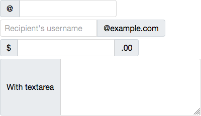
<zk>
    <inputgroup>
        @<textbox />
    </inputgroup>

    <inputgroup>
        <textbox placeholder="Recipient's username"/>@example.com
    </inputgroup>

    <inputgroup>
        $<textbox/>.00
    </inputgroup>

    <inputgroup>
        With textarea
        <textbox multiline="true" rows="5" cols="30"/>
    </inputgroup>
</zk>
Try it
-
Vertical Orientation:
The vertical orientation example shows how to set the inputgroup to display components vertically using the
orientattribute.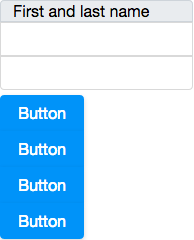
<zk>
     <inputgroup orient="vertical">
         First and last name<textbox/><textbox/>
     </inputgroup>

     <inputgroup orient="vertical">
         <button label="Button"/>
         <button label="Button"/>
         <button label="Button"/>
         <button label="Button"/>
     </inputgroup>
 </zk>
Try it
Properties
Orient
Default Value: horizontal
Sets the orientation of the inputgroup. Accepted values:
| Value | Meaning |
|---|---|
horizontal |
Children are laid out in a row (default). |
vertical |
Children are stacked in a column. |
<inputgroup orient="vertical">
    First and last name
    <textbox placeholder="First"/>
    <textbox placeholder="Last"/>
</inputgroup>