Drawer
- Demonstration: Introduce a new ZK Addon: Drawer
- Java API: org.zkoss.zkmax.zul.Drawer
- JavaScript API: zkmax.wgt.Drawer
Employment/Purpose
The Drawer component functions as a panel that remains attached to the boundary of a web page. By utilizing the Drawer, developers can maintain a cleaner page layout and enhance the user experience by organizing detailed information within the Drawer itself.
Common Use Cases
- Contextual detail panels — Show supplementary information (file metadata, record details, audit logs) for a selected item without navigating away from the page. Trigger via a button calling
drawer.open(). - Settings / filter sidebars — Slide in a form for filter criteria or user-preference controls from the
leftorrightedge, keeping the main content visible behind the mask. - Step-by-step helper panels — Use
position="bottom"to present guided instructions or a mini-wizard below the working area, closable once the user is done. - Edge-hover quick access — Enable
autodrop="true"so the drawer opens automatically when the cursor nears the page boundary, providing keyboard-shortcut panels or toolboxes without a dedicated trigger button. (Not supported on mobile devices.)
Example
The example below demonstrates the placement of a Drawer on the right side of the page and exhibits detailed file information contained within the Drawer:
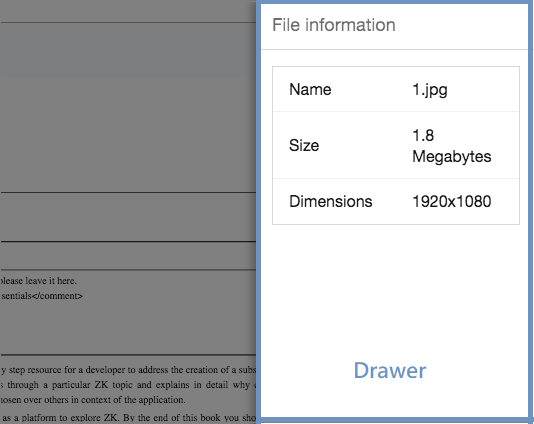
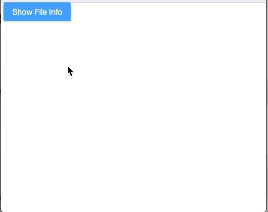
In this example, a button labeled “Show File Info” is used to trigger the opening of the Drawer component with the title “File Information”. Within the Drawer, a grid layout is applied to display specific file details such as Name, Size, and Dimensions.
<zk>
  <button label="Show File Info" onClick="fi.open()"/>
  <drawer id="fi" title="File information">
    <grid>
      <rows>
        <row>
          <label value="Name"/>
          1.jpg
        </row>
        <row>
          <label value="Size"/>
          1.8 Megabytes
        </row>
        <row>
          <label value="Dimensions"/>
          1920x1080
        </row>
      </rows>
    </grid>
  </drawer>
</zk>
Try it
Open / Close the Drawer
You can utilize both the visible attribute and the open/close methods to interact with the Drawer component for opening and closing it as needed.
Change Animation Speed
The Drawer component supports the data-animationspeed attribute for adjusting the animation speed. Refer to Data-AnimationSpeed for more information.
Properties
Autodrop

When enabled, the drawer will automatically open when the mouse cursor approaches the page edge. Note that this feature is not currently supported on mobile devices.
Closable
Determines whether the Drawer can be closed by the user through the display of a close button. Even if the closable attribute is set to false, users can still close the Drawer by clicking outside of it.
Mask
Controls whether a translucent dark gray full-screen mask is displayed when the Drawer is opened. Users can still close the Drawer by clicking outside of it, even when the mask attribute is set to false.
Position
Default Value: right
Specifies the placement position of the Drawer on the web page. Supported values include left, right, top, and bottom.
Title
Sets the title of the Drawer component. A null value indicates no title for the Drawer.
Supported Events
| Name | Event Type | Description |
|---|---|---|
onOpen |
OpenEvent | The onOpen event signifies that the user has opened or closed a component. Unlike the onClose event, onOpen serves as a notification event sent after the opening or closing of the component. |
Supported Children
*ALL: Indicates that the Drawer component can have any kind of ZK component as its child element. This allows you to include any ZK component within the Drawer, providing flexibility and customization options for your designs.