North
- Demonstration: Borderlayout
- Java API: org.zkoss.zul.North
- JavaScript API: zul.layout.North
Employment/Purpose
A north region of a border layout and only allows one component as its child.
Common Use Cases
Fixed-height header bar
Use the north region with a fixed pixel height for a persistent page header:
<borderlayout height="600px">
    <north size="60px" border="none">
        <toolbar>
            <toolbarbutton label="Home"/>
            <toolbarbutton label="About"/>
        </toolbar>
    </north>
    <center autoscroll="true">
        <label value="Main content"/>
    </center>
</borderlayout>
Collapsible north panel
Allow users to collapse the north region to reclaim vertical space:
<borderlayout height="500px">
    <north size="120px" collapsible="true" title="Summary Panel">
        <label value="Summary information"/>
    </north>
    <center>
        <label value="Detail view"/>
    </center>
</borderlayout>
Splittable north region
Enable drag-to-resize with splittable="true" so users can adjust the north region’s height at runtime:
<borderlayout height="500px">
    <north size="150px" splittable="true" minsize="50" maxsize="300">
        <label value="Resizable header content"/>
    </north>
    <center>
        <label value="Main content"/>
    </center>
</borderlayout>
Example
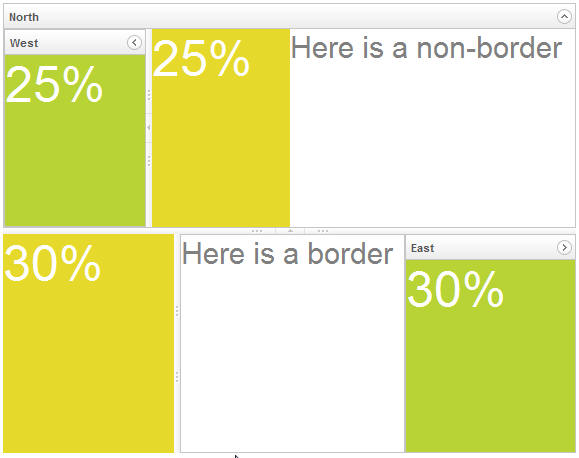
<borderlayout height="450px">
    <north title="North" maxsize="300" size="50%" splittable="true" collapsible="true">
        <borderlayout>
            <west title="West" size="25%" flex="true" maxsize="250" splittable="true" collapsible="true">
                <div style="background:#B8D335">
                    <label value="25%"
                        style="color:white;font-size:50px" />
                </div>
            </west>
            <center border="none">
                <div style="background:#E6D92C" vflex="1">
                    <label value="25%"
                        style="color:white;font-size:50px" />
                </div>
            </center>
            <east size="50%" border="none">
                <label value="Here is a non-border"
                    style="color:gray;font-size:30px" />
            </east>
        </borderlayout>
    </north>
    <center border="0">
        <borderlayout>
            <west maxsize="600" size="30%" border="0" splittable="true">
                <div style="background:#E6D92C" vflex="1">
                    <label value="30%"
                        style="color:white;font-size:50px" />
                </div>
            </west>
            <center>
                <label value="Here is a border"
                    style="color:gray;font-size:30px" />
            </center>
            <east title="East" size="30%" collapsible="true">
                <div style="background:#B8D335"  vflex="1">
                    <label value="30%"
                        style="color:white;font-size:50px" />
                </div>
            </east>
        </borderlayout>
    </center>
</borderlayout>
How to Layout
For more details, please refer to Borderlayout.
Properties
Size
Default Value: null
Sets the height of the north region. This is a shortcut for the height attribute — any valid CSS height value is accepted (e.g. "200px", "30%").
<borderlayout height="400px">
    <north size="150px">
        <label value="Header area"/>
    </north>
    <center>
        <label value="Content area"/>
    </center>
</borderlayout>
Note: The
widthattribute is not applicable to<north>because its width is determined by sibling<west>and<east>regions. Usesize(or equivalentlyheight) to control the north region’s dimension.
Caption
since 6.5.0
A layout region may have a caption, which is specified by declaring a
child component <caption>.
<borderlayout>
    <north>
        <caption label="search" image="/img/live.gif"/>
        <div>
        Content
        </div>
    </north>
</borderlayout>
Closable
since 8.5.2
Default: true
Whether users can open or close the region. Require
collapsible="true". Notice you need to click the icon on the title or
on the splitter to open/close a region. Clicking a title slides a region
instead of opening it. 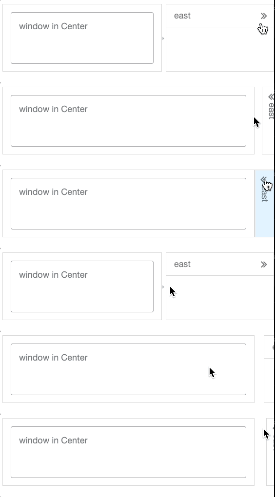
Slidable
since 8.5.2
Default: true
Whether users can slide (preview) the region when clicking on the title
of the collapsed region. It opens the region like a drawer overlapping
on the <center>, so it doesn’t affect the size of <center> which is
different from opening the region. Require collapsible="true".

Supported Events
- Inherited Supported Events: LayoutRegion
Supported Children
*ALL