Group
- Demonstration: Group
- Java API: org.zkoss.zul.Group
- JavaScript API: zkex.grid.Group
Employment/Purpose
Adds the ability for single level grouping to the Grid.
Default getSclass(): the same as grid’s sclass.
Common Use Cases
Example
<?xml version="1.0" encoding="UTF-8"?>
<zk>
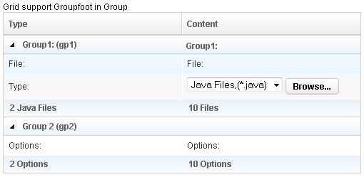
Grid support Groupfoot in Group
<grid id="grid" width="500px">
<columns id="h" sizable="true">
<column id="col1" label="Type"/>
<column id="col2" label="Content"/>
</columns>
<rows id="rows">
<group id="gp1">
<label value="Group1: (gp1)"/>
<label value="Group1:"/>
</group>
<row>
<label value="File:"/>
<label value="File:"/>
</row>
<row id="row1">
<label value="Type:"/>
<hbox>
<listbox rows="1" mold="select">
<listitem label="Java Files,(*.java)"/>
<listitem label="All Files,(*.*)"/>
</listbox>
<button label="Browse..."/>
</hbox>
</row>
<groupfoot>
<label value="2 Java Files"/>
<label value="10 Files"/>
</groupfoot>
<group id="gp2" label="Group 2 (gp2)" onOpen='alert("Group is open: "+self.open);'/>
<row>
<label value="Options:"/>
<label value="Options:"/>
</row>
<groupfoot>
<label value="2 Options"/>
<label value="10 Options"/>
</groupfoot>
</rows>
</grid>
</zk>
Properties
Label
Default Value: null
Sets the text label displayed in the group header row. If no child <label> exists yet, one is created automatically. Setting this attribute is the concise alternative to placing a <label> as the first child of <group>.
<grid>
  <columns>
    <column label="Type"/>
    <column label="Value"/>
  </columns>
  <rows>
    <group label="Section A"/>
    <row><label value="Item 1"/><label value="42"/></row>
  </rows>
</grid>
Open
Default Value: true
Controls whether the group is expanded (true) or collapsed (false). When collapsed, all child rows are hidden.
Note: When a
GroupsModelis used to supply data, do not useopento toggle visibility — control the model directly (for example, callGroupsModelArray.setClose()) to avoid lifecycle conflicts.
<grid>
  <columns>
    <column label="Type"/>
    <column label="Value"/>
  </columns>
  <rows>
    <group label="Collapsed Group" open="false"/>
    <row><label value="Hidden"/><label value="Row"/></row>
    <group label="Expanded Group" open="true"/>
    <row><label value="Visible"/><label value="Row"/></row>
  </rows>
</grid>
Supported Events
| Name | Event Type | Description |
|---|---|---|
onOpen |
org.zkoss.zk.ui.event.OpenEvent | Denotes user has opened or closed a component. Note: unlike onClose, this event is only a notification. The client sends this event after opening or closing the component. It is useful to implement load-on-demand by listening to the onOpen event, and creating components when the first time the component is opened. |
- Inherited Supported Events: Row
Supported Children
*ALL