Linelayout
- Demonstration: Linelayout
- Java API: org.zkoss.zkmax.zul.Linelayout
- JavaScript API: zkmax.layout.Linelayout
since 9.0.0
Employment/Purpose
Linelayout is a component for displaying chronological information in
a flexible and easy way; in addition to static data it also support
ListModel. Linelayout only accept Lineitem as its child.
A Linelayout is composed of three parts: first area, line area and last area. The first and last areas are the containers for the content, and the line area contains the line and the point.
Common Use Cases
Static Timeline
Use inline <lineitem> children for a fixed list of events. Apply opposite="true" to alternate items and customize the point via pointIconSclass and pointStyle.
<linelayout>
    <lineitem>
        <label value="Jan — Project kick-off" />
    </lineitem>
    <lineitem opposite="true" pointStyle="background:#FF4051">
        <label value="Mar — Design review" />
    </lineitem>
    <lineitem>
        <label value="Jun — Beta release" />
    </lineitem>
</linelayout>
Model-Driven Timeline with Template
Bind a ListModel and declare a <template name="model"> to render dynamic data without a custom renderer. The EL variables ${each} (current item) and ${forEachStatus} (loop metadata) are available inside the template.
<zscript>
    import org.zkoss.zul.ListModelList;
    ListModelList model = new ListModelList(
        new String[] { "2024-Q1", "2024-Q2", "2024-Q3", "2024-Q4" }
    );
</zscript>
<linelayout model="${model}">
    <template name="model">
        <lineitem>
            <label value="${each}" />
        </lineitem>
    </template>
</linelayout>
Horizontal Layout
Set orient="horizontal" to arrange items left-to-right instead of top-to-bottom. Combine with firstScale and lastScale to shift the line axis.
<linelayout orient="horizontal" lineStyle="background:rgba(0,0,0,0.3)" firstScale="1" lastScale="2">
    <lineitem><label value="08:00" /></lineitem>
    <lineitem opposite="true"><label value="12:00" /></lineitem>
    <lineitem><label value="18:00" /></lineitem>
</linelayout>
Example
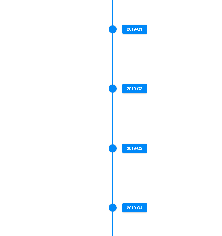
  <zscript>
    ListModel model = new ListModelList(new String[] {
        "2019-Q1",
        "2019-Q2",
        "2019-Q3",
        "2019-Q4"
    });
  </zscript>
  <linelayout model="${model}">
    <template name="model">
      <lineitem>
        <button label="${each}"></button>
      </lineitem>
    </template>
  </linelayout>
Browser Support
- This component is based on CSS Flexbox and is compatible with browsers that support CSS Flexbox such as IE11+, Chrome and Firefox. Please check browser compatibility before using it.
Accessibility
since 9.5.0
Keyboard Support
| Key | Description |
|---|---|
| ArrowUp / ArrowLeft | Moves focus to previous item. |
| ArrowDown / ArrowRight | Moves focus to next item. |
Labeling with ARIA
To name a component with ARIA attribute by adding the aria-label
client attribute to the component, please refer to
ZK Developer’s Reference/Accessibility#Specify_ARIA_Attributes
Properties
Model
Default Value: null
Associates a ListModel with this linelayout to drive its children dynamically. When a model is set, the linelayout renders one Lineitem per element using either the default renderer or the renderer supplied via ItemRenderer / LineitemRenderer.
To use a template-based rendering, declare a <template name="model"> inside the linelayout — the default renderer will use it and expose ${each} and ${forEachStatus} EL variables.
The value is a Java object (ListModel) constructed in <zscript>, a Composer, or a ViewModel.
<zscript>
    import org.zkoss.zul.ListModelList;
    ListModelList model = new ListModelList(
        new String[] { "2019-Q1", "2019-Q2", "2019-Q3", "2019-Q4" }
    );
</zscript>
<linelayout model="${model}">
    <template name="model">
        <lineitem>
            <label value="${each}" />
        </lineitem>
    </template>
</linelayout>
LineitemRenderer
Default Value: null (uses built-in default renderer)
Sets the LineitemRenderer used to render each Lineitem when a Model is assigned. When null, the default renderer is used, which either renders a plain Label or expands a <template name="model"> if one is declared.
Changing this property when a model is already set will trigger a re-render via onInitRender. For an alternative that triggers a full invalidate(), see ItemRenderer.
The value is a Java object constructed in a Composer or ViewModel and passed via EL.
<zscript>
    import org.zkoss.zkmax.zul.LineitemRenderer;
    import org.zkoss.zkmax.zul.Lineitem;
    import org.zkoss.zul.Label;
    import org.zkoss.zul.ListModelList;

    ListModelList model = new ListModelList(
        new String[] { "Alpha", "Beta", "Gamma" }
    );

    LineitemRenderer myRenderer = new LineitemRenderer() {
        public void render(Lineitem item, Object data, int index) {
            Label lbl = new Label("Item " + index + ": " + data);
            lbl.setParent(item);
        }
    };
</zscript>
<linelayout model="${model}" lineitemRenderer="${myRenderer}" />
ItemRenderer
Default Value: null (uses built-in default renderer)
Sets the LineitemRenderer used to render each Lineitem when a Model is assigned. This property is functionally equivalent to LineitemRenderer but triggers a full component invalidate() instead of a partial re-render when changed; prefer this when you need the client widget to be fully rebuilt.
The value is a Java object constructed in a Composer or ViewModel and passed via EL.
<zscript>
    import org.zkoss.zkmax.zul.LineitemRenderer;
    import org.zkoss.zkmax.zul.Lineitem;
    import org.zkoss.zul.Label;
    import org.zkoss.zul.ListModelList;

    ListModelList model = new ListModelList(
        new String[] { "2024-Q1", "2024-Q2", "2024-Q3" }
    );

    LineitemRenderer myRenderer = new LineitemRenderer() {
        public void render(Lineitem item, Object data, int index) {
            Label lbl = new Label(String.valueOf(data));
            lbl.setParent(item);
        }
    };
</zscript>
<linelayout model="${model}" itemRenderer="${myRenderer}" />
Orient
Default Value: vertical
Whether the linelayout displays vertically or horizontally.
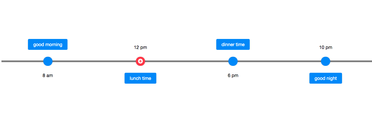
  <linelayout orient="horizontal" lineStyle="background:rgba(0,0,0,0.5)" >
    <lineitem>
      <label>8 am</label>
      <button>good morning</button>
    </lineitem>
    <lineitem opposite="true" pointIconSclass="z-icon-plus-circle" pointStyle="background: #FF4051">
      <label>12 pm</label>
      <button>lunch time</button>
    </lineitem>
    <lineitem>
      <label>6 pm</label>
      <button>dinner time</button>
    </lineitem>
    <lineitem opposite="true">
      <label>10 pm</label>
      <button>good night</button>
    </lineitem>
  </linelayout>
LineStyle
The CSS inline style for the line.
FirstScale
The scale of space occupied by the first area. The default value is 1, you can change the position of the line by adjusting this property. For example, set firstScale as 1 and lastScale as 3 in a vertical linelayout, the line will be rendered a quarter away from the left boundary since the space ratio becomes 1:3..
LastScale
The scale of space occupied by the last area, the default value is 1.
Please refer to FirstScale.
Supported Events
| Name | Event Type | Description |
|---|---|---|
| Inherited Supported Events: XulElement |
Supported Children
* Lineitem