Toolbarbutton
- Demonstration: Toolbar and Fileupload
- Java API: org.zkoss.zul.Toolbarbutton
- JavaScript API: zul.wgt.Toolbarbutton
Employment/Purpose
The behavior of Toolbarbutton is similar to the button except the appearance is different. The button component uses HTML BUTTON tag, while the toolbarbutton component uses HTML DIV tag.
A toolbarbutton could be placed outside a toolbar. However toolbarbuttons change their appearance if they are placed inside a toolbar.
Toolbarbutton supports getHref(). If getHref() is not null, the onClick handler is ignored and this element is degenerated to HTML’s A tag.
Within ZK 5, the file upload has been redesigned so it can be integrated with any widget. For example, the toolbarbutton can now be used to upload a file. In addition to this, the display of the upload status has been enhanced and can be customized easily.
Common Use Cases
Toggle Button in a Toolbar
Use mode="toggle" to create a persistent on/off control. Handle onCheck to react to state changes:
<toolbar>
    <toolbarbutton id="boldBtn" label="Bold" mode="toggle"
        onCheck="applyBold(event.isChecked())" />
    <toolbarbutton id="italicBtn" label="Italic" mode="toggle"
        onCheck="applyItalic(event.isChecked())" />
</toolbar>
Navigation Link
Set href to degenerate the toolbarbutton into an HTML anchor (<a> tag). The onClick handler is ignored when href is set:
<toolbar>
    <toolbarbutton label="Home" image="/img/home.png" href="/index.zul" />
    <toolbarbutton label="ZK" href="https://www.zkoss.org" target="_blank" />
</toolbar>
File Upload
Set upload="true" to use the toolbarbutton as a file-upload trigger. Handle the onUpload event to process the uploaded file:
<toolbarbutton upload="true" label="Upload File"
    onUpload="myProcessUpload(event.getMedia())" />
Example
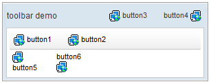
<window title="toolbar demo" border="normal" width="300px">
    <caption>
        <toolbarbutton label="button3" image="/img/network.gif" />
        <space />
        <toolbarbutton label="button4" image="/img/network.gif"
            dir="reverse" />
    </caption>
    <toolbar>
        <toolbarbutton label="button1" image="/img/network.gif" />
        <space />
        <toolbarbutton label="button2" image="/img/network.gif" />
    </toolbar>
    <hbox>
        <toolbarbutton label="button5" image="/img/network.gif"
            orient="vertical" />
        <space />
        <toolbarbutton label="button6" image="/img/network.gif"
            orient="vertical" dir="reverse" />
    </hbox>
</window>
Properties
See also inherited properties documented on Button.
Checked
Default Value: false
Returns or sets whether the toolbarbutton is in the checked (pressed) state. This property is meaningful only when mode="toggle" is set. When the user clicks the button to toggle it on, checked becomes true; clicking again sets it back to false. The component fires an onCheck event whenever the value changes.
since 6.0.0
<toolbar>
    <toolbarbutton label="Bold" mode="toggle" checked="true" />
</toolbar>
Mode
Default Value: "default"
Sets the interaction mode of the toolbarbutton. Accepted values:
| Value | Meaning |
|---|---|
default |
Standard push-button behaviour. Each click fires onClick and the button returns to its unpressed appearance immediately. |
toggle |
The button acts as a two-state toggle. It stays visually pressed after the first click and releases on the next click. Each state change fires onCheck with a CheckEvent. |
since 6.0.0
<toolbar>
    <toolbarbutton label="File system" mode="toggle"
        onCheck="result.setValue(event.isChecked() ? 'on' : 'off')" />
    <label id="result" />
</toolbar>
Supported Events
| Name | Event Type | Description |
|——|————|————-|
| onCheck | CheckEvent | Denotes when the toolbarbutton state changes in toggle mode. Fired whenever checked property changes. Only meaningful when mode="toggle" is set.
since 6.0.0
|
Inherited Supported Events: Button
Supported Molds
| Mold | Description |
|---|---|
default |
The standard toolbarbutton appearance — a flat DIV-based button that reacts to hover/focus/active states. |
toggle |
A two-state toggle button appearance. Equivalent to setting mode="toggle"; the button renders in a visually distinct pressed state when checked="true". |
The default mold renders the toolbarbutton as a standard flat DIV-based push button. This is the out-of-the-box appearance used when no mold attribute is specified.
The toggle mold renders the toolbarbutton as a two-state toggle button. The button stays visually pressed when checked="true" and releases when checked="false". Use this mold (or equivalently set mode="toggle") when you need a persistent on/off indicator in a toolbar.
Supported Children
*NONE