Cardlayout
- Java API: org.zkoss.zkmax.zul.Cardlayout
- JavaScript API: zkmax.layout.Cardlayout
Employment/Purpose
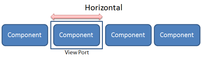
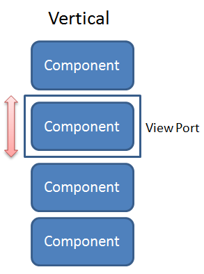
Cardlayout is a layout that allows end-users to change component like
changing cards. The selectedIndex will decide which component will be
shown in the view port. When the value of selectedIndex changes or
when next() or previous() is called, transition of components
through animation will occur whereas the orient attribute decides
whether the direction of the animation is horizontal or vertical.
Common Use Cases
- Wizard / step-by-step form — place each step in a child component and advance via
next()/previous()or by settingselectedIndexprogrammatically from a ViewModel. - Image gallery / carousel — wrap
<image>components as children; swipe gestures on touch devices fireonChangeautomatically. - Tab-like navigation without tab headers — pair
Cardlayoutwith an external<tabbox>or custom button bar that setsselectedIndexto switch panels without the built-in tab strip. - Vertical slide panels — set
orient="vertical"when the natural reading direction of the content flow is top-to-bottom (e.g., a vertically paginated report).
Example

    <cardlayout id="card" width="300px" height="200px" style="border:3px solid orange" selectedIndex="1">
        <div vflex="1" hflex="1" style="background-color:yellow;padding:20px">card 1</div>
        <div vflex="1" hflex="1" style="background-color:green;padding:20px">card 2</div>
        <div vflex="1" hflex="1" style="background-color:skyblue;padding:20px">card 3</div>
    </cardlayout>
    <hlayout>
        <button onClick="card.previous()">previous</button>
        <button onClick="card.next()">next</button>
        <button
          onClick='card.setOrient("horizontal".equals(card.getOrient()) ? "vertical" : "horizontal")'>
          change orient
        </button>
    </hlayout>
Size Issue
If Cardlayout of hflex is set as "min", it’s width will be decided
by the selected component’s size when initializing. On the other hand,
if the child component of Cardlayout sets hflex="1", its width will
equal to Cardlayout’s width.
Swipe Distance Issue
On tablet, think for user experience Cardlayout will change component
if swipe distance bigger than one-third of it’s width/height. If
Cardlayout’s width/height is smaller than 90px, the minimum trigger
distance will be 30px. Another case is Image. If Cardlayout’s child
component is Image, it will use default swipe distance trigger
setting.
Accessibility
since 9.5.0
Cardlayout is often used along with other components to achieve the carousel effect. If you are using cardlayout for carousel, check here for carousel practice.
Sample
Here is a simple traffic light carousel:
    <div ca:role="region" ca:aria-roledescription="carousel" ca:aria-label="traffic light" tabindex="0">
        <div>
            <button ca:aria-label="Previous Slide" onClick="card.previous()">previous</button>
            <button ca:aria-label="Next Slide" onClick="card.next()">next</button>
        </div>
        <cardlayout id="card" width="300px" height="200px" style="border:1px solid red" selectedIndex="1" tabindex="0">
            <div ca:aria-label="red" vflex="1" hflex="1" style="background-color:red;padding:20px">red</div>
            <div ca:aria-label="yellow" vflex="1" hflex="1" style="background-color:yellow;padding:20px">yellow</div>
            <div ca:aria-label="green" vflex="1" hflex="1" style="background-color:green;padding:20px">green</div>
        </cardlayout>
    </div>
Labeling with ARIA
To name a component with ARIA attribute by adding the aria-label
client attribute to the component, please refer to
ZK Developer’s Reference/Accessibility#Specify_ARIA_Attributes
Properties
Orient
Default Value: "horizontal"
Sets the direction of the card-change animation. Accepted values:
| Value | Meaning |
|---|---|
horizontal |
Cards slide left/right (default) |
vertical |
Cards slide up/down |
Passing any other string throws a WrongValueException.
<cardlayout orient="vertical" width="300px" height="200px">
    <div vflex="1" hflex="1" style="background-color:yellow">card 1</div>
    <div vflex="1" hflex="1" style="background-color:green">card 2</div>
</cardlayout>
SelectedIndex
Default Value: 0
Sets the zero-based index of the child component currently shown in the viewport. The value must be >= 0 and < the number of child components; passing an out-of-range value throws a UiException. Unlike most selection components, a negative (deselected) state is not supported.
<cardlayout selectedIndex="1" width="300px" height="200px">
    <div vflex="1" hflex="1" style="background-color:yellow">card 1</div>
    <div vflex="1" hflex="1" style="background-color:green">card 2 (initially visible)</div>
    <div vflex="1" hflex="1" style="background-color:skyblue">card 3</div>
</cardlayout>
Supported Events
| Name | Event Type | Description |
|---|---|---|
onChange |
Event | Fired when the user swipes on a touch device to change the visible card. The new selectedIndex is synchronized to the server automatically before the event is posted. |
Inherited Supported Events: XulElement
Supported Children
*ALL