Window
- Demonstration: Window
- Java API: org.zkoss.zul.Window
- JavaScript API: zul.wnd.Window
Employment/Purpose
A window is, like HTML DIV tag, used to group components. Unlike other components, a window has the following characteristics.
- A window is an owner of ID_Space. Any component contained in a window, including itself, could be found by use of org.zkoss.zk.ui.Component#getFellow(java.lang.String), if it is assigned with an identifier.
- A window could be overlapped, popup, and embedded.
- A window could be a modal dialog.
Example

    <window title="Embedded Style" border="normal" width="200px">Hello,
        Embedded!
    </window>
    <window title="Overlapped Style" mode="overlapped" border="normal"
            width="200px">Hello, Overlapped!
    </window>
Window Modes
A window could be in one of five different modes:
- embedded (default)
- overlapped
- popup
- modal
- highlighted and
You could change the mode by the use of org.zkoss.zul.Window#setMode(java.lang.String).
<window title="Hi, I'm Overlapped" border="normal" mode="overlapped">
...
</window>
Alternatively, you could invoke one of org.zkoss.zul.Window#doOverlapped(), org.zkoss.zul.Window#doPopup(), org.zkoss.zul.Window#doModal(), org.zkoss.zul.Window#doHighlighted(), and org.zkoss.zul.Window#doEmbedded(), as shown below.
<zk>
    <window id="win" title="Hi!" border="normal" width="200px">
        <caption>
            <toolbarbutton label="Help"/>
        </caption>
        <checkbox label="Hello, Wolrd!"/>
    </window>

    <button label="Overlap" onClick="win.doOverlapped();"/>
    <button label="Popup" onClick="win.doPopup();"/>
    <button label="Modal" onClick="win.doModal();"/>
    <button label="Embed" onClick="win.doEmbedded();"/>
    <button label="Highlighted" onClick="win.doHighlighted();"/>
</zk>
Embedded
An embedded window is placed inline with other components. In this mode, you cannot change its position, since the position is decided by the browser. It is the default mode since it is the most common appearance.
Overlapped
An overlapped window is overlapped with other components, such that users could drag it around and developer could set its position by org.zkoss.zul.Window#setLeft(java.lang.String) and org.zkoss.zul.Window#setTop(java.lang.String) based on the entire scrollable area.
<window title="My Overlapped" width="300px" mode="overlapped">
</window>
An overlapped window is typically used to display the information that should co-exist with the current operation and should appear for a long time. You might have multiple overlapped windows and each for different set of information. If you want to show the information that will appear only temporarily (dismissed as soon as a user clicks somewhere else), you could use the popup mode as described in the next section, or the Popup component.
Popup
A popup window is similar to overlapped windows, except it is automatically closed when user clicks on any component other than the popup window itself or any of its descendants. Of course, you could dismiss it manually by making it invisible or detaching it.
As its name suggested, it is designed to implement the popup windows. A
typical application is to display information that won’t obscure the
current operation and are easy to close. A popup window is usually
position around the focal point (such as a button). It can be done by
use of
org.zkoss.zul.Window#setPosition(java.lang.String)
with parent.
For example, we could display a popup window right after a button as depicted below.
<zk>
    <toolbarbutton label="More info" onClick="info.doPopup()"/><span>
    <window id="info" visible="false" width="120px" border="normal" position="parent">
    Here is more information
    </window>
    </span>
</zk>
where we specify position="parent", and make it as a child of a span component. The span component acts as an anchor
point and the window is posited based on it.
In additions to popup windows, you could use Popup for displaying a popup. The popup component has more control how to position it (by the use of org.zkoss.zul.Popup#open(org.zkoss.zk.ui.Component, java.lang.String)).
Modal and Highlighted
By default, a modal window is the same as a highlighted window. You should consider them exactly the same.
Blocking Background Content
A modal window provides the so-called modal effect that limits a user from accessing components other than the modal window. Users cannot access anything outside of the modal window, including clicking or tabbing.
For instance, you could access only the textbox and button in the following example:
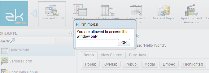
You can have multiple modal windows at the same time, and a user can only access the last modal window. Once the last modal is dismissed (invisible or detached), the previous modal window will become the active modal window until it is dismissed.
Dismiss
To dismiss a modal window, you can make it invisible (org.zkoss.zul.Window#setVisible(boolean)), or detach it from a page.
Position
By default, a modal window is positioned at the center of the viewport. You can change the position by org.zkoss.zul.Window#setPosition(java.lang.String) or org.zkoss.zul.Window#setLeft(java.lang.String) and org.zkoss.zul.Window#setTop(java.lang.String) based on the current viewport.
Enforce Gaining the Focus
When a modal (or highlighted) window is displayed, ZK enforces focus on its first focusable child component if a user clicks anywhere on the page. This behavior ensures that users remain within the context of the modal interaction, which is a common design pattern for modal dialogs. The enforced focus prevents users from interacting with the background content, maintaining the modal window’s purpose as a self-contained prompt requiring user attention.
Modal Windows and Event Processing Threads
By default, events are processed in the same thread that serves the HTTP request (so-called Servlet thread). However, you could configure ZK to process events in an individual thread, such that the event listener could suspend the execution at any time, and resume later. For how to enable the event processing thread, please refer to The_disable-event-thread_Element
Notice that, for better integration with other frameworks, such as Spring, it is suggested to disable the event processing thread (default). For more information, please refer to the Event Threads.
Once the event thread is enabled, a modal window will behave differently from other modes: org.zkoss.zul.Window#doModal() will suspend the execution until dismissed (invisible, detached or mode changed). It is convenient to implement something that has to wait for user’s further input.
As depicted in the following example, f1() is called only after win1
is dismissed, while g1() is called immediately right after win2
becomes highlighted:
win1.doModal(); //the execution is suspended until win1 is closed
f1();
win2.doHighlighted(); //the execution won't be suspended
g1()
Properties and Features
Border
The border property
(org.zkoss.zul.Window#setBorder(java.lang.String))
specifies whether to display a border for window. The default style
sheets support only normal and none. The default value is none,
i.e., no border.
Closable
By setting the closable property
(org.zkoss.zul.Window#setClosable(boolean))
to true, a close button is shown for the window, which enables a to
close the window by clicking the button. Once the user clicks on the
close button, an onClose event is sent to the window which is
processed by the onClose method of the Window component. Then,
onClose, by default, detaches the window itself.
The onClose Event
You can override it to do whatever you want. Or, you can register your own listener to change the default behavior. For example, you might choose to hide the window rather than close it.
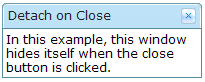
<window closable="true" title="Detach on Close" border="normal" width="200px"
 onClose="self.visible = false; event.stopPropagation();">
     In this example, this window hides itself when the close button is clicked.
</window>
Notice that event.stopPropagation()
(org.zkoss.zk.ui.event.Event#stopPropagation())
must be called to prevent the default onClose handler
(org.zkoss.zul.Window#onClose()) being
called.
Tip: If the window is a popup, the onOpen event will be sent to
the window with open=false, when the popup is closed due to the user
clicking outside of the window, or pressing ESC.
The onClose is sent to ask the server to detach or to hide the window.
By default, the window is detached. Of course, the application can
override this behavior and do whatever it wants as described above.
On the other hand, onOpen is a notification. It is sent to notify the
application that the client has hidden the window. The application
cannot prevent it from hiding or changing the behavior to be detached.
ContentStyle and ContentSclass
You can customize the look and feel of window’s content block by
specifying the contentStyle property
(org.zkoss.zul.Window#setContentStyle(java.lang.String)).
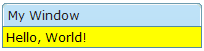
<zk>
    <window title="My Window" border="normal" width="200px" contentStyle="background:yellow">
        Hello, World!
    </window>
</zk>
Scrollable Window
A typical use of the contentStyle attribute is to make a window
scrollable as follows.
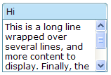
<window id="win" title="Hi" width="150px" height="100px" contentStyle="overflow:auto" border="normal">
     This is a long line wrapped over several lines, and more content to display.
     Finally, the scrollbar becomes visible.
     This is another line.
</window>
Note: For IE 7’s overflow bug, also use position:relative with overflow:auto
Position
By default, its value is null. That is, an overlapped/popup window is
positioned by the left and top attributes based on the entire
scrollable area, while a highlighted/modal window is positioned at the
center of the viewport.
If you specify a value in this attribute, it takes higher priority than
left and top attributes. Hence, a window is rendered upon this
position and ignore left and top.
For example, the following code snippet positions the window to the right-bottom corner.
<window width="300px" mode="overlapped" position="right,bottom">
 ...
The position’s value can be a combination of the following constants
by separating them with commas (,).
| Constant | Description |
|---|---|
| center | Position the window at the center. If left or right is also specified, it means the vertical center. If top or bottom is also specified, it means the horizontal center. If none of left, right, top and bottom is specified, it means the center in both directions.Both the left and top properties are ignored. |
| left | Position the window at the left edge. The left property is ignored. |
| right | Position the window at the right edge. The left property is ignored. |
| top | Position the window at the top. The top property is ignored. |
| bottom | Position the window at the bottom. The top property is ignored. |
Based on Viewport
ZK calculates the position based on the current
viewport,
not the whole scrollable area’s boundary. So if you scroll down a page
for 1000px, the top means the top of the viewport instead of the top
of the page.
Based on the Parent
| Constant | Description |
|---|---|
| parent | Position the window relative to the top-left corner of the parent component. See specific details in the popup section. If left or top is also specified, the position will be offset from the top-left corner of the parent component by the same amount.This position cannot be combined with other positions mentioned in the previous table. |
Sizable
If you allow users to resize the window, you can set the sizable
attribute to true as follows.
<window id="win" title="Sizable Window" border="normal" width="200px" sizable="true">
    This is a sizable window.
    <button label="Change Sizable" onClick="win.sizable = !win.sizable"/>
</window>
Once allowed, users can resize the window by dragging the borders.
The onSize Event
Once a user resizes the window, the onSize event is sent with an
instance of the org.zkoss.zul.event.SizeEvent. Notice that the window
is resized before theonSize event is sent. In other words, the event
serves as a notification that you generally ignore. Of course, you can
do whatever you want in the event listener.
Note: If the user drags the upper or left border, the onMove event
is also sent since the position has changed, too.
Title and Caption
A window might have a title, a caption and a border. The title is
specified by the title attribute. The caption is specified by
declaring a child component called caption. All children of the
caption component will appear on right hand side of the title.
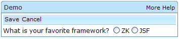
<zk>
    <window title="Demo" border="normal" width="350px">
        <caption>
            <toolbarbutton label="More" />
            <toolbarbutton label="Help" />
        </caption>
        <toolbar>
            <toolbarbutton label="Save" />
            <toolbarbutton label="Cancel" />
        </toolbar>
        What is your favorite framework?
        <radiogroup>
            <radio label="ZK" />
            <radio label="JSF" />
        </radiogroup>
    </window>
</zk>
You are also able to specify a label and an image within a caption, and then the appearance is as follows.
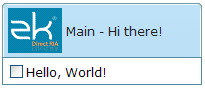
<zk>
    <window id="win" title="Main" border="normal" width="200px">
        <caption image="/images/ZK-Logo.PNG" label="Hi there!"/>
        <checkbox label="Hello, World!"/>
    </window>
</zk>
Common Dialogs
The XUL component set supports the following common dialogs to simplify some common tasks.
Supported Events
| Name | Event Type |
|---|---|
onMove |
Event: org.zkoss.zk.ui.event.Event Denotes the position of the window is moved by a user. |
onOpen |
Event: org.zkoss.zk.ui.event.OpenEvent Denotes user has opened or closed a component. Note: Unlike onClose, this event is only a notification. The client sends this event after opening or closing the component.It is useful to implement load-on-demand by listening to the onOpen event, and creating components when the first time the component is opened. |
onClose |
Event: org.zkoss.zk.ui.event.Event Denotes the close button is pressed by a user, and the component shall detach itself. |
onMaximize |
Event: org.zkoss.zk.ui.event.MaximizeEvent Denotes user has maximize a component. |
onMinimize |
Event: org.zkoss.zk.ui.event.MinimizeEvent Denotes user has minimize a component. |
onSize |
Event: org.zkoss.zk.ui.event.SizeEvent Denotes the panel’s size is updated by a user. |
onZIndex |
Event: org.zkoss.zk.ui.event.ZIndexEvent Denotes the panel’s zindex is updated by a user. |
Supported Children
ALL