Layouts and Containers
Layouts are components used to partition the display area it owns into several sub-areas for its child components, while containers group its child components into the display area it owns.
Users are allowed to nest one from another to create desired UI.
Layouts
This section provides brief introductions for some of the layout components in ZK. For detailed information and the complete list of layouts, please refer to ZK Component Reference: Layouts.
Hlayout and Vlayout
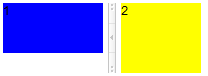
Hlayout and Vlayout are simple and light-weighted layout components that arrange their children to be displayed horizontally and vertically respectively. Also, they are easily customizable as they are made up of HTML DIVs.
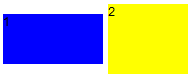
<hlayout>
  <div width="100px" height="50px" style="background:blue">1</div>
  <div width="80px" height="70px" style="background:yellow">2</div>
</hlayout>
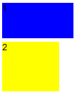
<vlayout>
  <div width="100px" height="50px" style="background:blue">1</div>
  <div width="80px" height="70px" style="background:yellow">2</div>
</vlayout>
Scrolling
- To make Hlayout and Vlayout scrollable, specify
overflow:auto;at “style” . - The height of Hlayout and Vlayout depends on the size of their children, therefore, in order to keep the height of Hlayout and Vlayout constant for the scroll bar to appear, specify a fixed height to Hlayout and Vlayout or place them into a fixed height container, EX: “<window height=”100px”…”.
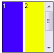
<hlayout width="100px" height="100px" style="border:1px solid black;overflow:auto;">
    <div width="40px" height="150px" style="background:blue;color:white;">1</div>
    <div width="40px" height="150px" style="background:yellow;">2</div>
</hlayout>
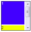
<vlayout width="100px" height="100px" style="border:1px solid black;overflow:auto;">
    <div width="80px" height="80px" style="background:blue;color:white;">1</div>
    <div width="80px" height="80px" style="background:yellow;">2</div>
</vlayout>
Alignment
Users are allowed to change sclass to control alignment.
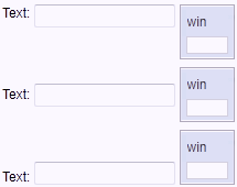
<zk>
    <hlayout sclass="z-valign-top">
        <label value="Text:"/>
        <textbox/>
        <window width="50px" height="50px" title="win" border="normal"/>
    </hlayout>
    <separator/>
    <hlayout>
        <label value="Text:"/>
        <textbox/>
        <window width="50px" height="50px" title="win" border="normal"/>
    </hlayout>
    <separator/>
    <hlayout sclass="z-valign-bottom">
        <label value="Text:"/>
        <textbox/>
        <window width="50px" height="50px" title="win" border="normal"/>
    </hlayout>
</zk>
Hbox and Vbox
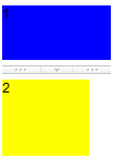
Similar to Hlayout and Vlayout, Hbox and Vbox arrange their children to be displayed horizontally and vertically respectively. Hbox and Vbox provide more functionalities such as splitter, align and pack. However, their performance is slower, so it is suggested to use Hlayout and Vlayout if you’d like to use them a lot in a UI, unless you need the features that only Hbox and Vbox support.
<hbox>
  <div width="100px" height="50px" style="background:blue">1</div>
  <splitter collapse="before"/>
  <div width="80px" height="70px" style="background:yellow">2</div>
</hbox>
<vbox>
  <div width="100px" height="50px" style="background:blue">1</div>
  <splitter collapse="after"/>
  <div width="80px" height="70px" style="background:yellow">2</div>
</vbox>
Scrolling
- Hbox and Vbox are created by a table, however, HTML tables are not able to show scroll bars. Hence, to achieve this, users will need to place them in a scrolling container.
<div width="100px" height="100px" style="border:1px solid black;overflow:auto;">
    <hbox>
        <div width="40px" height="150px" style="background:blue;color:white;">1</div>
        <div width="40px" height="150px" style="background:yellow;">2</div>
    </hbox>
</div>
<div width="100px" height="100px" style="border:1px solid black;overflow:auto;">
    <vbox>
        <div width="80px" height="80px" style="background:blue;color:white;">1</div>
        <div width="80px" height="80px" style="background:yellow;">2</div>
    </vbox>
</div>
Alignment
- Users are also allowed to specify align and pack to control alignment.
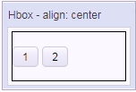
<window title="Hbox" border="normal" width="150px" height="100px">
    <caption label="align: center" />
    <hbox  height="100%" style="border:1px solid black;"
        align="center">
        <button label="1" />
        <button label="2" />
    </hbox>
</window>
<window title="Hbox" border="normal" width="150px" height="100px">
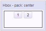
<caption label="pack: center" />
<hbox height="100%" style="border:1px solid black;"
pack="center">
<button label="1" />
<button label="2" />
</hbox>
</window>
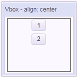
<window title="Vbox" border="normal" width="150px" height="150px">
    <caption label="align: center" />
    <vbox  height="100%" style="border:1px solid black;"
        align="center">
        <button label="1" />
        <button label="2" />
    </vbox>
</window>
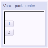
<window title="Vbox" border="normal" width="150px" height="150px">
    <caption label="pack: center" />
    <vbox  height="100%" style="border:1px solid black;"
        pack="center">
        <button label="1" />
        <button label="2" />
    </vbox>
</window>
For more detailed information, please refer to Hbox and Vbox.
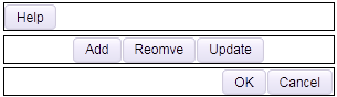
- Users are also allowed to use “cell” to control each cell’s alignment.

<hbox width="500px">
    <cell style="border:1px solid black;">
        <button label="Help"/>
    </cell>
    <cell style="border:1px solid black;"
        hflex="6" align="center">
        <button label="Add"/>
        <button label="Reomve"/>
        <button label="Update"/>
    </cell>
    <cell style="border:1px solid black;"
        hflex="4" align="right">
        <button label="OK"/>
        <button label="Cancel"/>
    </cell>
</hbox>
<vbox width="300px" align="stretch">
    <cell style="border:1px solid black;">
        <button label="Help"/>
    </cell>
    <cell style="border:1px solid black;"
        align="center">
        <button label="Add"/>
        <button label="Reomve"/>
        <button label="Update"/>
    </cell>
    <cell style="border:1px solid black;"
        align="right">
        <button label="OK"/>
        <button label="Cancel"/>
    </cell>
</vbox>
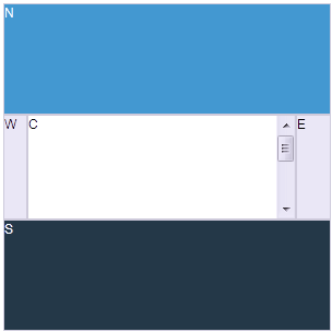
Borderlayout
Borderlayout divides its child components into to five areas: North, South, East, West and Center. The heights of North and South are first decided, the remaining space is then given to Center as its height. Note that East and West also take on the height of Center.

<borderlayout width="100px" height="100px">
    <north>
        <div style="background:#008db7;color:white;">N</div>
    </north>
    <south>
        <div style="background:#112f37;color:white;">S</div>
    </south>
    <center>
        <div>C</div>
    </center>
    <east>
        <div style="background:#f2f2f2;">E</div>
    </east>
    <west>
        <div style="background:#f2f2f2;">W</div>
    </west>
</borderlayout>
flex
Layout region shares the height of Borderlayout with a distributing sequence of: North, South and Center while the heights of East and West take on the height of Center. In the previous sample, the div in the layout region does not take up all of layout region’s space. In order for the child to occupy the whole area, please set vflex=”1” to the child component.

<borderlayout width="100px" height="100px">
    <north>
        <div style="background:#008db7;color:white;">N</div>
    </north>
    <south>
        <div style="background:#112f37;color:white;">S</div>
    </south>
    <center>
        <div>C</div>
    </center>
    <east>
        <div vflex="1" style="background:#f2f2f2;">E</div>
    </east>
    <west>
        <div vflex="1" style="background:#f2f2f2;">W</div>
    </west>
</borderlayout>
Scrolling
- The height of Center depends on Borderlayout but not on its child, therefore, the height of Center will not be expanded by the growing size of its child components. If Center’s height is too short for its child, Center will cut out the contents of its child, hence, to avoid this, specify autoscroll=”true” to Center in order to assign Center to handle the scrolling.
<borderlayout width="300px" height="300px">
    <north>
        <div height="100px"  style="background:#008db7;color:white;">N</div>
    </north>
    <south>
        <div height="100px"  style="background:#112f37;color:white;">S</div>
    </south>
    <center autoscroll="true">
        <div height="200px">C</div>
    </center>
    <east flex="true">
        <div width="30px" style="background:#f2f2f2;">E</div>
    </east>
    <west flex="true">
        <div width="20px" style="background:#f2f2f2;">W</div>
    </west>
</borderlayout>
Grown by children
- To make Borderlayout dependent on the size of its child components, vflex feature is applied. Specify vflex=”min” to each layout region and Borderlayout.

<borderlayout width="300px" vflex="min">
    <north vflex="min">
        <div height="100px"  style="background:#008db7;color:white;">N</div>
    </north>
    <south vflex="min">
        <div height="100px"  style="background:#112f37;color:white;">S</div>
    </south>
    <center vflex="min">
        <div height="200px">C</div>
    </center>
    <east flex="true">
        <div width="30px" style="background:#f2f2f2;">E</div>
    </east>
    <west flex="true">
        <div width="20px" style="background:#f2f2f2;">W</div>
    </west>
</borderlayout>
Borderlayout in a container
- Almost all containers’ heights depend on their child components, however, the height of Borderlayout does not expand according to the sizes of its child components, therefore, when placing Borderlayout in a container, users have to specify a fixed height in order for Borderlayout to be visible.
<zk>
    <window title="win" border="normal">
        <borderlayout height="200px">
            <north>
                <div style="background:blue">N</div>
            </north>
            <south>
                <div style="background:blue">S</div>
            </south>
            <center>
                <div>C</div>
            </center>
            <east>
                <div style="background:yellow">E</div>
            </east>
            <west>
                <div style="background:yellow">W</div>
            </west>
        </borderlayout>
    </window>
</zk>
- The default height of Borderlayout is dependent on its parent component, therefore, users can also put Borderlayout in a container with a fixed height.
<zk>
    <window title="win" border="normal" height="200px">
        <borderlayout>
            <north>
                <div style="background:blue">N</div>
            </north>
            <south>
                <div style="background:blue">S</div>
            </south>
            <center>
                <div>C</div>
            </center>
            <east>
                <div style="background:yellow">E</div>
            </east>
            <west>
                <div style="background:yellow">W</div>
            </west>
        </borderlayout>
    </window>
</zk>
Columnlayout
Columnlayout places its child components into multiple columns while each column allows any number of child components placed vertically with different heights (but with the same widths). Unlike portallayout, Columnlayout does not allow end users the ability to move child components to different locations at will (although of course, developers are allowed to use the ZK application to re-arrange the order of children components).

<columnlayout>
  <columnchildren width="30%" style="padding: 5px 1px">
    <panel height="60px" title="1" border="normal" maximizable="true">
      <panelchildren>1</panelchildren>
    </panel>
    <panel height="80px" title="2" border="normal" closable="true">
      <panelchildren>2</panelchildren>
    </panel>
  </columnchildren>
  <columnchildren width="70%" style="padding: 5px 1px">
    <panel height="100px" title="3" border="normal" collapsible="true">
      <panelchildren>3</panelchildren>
    </panel>
  </columnchildren>
</columnlayout>
Portallayout
Portallayout places its child components into multiple columns while each column can allow any number of child components to be placed vertically with different heights (but with the same widths). Users are also allowed to move any of them to any area desired like that of a portal.
<portallayout>
  <portalchildren width="40%" style="padding: 5px 1px">
    <panel height="60px" title="1" border="normal" maximizable="true">
      <panelchildren>1</panelchildren>
    </panel>
    <panel height="90px" title="2" border="normal" closable="true">
      <panelchildren>2</panelchildren>
    </panel>
  </portalchildren>
  <portalchildren width="60%" style="padding: 5px 1px">
    <panel height="100px" title="3" border="normal" collapsible="true">
      <panelchildren>3</panelchildren>
    </panel>
    <panel height="55px" title="4" border="normal" closable="true">
      <panelchildren>4</panelchildren>
    </panel>
  </portalchildren>
</portallayout>
Tablelayout
Tablelayout places its child components in a table. Ths implementation is based on an HTML TABLE tag.
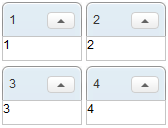
<tablelayout columns="2">
  <tablechildren>
    <panel title="1" border="normal"
      collapsible="true" width="80px" height="60px">
      <panelchildren>1</panelchildren>
    </panel>
  </tablechildren>
  <tablechildren>
    <panel title="2" border="normal"
      collapsible="true" width="80px" height="60px">
      <panelchildren>2</panelchildren>
    </panel>
  </tablechildren>
  <tablechildren>
    <panel title="3" border="normal"
      collapsible="true" width="80px" height="60px">
      <panelchildren>3</panelchildren>
    </panel>
  </tablechildren>
  <tablechildren>
    <panel title="4" border="normal"
      collapsible="true" width="80px" height="60px">
      <panelchildren>4</panelchildren>
    </panel>
  </tablechildren>
</tablelayout>
Containers
This section provides a brief introduction for some of the container components in ZK. For detailed information and a complete list of containers, please refer to ZK Component Reference: Containers.
Div and Span
Div and span are the most light-weighted containers to group child components. They work the same way as HTML DIV and SPAN tags respectively. Div is a block element that would cause line break for the following sibling i.e. the child and its sibling won’t be on the same line (horizontal position). On the other hand, span is an inline element which would place the child component and its siblings on the same line (horizontal position).

<div style="border: 1px solid blue" width="150px">
  this is
  <span>inlined with <button label="Hi"/></span>
</div>
<div style="border: 1px solid grey">
    <div>div is a block</div>
    <datebox/>
</div>
Scrolling
Span:
- Span is an inline element that is not scrollable.
Div:
- To make Div scrollable, specify “overflow:auto;” to “style”.
- The height of Div depends on the size of its children, therefore, in order to keep the height of Div constant for the scroll bar to appear, specify a fixed height to Div.

<div height="100px" width="100px"
    style="border:1px solid black;overflow:auto;">
    <grid>
        <rows>
            <row>item</row>
            <row>item</row>
            <row>item</row>
            <row>item</row>
            <row>item</row>
        </rows>
    </grid>
</div>
Window
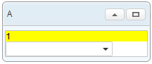
Window is a container providing captioning, bordering, overlapping, draggable, closable, sizable, and many other features. Window is also the owner of an ID space, such that each child component and its IDs are in one independent window so as to avoid the IDs of child components conflicting with one another.
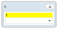
<window title="A" closable="true" sizable="true"
 border="normal" mode="overlapped">
   <div style="background: yellow">1</div>
   <combobox/>
</window>
Scrolling
- To make Window scrollable, specify “overflow:auto;” from “contentStyle”.
- The height of Window is dependent on the size of its children, therefore, in order to keep the height of Window constant for the scroll bar to appear, specify a fixed height to Window.
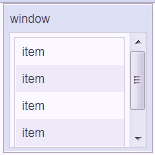
<window title="window" border="normal"
    height="150px" width="150px"
    contentStyle="overflow:auto;">
    <grid>
        <rows>
            <row>item</row>
            <row>item</row>
            <row>item</row>
            <row>item</row>
            <row>item</row>
        </rows>
    </grid>
</window>
Panel
Like Window, panel is another powerful container supporting captioning, bordering, overlapping and many other features. However, org.zkoss.zk.ui.IdSpace is not implemented by this component, therefore, all of its children belong to the same ID space of its parent.
<panel title="A" framable="true" border="normal"
 maximizable="true" collapsible="true">
   <panelchildren>
      <div style="background: yellow">1</div>
      <combobox/>
   </panelchildren>
</panel>
Scrolling
- To make Panel scrollable, specify “overflow:auto;” to “style” of “panelchildren”.
- The height of Panel is dependent on the size of its children, therefore, in order to keep the height of the Panel constant for the scroll bar to appear, specify a fixed height to Panel.
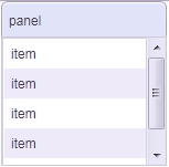
<panel title="panel" border="normal"
    height="150px" width="150px">
    <panelchildren style="overflow:auto;">
        <grid>
            <rows>
                <row>item</row>
                <row>item</row>
                <row>item</row>
                <row>item</row>
                <row>item</row>
            </rows>
        </grid>
    </panelchildren>
</panel>
Groupbox
Groupbox is a light-weighted way to group child components together. It supports “caption” and “border”, however, it does not support overlapping or resizing. Like Panel, org.zkoss.zk.ui.IdSpace is not implemented by this component either.

<groupbox mold="3d">
  <caption label="Fruits"/>
  <radiogroup>
    <radio label="Apple"/>
    <radio label="Orange"/>
    <radio label="Banana"/>
  </radiogroup>
</groupbox>
Scrolling
`3d mold only`- To make Groupbox scrollable, specify “overflow:auto” to “contentStyle”.
- The height of the Groupbox depends on the size of its children, therefore, in order to keep the height of the Groupbox constant for the scroll bar to appear, specify a fixed height to Groupbox.
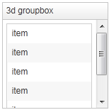
<groupbox mold="3d" height="150px" width="150px"
    contentStyle="overflow:auto;">
    <caption label="3d groupbox" />
    <grid>
        <rows>
            <row forEach="1,2,3,4,5,6">item</row>
        </rows>
    </grid>
</groupbox>
Tabbox
Tabbox is a container used to display a set of tabbed groups of components. A row of tabs can be displayed at the top (or left) of the tabbox; users can switch between each tab group by a simple click. org.zkoss.zk.ui.IdSpace is not implemented by this component either.
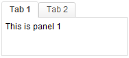
<tabbox height="80px">
  <tabs>
    <tab label="Tab 1"/>
    <tab label="Tab 2"/>
  </tabs>
  <tabpanels>
    <tabpanel>This is panel 1</tabpanel>
    <tabpanel>This is panel 2</tabpanel>
  </tabpanels>
</tabbox>
Scrolling
- To make Tabpanel scrollable, specify “overflow:auto;” to “style”.
- The height of Tabpanel is dependent on the size of its children, therefore, in order to keep the height of the Tabpanel constant for the scroll bar to appear, specify a fixed height to Tabbox.
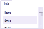
<tabbox height="100px" width="150px">
    <tabs>
        <tab label="tab" />
    </tabs>
    <tabpanels>
        <tabpanel style="overflow:auto;">
            <grid>
                <rows>
                    <row forEach="1,2,3,4,5,6">item</row>
                </rows>
            </grid>
        </tabpanel>
    </tabpanels>
</tabbox>