Useful Java Utilities
In this section we introduce some of the most commonly used Java utility classes.
Executions
getCurrent
[http://www.zkoss.org/javadoc/latest/zk/org/zkoss/zk/ui/Executions.html#getCurrent() Executions.getCurrent()]
Retrieves the current execution (request/response).
createComponents
Creates components defined in another zul file and attaches them to the current page.
sendRedirect
Redirects to another URL. If the parameter is left null, it will redirect to the current page.
Sessions
getCurrent
[http://www.zkoss.org/javadoc/latest/zk/org/zkoss/zk/ui/Sessions.html#getCurrent() Sessions.getCurrent()]
Retrieves the current session.
Clients
The Clients class provides a comprehensive set of utility methods for client-side manipulation through AU (Asynchronous Update) responses. It enables server-side code to interact with the browser, including executing JavaScript, managing UI focus, handling scrolling, showing notifications, controlling busy states, and more. This class serves as the bridge between server-side Java code and client-side browser interactions in ZK applications.
evalJavaScript
This method sends an AU Response to execute the given JavaScript on client side, which is the standard way of calling JavaScript from server side in ZK. For example,
Clients.evalJavaScript("zk.log('Hi.');");
since 9.6.0 To handle javascript errors triggered by evalJavascript, org.zkoss.zk.ui.ScriptErrorListener.class is provided.
focus
since 9.5.0
Clients.focus(Component component) for MVC
Clients.focus(String selector) for MVVM.
Focus the given component or the selector-matched component.
Scroll Components Into View
Clients.scrollIntoView(Component cmp)
Scroll a component into viewport. It scrolls the parent component of the given component, so the given one becomes visible in the view.
This method is particularly useful to ensure a component is visible to the users, especially when it might initially be outside the current viewport. Common use cases include bringing form fields with validation errors into view, ensuring components are visible for user interaction like focusing, navigating to specific elements on long pages (similar to anchor links), highlighting search
results within lists or tables, or bringing newly loaded items in dynamically loading content into view. It is often used in conjunction with Clients.focus() to improve reliability across different browsers and devices, including mobile, where automatic scrolling might not occur when focusing.
Component myComponent;
Clients.scrollIntoView(myComponent);
since 9.5.0 Clients.scrollIntoView(String selector)
Scrolls the parent of the selector matched component, so the given one becomes visible in the view.
Clients.scrollIntoView("#myWindow");
Clients.scrollIntoView(".myField");
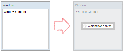
Show Busy Message / Block Users Interaction
Clients.showBusy() Clients.clearBusy()
Display/dismiss a busy message which can cover a component or the whole page. So you can block all interaction to components and let users know the operation is in progress or has finished. For example,
Clients.showBusy(window, "Waiting for server...");
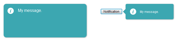
showNotification
since 6.0.1 Clients.showNotification() since 9.0.0 It is advised to use Notification class which was introduced in ZK 9 instead.
Shows a notification box, which is dismissed upon left click (like a Popup). You can either display a global notification (bigger) or a notification specific to another component (smaller with an arrow pointing to the target component).
Clients.showNotification(msg); // display a global notification box
Clients.showNotification(msg, component); // display a notification box pointing to a component
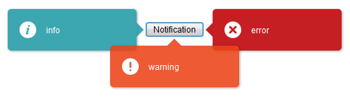
You can also specify its position, style, and duration (for auto-dismiss):
Clients.showNotification(msg, type, component, position, duration);
Type determines the style of the notification box.
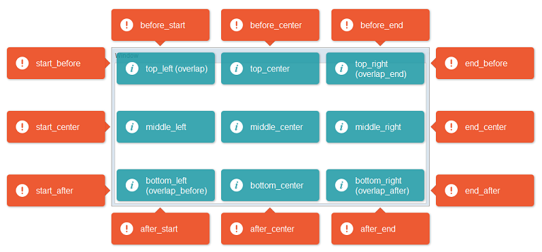
Here are the available positions:
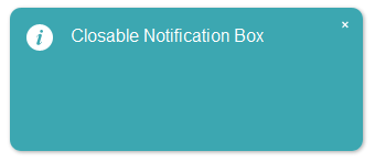
Closable
since 6.5.0 Notification now supports closable to let users close the notification box manually.
// add close icon on the top right corner of notification box
Clients.showNotification(msg, closable);
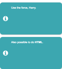
Multiline
To show a multiline message, just append <br/> in the message string.
Clients.showNotification("msg1 <br/> msg2 <br/>");
Notification
since 9.0.0
org.zkoss.zk.ui.util.Notification
The Notification class provides a set of static methods to display a notification box, which are dismissed upon a left mouse click (similar to a popup).
You can choose between:
- Global Notifications:
These are centered and styled prominently, suitable for broadcasting general messages to the users.
- Component-Targeted Notifications:
These are smaller, contextual messages that appear near a specific UI component, with an arrow pointing to the component.
Note: Only one component-targeted notification can be displayed at a time. Showing a new one will automatically dismiss the previous notification.
Notification.show(msg); // display a global notification box
Notification.show(msg, component); // display a notification box pointing to a component
Toast
since 9.0.0
This class offers a set of static methods showing a toast-style notification, which is dismissed either automatically or upon user interaction (e.g., left click).
Unlike Notification, Toast supports multiple concurrent messages and will stack them on screen without replacing previously shown toasts.
Toast.show(msg); // display a toast notification
Toast.show(msg, "warning", "top_right"); // display a toast notification on top-right of the browser viewport
Advanced Usage
You can customize the toast by specifying:
- Type (style): e.g., “info”, “success”, “warning”, “error”
- Position: location within the browser viewport
- Duration: time in milliseconds before auto-dismissal
- Closable: whether the user can manually close it
Toast.show(msg, type, position, duration, closable);
Here are the available positions:
| left | center | right | |
|---|---|---|---|
| top | top_left | top_center | top_right |
| middle | middle_left | middle_center | middle_right |
| bottom | bottom_left | bottom_center | bottom_right |
Animation Speed
To specify the duration of opening and closing animation, org.zkoss.zkmax.ui.util.Toast.animationSpeed is provided.
<library-property>
    <name>org.zkoss.zkmax.ui.util.Toast.animationSpeed</name>
    <value>500</value>
</library-property>
Loadingbar
since 9.0.0
org.zkoss.zkmax.ui.util.Loadingbar
A Loadingbar behaves like a Progressmeter that provides information on the progress of a task.
You can control a loadingbar with the LoadingbarControl.

// create a LoadingbarControl for control the loadingbar
LoadingbarControl loadingbarCtrl = Loadingbar.createLoadingbar("myId");
loadingbarCtrl.start();
loadingbarCtrl.update(20); // update the value to 20
loadingbarCtrl.finish();
You can also specify its value(0~100), position(top/bottom) and indeterminate(true/false):
loadingbarCtrl.start(20, "top", false);
You can turn on/off the indeterminate animation:

loadingbarCtrl.update(true); // set loadingbar indeterminate true
Animation Speed
To specify the Loadingbar animation speed, org.zkoss.zkmax.ui.util.Loadingbar.animationSpeed is provided.
<library-property>
    <name>org.zkoss.zkmax.ui.util.Loadingbar.animationSpeed</name>
    <value>500</value>
</library-property>
Version History
| Version | Date | Content |
|---|---|---|
| 6.0.1 | March 2012 | Add Clients.showNotification() |
| 6.5.0 | July 2012 | ZK-1145: Notification supports closable |
| 9.0.0 | Sep 2019 | ZK-4371: Provide a Toast utility |
| 9.0.0 | Sep 2019 | ZK-4372: Extract Notification functionalities from Clients |
| 9.0.0 | Nov 2019 | ZK-4379: Provide a Loadingbar utility |
| 9.5.0 | Sep 2020 | ZK-4624: Clients API support scrollIntoView and focus by using selector string |